3 Designing Items Using Static Content

The following two chapters describe creating new items with the CBA ItemBuilder. Static content (chapter 3) and dynamic content (chapter 4) are introduced separately, which helps describe the CBA ItemBuilder’s functional scope. This separation will become less critical for practical work with the authoring tool since the two areas are deeply integrated.
In this chapter, the features and topics are introduced in sections 3.1-3.7 in the order that follows the steps required for item implementation, and cross-references acknowledge the relationships between the various topics. The introduction is followed by a second part in sections 3.8-3.15 that systematically introduces all components authors can use to design assessment content.29
3.1 Overview of the User Interface

The CBA ItemBuilder is built based on an open-source development environment (Eclipse). Hence, working with the CBA ItemBuilder differs from using modern apps and web-based tools. The user interface is first described in detail for all users to find their way around quickly.
3.1.1 Top: Main Menu and Toolbar
After starting the CBA ItemBuilder, a program window opens with a structure as shown in Figure 3.1. The arrangement of the different areas can be adjusted and configured according to individual needs and preferences (see section 6.8.1 for details). The different areas of the user interface have particular meanings, described in the following, as shown in the default configuration.
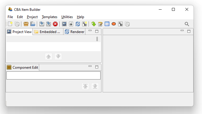
FIGURE 3.1: Main Menu, Toolbar and left area of the CBA ItemBuilder user interface (Project View, Embedded HTML Explorer, Renderer and below the Component Edit).
The CBA ItemBuilder can be operated via a Main Menu, located in the top of the application (see File, Edit, … Help in Figure 3.1). Essential commands are also directly accessible with icons in the Toolbar, below the Main Menu.30
3.1.2 Left: Project View, Component Edit, Embedded HTML Explorer and Design Pages with Basic Components
In the default configuration, the left area of the CBA ItemBuilder contains the following four tabs (see Figure 3.1) with specific functions as described in the following: The Project View, the Component Edit, the Embedded HTML Explorer, and the internal Rendering. It is possible to switch between the tabs at any time, and the tabs can also be un-docked and re-sized (see section 6.8.1).
Project View: The Project View is organized as a tree and is empty by default. As soon as a project is created (see section 3.2.1, the Project View shows the current project’s name as the root element, which is also shown in the name of the main window. When a project contains pages, the pages are listed under the root element. Right-click on the root element (i.e., the project name) or a page (i.e., one of the elements in the tree) opens different context menus, as shown in Figure 3.2.
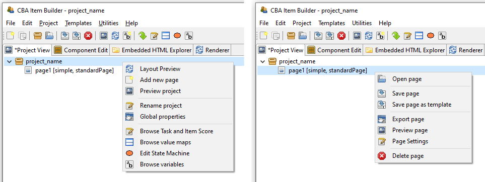
FIGURE 3.2: Context Menu in the Project View clicked on the root (left) and on a page (right)
Entries in the tree of the Project View represent pages in the current project. The order of pages can be sorted with the buttons  and
and  .31
.31
The context menu of the Project View clicked on the root (i.e., right-click on the project name) allows to create new pages (see Add new page in the left part of Figure 3.2). Double-click a page in the Project View (or right-click a page name and select Open Page) allows to open a page in the Page Editor. The remaining functions accessible using the context-menu of the Project Name (right-click the root element in the Project View) and the Pages (right-click a page name in the Project View) will be described in context of the related features of the CBA ItemBuilder.
Component Edit: Beyond the Project View that is open by default, the left area of the CBA ItemBuilder’s user interface contains three more tabs. The first tab is headed with Component Edit. After opening a page in the Page Editor the Component Edit lists all components of that page. The Component Edit view is essential for selecting components in the graphical Page Editor, for instance, when components are placed on each other or are too small to be easily selected by point-and-click.
Embedded HTML Explorer: The CBA ItemBuilder is designed as an open tool for researchers to create interactive assessment components (items, instructions, etc.). Content that can be created with the core components presented in this chapter is defined independently of concrete programming technique (see detailed about the model-based representation in section 2.11.2). However, CBA ItemBuilder items can be extended with HTML5/JavaScriopt content. If features are not available using the core components or fragments are already available or programmed for browser-based environments, HTML and JavaScript can also be used along with core components. For this purpose, existing material can be imported as files and folders in the CBA ItemBuilder Project Files using the Embedded HTML Explorer (see section 3.14.2).
Rendering: The Drawing Area in the Page Editor of the CBA ItemBuilder (see section 3.1.3) is not What you see is what you get. To verify the final layout of a page, the internal Rendering (or the full Preview, see section 1.4) can be used. The Rendering tab in the left part of the CBA ItemBuilder is preferred since this preview of the currently opened page of the Page Editor is updated automatically if major changes are applied to the page or the button  is pressed (see section 3.7.1 for details). The Rendering tab is empty, of no page is opened.
Minimize. The icon 
Maximize enlarges the area by minimizing all other areas. The icon 
Restore returns to the original view.
3.1.3 Middle: Page Editor and Other Editor-Tabs
The middle region is the main working area of the CBA ItemBuilder. This area is structured in the form of tabs, each of which is opened to edit specific content (i.e., a Page Editor to edit pages, an HTML Text Editor to edit components of type HTMLTextField, etc.). Changes to individual parts of the current Project Files made in such a tab must typically be applied, before other parts of the CBA ItemBuilder can consistently work with the changes. The CBA ItemBuilder indicates unchanged contents with a small * in the tab name.
Page Editor and Palette: The core component for designing pages is the Page Editor. The Page Editor is opened for a particular page by double-clicking on the existing page in the Project View. By clicking on the small icon on the right  , the context-sensitive Palette is displayed (see Panel E in Figure 3.3).
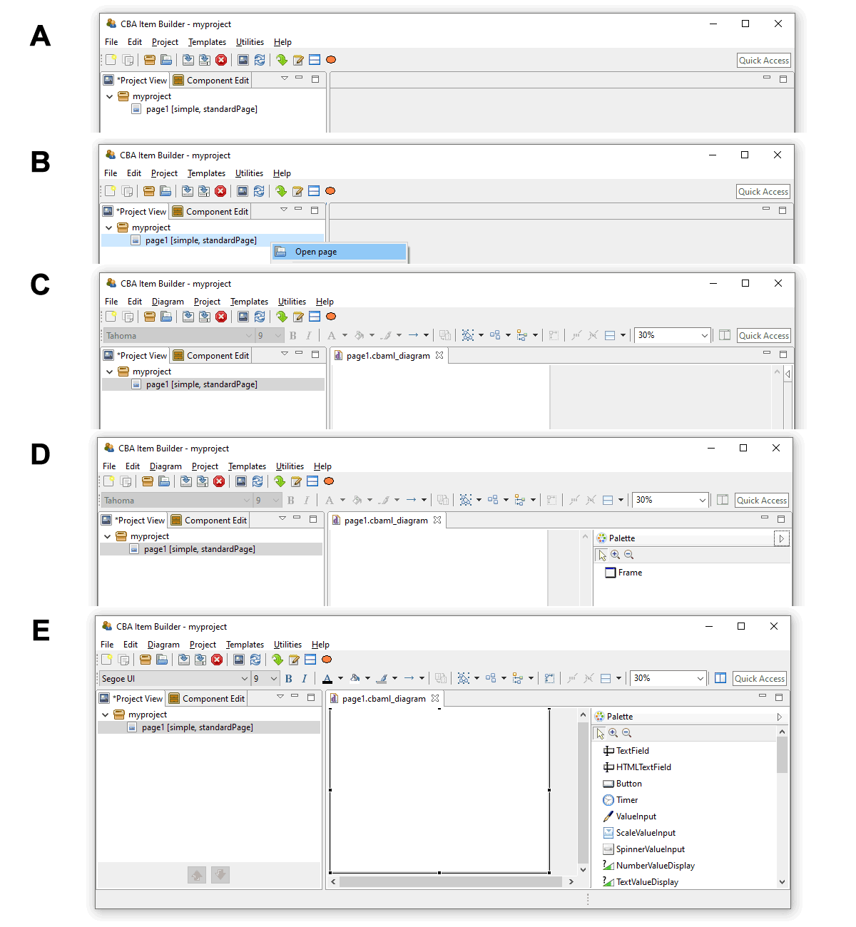
FIGURE 3.3: Five steps for opening a newly created page in the Page Editor and open the Palette.
If not requested differently, new pages are by default created with Frame and Panel (see section 3.4).The Palette allows selecting components that can be added in the Page Editor in the current context, meaning within the currently selected component. After creating the first page, the CBA ItemBuilder, the Page Editor is not yet open (see A in Figure 3.3). To open the page, double-click the page name in the Project View or use the context menu (right-click on the page name, see B in Figure 3.3, and select Open page). After opening the page the Page Editor appears as a new tab, showing the page with Frame and Panelin the Drawing Area (see D in Figure 3.3). Clicking on the small icon opens the context-sensitive Palette (see D in Figure 3.3). However, as long as no component is selected, the Palette contains only the Framecomponent. To see all components in the Palette that can be added inside of components of type Panel, click the Panel that is by default created when new pages are added (see E in Figure 3.3).
The different components possible in the current context are shown in the Palette (according to the currently selected component in the Drawing Area). To insert a new component, select that particular component in the Palette and then click and drag to place it in the parent component in the Page Editor (see section 3.7 for detailed instructions).
Changes in the Page Editor are applied when the Page Editor is closed via the small cross next to the page name in the tab title  and the Save Resource dialog is confirmed with OK. Also, the saving of the entire Project Files takes over the change one all Page Editors.
Other Editor Tabs: The CBA ItemBuilder’s main area is also used for other editors. These include editors for formatting text (for components of type HTMLTextField see section 3.8.2, and for components of type TextField, see section 3.8.3). In addition, the Resource Browser (see section 3.10.1) for importing images and media files into Project Files is also shown in this area. Editors for editing dynamic content (see chapter 4) and defining the scoring items (see chapter 5) are also presented in this section. This includes syntax editors for defining Hit Conditions (see section 5.3.2), Task Initialization (see section 4.5), Conditional Links (see section 4.3) and for defining State Machine Rules (see section 4.4.4). Finally, the definition of States and Variables is also conducted in the State Machine Tree View, shown in this part of the CBA ItemBuilder user interface (see section 4.4.1).
Zoom: For the graphical editing of assessment components (i.e., for the design of pages in the Page Editor), the CBA ItemBuilder provides a zoom function. A zoom factor can be entered or selected in the toolbar ( ). This zoom factor only influences the display in the Page Editor during the creation of the pages and has no influence on the final display in the Preview or the test delivery.32 Page Editors for multiple pages can be opened simultaneously.
3.1.4 Right: Properties, Tasks, Variables, Value Maps and Clipboard View
The right part of the CBA ItemBuilder window also has content that in the default configuration always displayed there, and also this right area is organized with the help of tabs. A tab appears if one of the following editors are requested: Properties view, Tasks, Variables or Value Maps. Changes in the editor are saved either when the project is saved (see section 3.2.1) or when the tab is closed.
Properties view: A central part of the user interface for defining components in the Page Editor of the CBA ItemBuilder is the so-called Properties view. In this tabular display, individual properties of the component currently selected in the Page Editor can be specified and modified. The Properties view is hidden by default. The Properties view can be shown with the entry Show Properties View from the Context Menu of components in the Page Editor
Once the Properties view is opened in the right area of the CBA ItemBuilder, it shows the properties of the currently selected component in the Page Editor. The headline of the Properties view always show the components’ type. The component selection in Figure 3.4 is, for instance, of type Panel (as can be seen from the headline:  ).
).
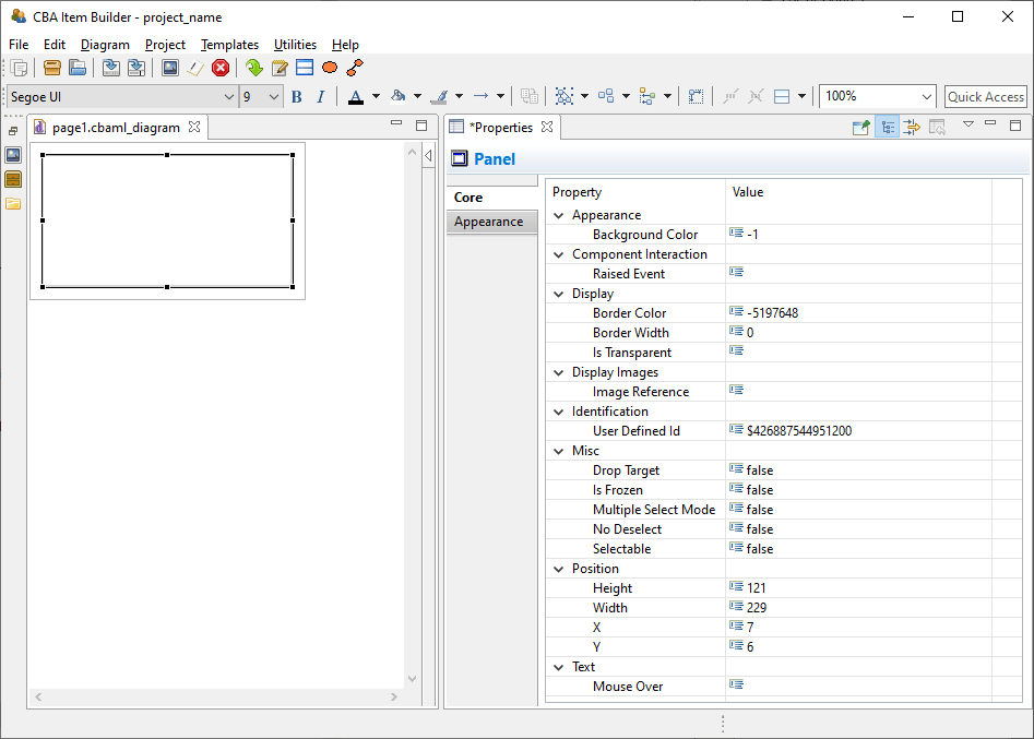
FIGURE 3.4: Properties view of a selected component of type Panel.
The Properties view is divided into sections (Appearance, Component Interaction, Display, …) and has two tab-pages (Core and Appearance). Most properties are shown on the tab Core. Which properties can be changed depends on the component’s type.
Section Position in the Properties View: All components that can be freely placed in the Page Editor have a section Position in the Properties view. The section Positions allows the Width and Height as well as the X- and Y-coordinate to be defined exactly. The upper-left corner serves as the origin with the coordinates X=0 and Y=0.
Tab Appearance in the Properties View: For components that display text (except for components TextField and HTMLTextField, which support different formatted text, see section 3.8), font name, font size and font color ( ), bold font (
 ), italic font (
 ), and underlined font (
 ) can be configured in the Appearance tab of the Properties view (see Figure 3.5). To facilitate the use of consistent fonts and to narrow the fonts used in web deliveries, the available fonts can be restricted (see section 6.8.2).
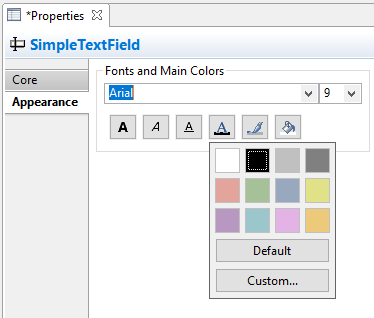
FIGURE 3.5: Properties view showing the tab Appearance.
For all components the fill color ( ) is only applied, if the component is not configured to be
 Is Transparent=true in the section Display of the Properties view. Finally, for all components the border color ( ) can be defined. However, a border is only shown if the property
 Border Width in the section Display of the Properties view is defined (default is \(0\)).
Border Width for a component is a positive number larger than zero.
Section Identification in the Properties View: The section Identification should be mentioned, which is important for the creation of assessment components with the CBA ItemBuilder. As described in detail in section 3.7.4, components required for scoring or dynamic parts must be named with a unique UserDefinedId. For that purpose, a string literal can be entered as value of the property UserDefinedId.
Rulers & Grid in the Properties View: The CBA ItemBuilder can align components in the Page Editor using a grid. Settings for spacing and visibility of the grid can be made using the Properties view when the Page is selected (see Figure 3.6). To select the Page, open the Page and click outside of the Frame in the Page Editor.
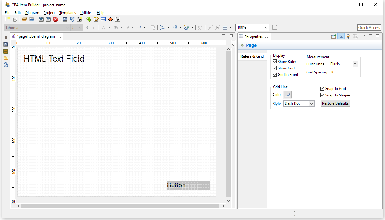
FIGURE 3.6: Properties view shows Rules & Grid if the Page is selected.
Editing the Rulers & Grid options in the Properties view is only possible, if a page is open and the page itself (and no component) is selected in the Page Editor.33
Snap To Grid and Snap To Shape functions an to define a meaningful Grid Spacing (e.g., 10 for the Ruler Units=Pixels) or to use Auto-Layout Panels (see section 3.5.3).
Task Editor: A specific editor to define the entry points that are provided by a Project File is the Task Editor (see section 3.6). The editor is requested using the icon  (or the entry
 Browse Task and Item Score from the Project menu) and allows also to define the scoring rules for each task (see section 5.3). The Task Editor is also displayed in the right part of the user interface (see Figure 3.7, in which the left and the middle part of the user interface are minimized).
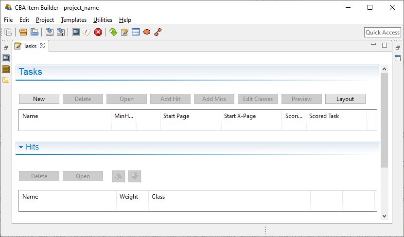
FIGURE 3.7: Task editor in the right area of the user interface.
Variables: Variables can be used in the logic-layer of the CBA ItemBuilder (to control the behavior of items using finite-state machines and to show dynamic content, see section 4.2). Variables can also be used to store results or information from content embedded via so-called ExternalPageFrames (see section 3.14) and variables can be used for scoring responses. As shown in Figure 3.8, variables can be declared with different Typ, need to have a Name and a (default) Value.
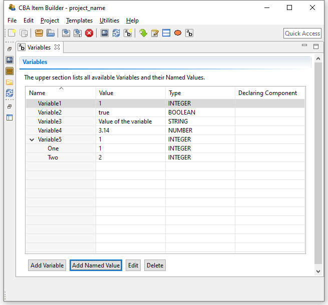
FIGURE 3.8: Variables editor in the right area of the user interface.
Value Maps: Another part of the CBA ItemBuilder’s user interface shown in Figure 3.9 is the editor for so-called Value Maps (see section 4.2.4). Value Maps are tables for translating variable values (e.g., 1, 2, 3-5, see section 4.2) into pre-defined texts and media (i.e., images, audio or video files embedded in the project, see section 4.2.4).
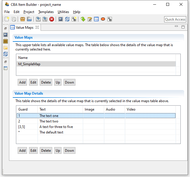
FIGURE 3.9: Value Maps editor in the right area of the user interface.
After defining a Value Map to translate variable values or value ranges (so-called Guards) to texts, images or audio-/video files (see section 4.2.4 for details), map-based value-displays can be embedded on pages to show the mapped resources (using MapBasedVariableDisplays, see section 4.2.5). Value maps are used, for instance, to visualize FSM-variable values, to adjust the visual presentation within items dynamically and to implement drag-and-drop response formats (see section 4.2.6).
Clipboard View: The right pane of the CBA ItemBuilder can also display the Clipboard View, enabling components and their contents to be copied and transferred within pages, between pages, and between CBA ItemBuilder Project Files (see section 3.7.2 for details).
3.2 CBA ItemBuilder Projects Files

After describing the user interface of the CBA ItemBuilder, this section turns to the content that can be created with the authoring tool. The CBA ItemBuilder uses Project Files that are plain ZIP-archives. The Project Files (with the file extension *.zip) contain the task specification, settings, pages, syntax for scoring and the finite-state machine as well as all resources (e.g., graphics, videos) used by the project. Moreover, the ZIP archives contain the generated data required for rendering the item during runtime (see section 2.11.2).
3.2.1 Working with Project Files
As already described in the section 1.4.1, the CBA ItemBuilder is an editor for item projects, which are stored as ZIP archives. The Project Files are not created using the Explorer. Instead, Project Files are created inside of the CBA ItemBuilder.
Creating new Projects: After the CBA ItemBuilder has been started, a project must either created, or an existing project can be opened. To start with an empty project, the menu File contains the entry New project ( ). To create a new project, the input of a valid project name is mandatory. The name selected here is subject to some restrictions:
template for CBA ItemBuilder projects is not allowed. The name of the Project File (i.e., the ZIP archive) is by default the Project Name, but projects can be renamed (see Figure 3.10) and project files can be renamed (by changing the name of the ZIP archive outside of the CBA ItemBuilder or by using Save As...) independently.
The file name is by default identical to the Project Name. To save a Project File with a different file name, use Save as... (see section 3.2.1). To rename a project, use the entry Rename project (see Figure 3.10) in the context menu of the Project View.
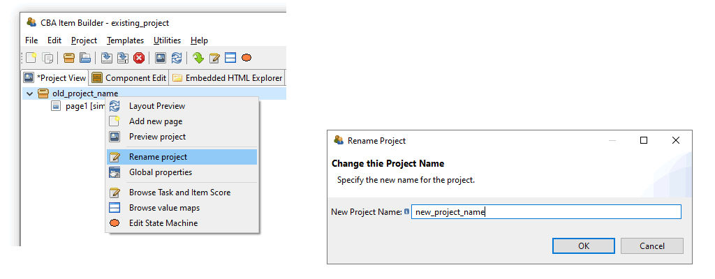
FIGURE 3.10: Rename Project-Dialog accessible form context menu in Project View.
Valid Project Names: If an invalid project name is entered, the CBA ItemBuilder displays the message shown in Figure 3.11 next to the  -icon. In this case, change the name to comply with the regulation and confirm the dialog with OK.
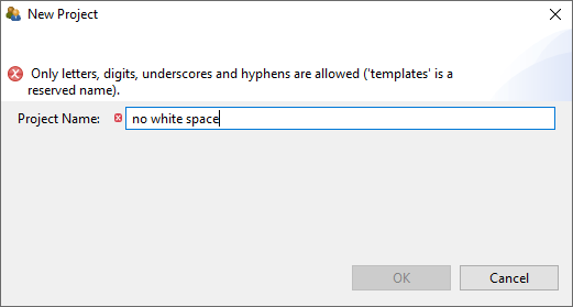
FIGURE 3.11: Warning about allowed characters for project names.
Download Project Files: Only local files can be opened in CBA ItemBuilder. Therefore, CBA ItemBuilder Project Files must be downloaded as ZIP archives when shared over the Internet. Web browsers have a habit of opening ZIP archives after download. Make sure you open Project Files unchanged as a ZIP archive in the CBA ItemBuilder.34
Rename Projects Files (Save as...): By using Save as from the File menu and choosing a different name, the CBA ItemBuilder renames the file but not the project. Renaming the ZIP file is therefore not sufficient to rename the project (see section 3.2.1).35
Use of CBA ItemBuilder Project Files: CBA ItemBuilder project files (i.e., ZIP archives) can be used directly in delivery software (see section 7). For the definition of tests (i.e., the so-called test assembly), assessment components stored in CBA ItemBuilder project files are referenced via the project name and the entry point (Task, see section 3.6). It is recommended not to change the file names of different versions and use tools for version management instead of files with different file names (see section 8.3.2).
The configurations required at runtime (see section 2.11.2) are automatically generated with each normal save and Project Files can be used directly after saving if no error message was displayed.36
Save Projects: Saving projects is possible using either Save from the File menu (or the icon in the toolbar).
If a project containing unsaved changes is to be closed, the dialog shown in Figure 3.12 is displayed.
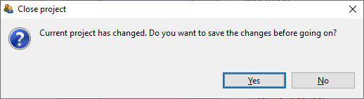
FIGURE 3.12: Dialog asking to save the changes in the current project.
Inconsistent Project States: Saving CBA ItemBuilder projects shows a warning if the runtime code (i.e., the definition of the item used for deployments) is invalid. Hence, a Preview (see section 1.4 might be required, as shown in Figure 3.13. (ref:IBPreviewRequired) Dialog asking for a preview of the current project before saving the project file is possible.
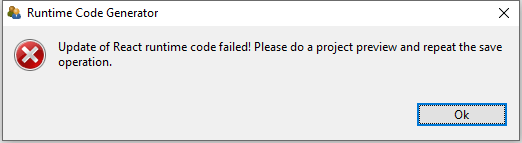
FIGURE 3.13: (ref:IBPreviewRequired)
The runtime code is created, whenever a project is previewed. However, there are selected configuration conflicts (i.e., inconsistencies) that make the creation of this runtime code and the preview impossible and therefore also prevent the saving of the items. In these cases the CBA ItemBuilder gives an error message and points to the place in the item definition which prevents saving (see Figure 3.14 for an example). This issue will occur as rare as possible in practice, if changes are regularly previewed and saved and if configuration inconsistencies (e.g. incorrect or empty UserDefinedID’s in the scoring definition) are corrected as soon as possible.
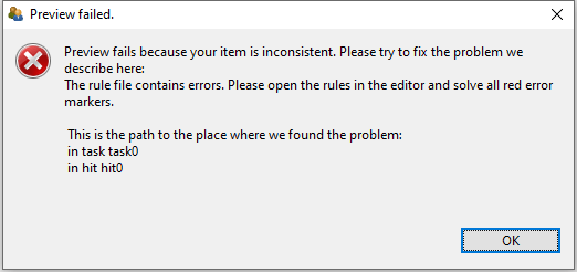
FIGURE 3.14: Request to preview the current project before saving the project is possible.
As shown in Figure 3.14, the CBA ItemBuilder provides a detailed description where the inconsistency is located (i.e., in this example, previewing and saving the project would be possible after changing the hit0 in task0, see chapter 5 for details about scoring). Inconsistencies can also at other locations (task definition, conditional links, value maps, finite-state machines), but the CBA ItemBuilder will always provide a useful hint (i.e., a path) where to spot the issue.
Migration and use of Multiple Versions (Details): The CBA ItemBuilder is updated at regular intervals. The software development tries to ensure that project files of previous CBA ItemBuilder versions can be used in newer software versions. For this purpose, files from older versions can be opened in the more recent CBA ItemBuilder. The internal data structures will be automatically transferred to the new data formats if necessary and possible (called Migration). Updating old items might require migrating in several steps.
3.2.2 CBA Presentation Size
CBA ItemBuilder projects are designed for a particular size (CBA Presentation Size), defined in pixel height and width. This CBA Presentation Size is expected to fit the expected average screen size (in pixels) to avoid raster images with too low or too high resolution.
Item Design: The CBA Presentation Size is used to define the actual size of the assessment component or at least the proportional size (i.e., the aspect ratio of width and height) used to position content in the form of components. Depending on the configuration of the deployment software, if the CBA Presentation Size is proportionally scaled and the CBA Presentation Size is the size of the content at 100% zoom-level.
The CBA Presentation Size for new items can be configured in the dialog Preferences, which can be found in the menu Utilities of the CBA ItemBuilder located in the menu entry Open preferences (see Figure 3.15). To define the item size that is used for newly created items, select the element CBA CBA Presentation Size on the left and adjust height and width of the item in pixels.38
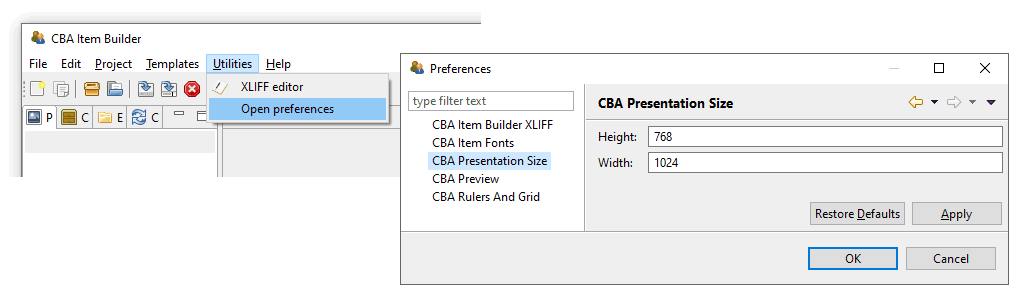
FIGURE 3.15: CBA ItemBuilder Preferences to define the CBA Presentation Size for new projects.
For existing CBA ItemBuilder projects, the CBA Presentation Size (see section 3.6.2) is part of the Global Properties (see section 6.3 for details).39 Hence, if the preview of your item is not correctly showing the item with the correct size, the CBA Presentation Size for the project can be changed in the Global Properties. After opening an existing project, the entry Global Properties can be selected in the context menu of the Project Name in the Project View using the right mouse button as shown in the following Figure 3.16 and the CBA Presentation Size must be adjusted in the dialog that then opens:
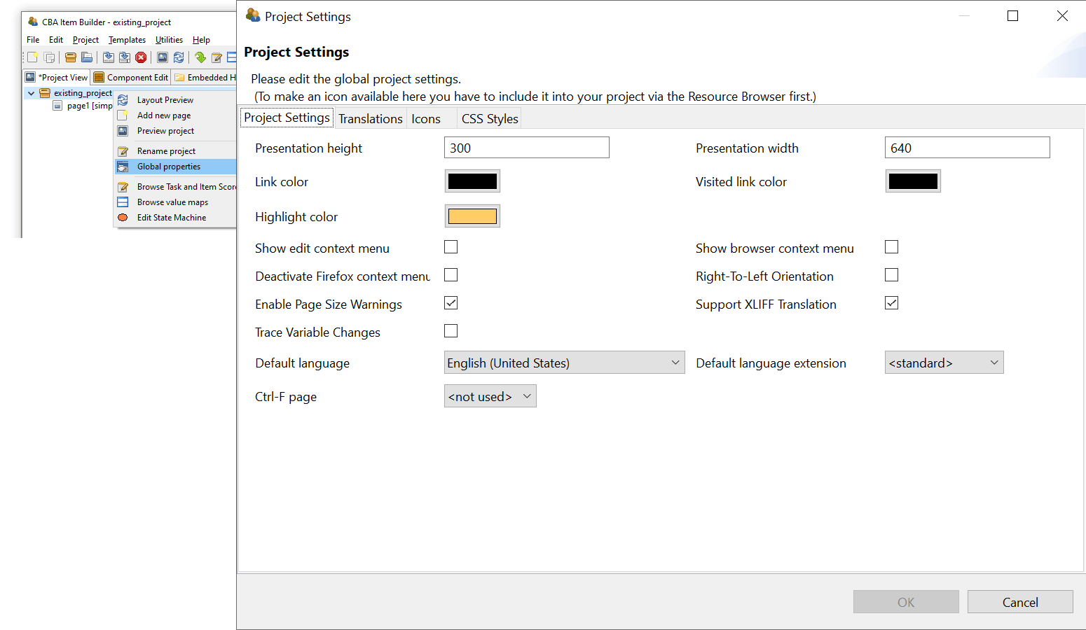
FIGURE 3.16: CBA ItemBuilder Global Properties to define the CBA Presentation Size for existing projects.
Item Deployment: For the use of CBA ItemBuilder generated items, the Presentation Size defines the display size and aspect ratio for which the items are designed. Within the space available for the delivery in a web browser or browser component, the deployment software is expected to provide options to customize the behavior: Alignment of the content in horizontal (left, center, right) and vertical (top, middle, bottom) direction as well as optional Proportional Scaling of the content (un-scaled, up-and-down, down).40
Tip: When starting a new project, the following questions can help to find the best CBA Presentation Size:
Should the items be optimized for a 4:3 display (e.g., 1024x768 pixels) or for a 16:9 display (e.g., 1366x768 pixels)?
Should the items be displayed in portrait format (width > height) or landscape format (height > width) with as few white borders as possible?
Are low-resolution screens (e.g., notebooks with 1024x600 pixels), medium-resolution (e.g., computers with FullHD monitors), or high-resolution screens (e.g., modern tablets or computers with 4K resolution) expected?
Should the items be delivered in full-screen mode, or is additional space on the screen necessary for either navigation or the browser window?
Is extra space covered by an on-screen keyboard, or do the items either not require a keyboard, or can a hardware keyboard be assumed?
Scaling Options: Proportional scaling should ensure that the items can still be displayed even if answers to this question change or if the test is performed on heterogeneous hardware. However, the display and usability may then be less than ideal. Deployment software should provide the following options, that also can be requested by item authors for task Preview (see also section 1.4.2):
None: Content is presented at 100%, and either a scrollbar appears (if the CBA Presentation Size of a task is larger than the effectively available size on screen) or space on screen remains empty. The position of the unused space will depend on the configuration for Horizontal and Vertical alignment.Up: If the CBA Presentation Size is smaller than the effectively available size on screen, the space will be filled, but content will not be scaled down.Down: If the CBA Presentation Size is larger than the effectively available size on screen, items will be scaled to fit the screen, but content will not be scaled up.Both: If the CBA Presentation Size is smaller than the effectively available size on screen, the space will be filled and if the CBA Presentation Size is larger than the effectively available size on screen, items will be scaled to fit the screen.
3.3 Quick Start: Create Single Page Items

While the several chapters in this book describe the individual functions, components, and concepts for creating complex assessment components with the CBA ItemBuilder in detail, simple one-page items can be easily made. A simple guide to how to do this is the subject of this Quick Start section.
First, it must be defined what is to be understood as a Single Page Item. Single Page Items are items that fit on a computer screen, i.e., that can be displayed without page switching. When possible, scrolling should be avoided. Single Page Items are typically composed of a question stem or stimulus and one single response format. The response formats Single-Choice, Multiple-Choice, and Text Entry are considered in this section. Moreover, CBA ItemBuilder projects containing tasks for the general instructions (embedding a video), a closing page (containing an image) will be created as Single Page Items.
To give a realistic impression of working with the CBA ItemBuilder, we will start with creating a master project, which we will then adapt for the different item types.
3.3.1 Create Master Project
At the beginning of preparing an assessment project, you have to decide on the screen orientation (portrait or landscape) and aspect ratio (e.g., 16:9 or 4:3) of the computer-based material (see section 2.4). The size that should be supported minimally without scrolling or scaling. As mentioned in the section 3.2.2, 1024x768 can often be a reasonable choice, which is the current default of the CBA ItemBuilder.
1. Check Settings: Before preparing multiple project files, it is recommended to check the settings of the CBA ItemBuilder. For instance, it is suggested to consider the appropriate CBA Presentation Size right at the very beginning. For that purpose, open the main menu Utilities and select Open preferences. The CBA Presentation Size should be defined as Height: 768, and Width: 1024. Change to the section CBA Rulers And Grid and select Apply changes to all pages. Finally, go to the section CBA Item Fonts, click Deselect All. Afterwards, select the two Font Names Arial and Courier New. Close the Preferences dialog with OK. Confirm the message Any open editors must be closed before these changes are applied with OK.
2. Create a new Project: With the main menu File using the entry New project, a new CBA ItemBuilder Project File can be created. It is required to enter a valid project name, for instance, SinglePageItems_MasterProject. As soon as the (empty) project is created, the entry Save from the main menu File can be used to specify the location where the Project File is stored. Select a folder and keep the file name SinglePageItems_MasterProject.zip.
3. Add New Page: Since creating the project, the project name SinglePageItems_MasterProject is shown in the Project View in the left part of the CBA ItemBuilder. Right-click on this project name in the Project View and select the entry Add new page in the context menu. In the dialog that appears keep the suggested name page1 and confirm the dialog with OK.
4. Define Rulers & Grid: The Project View now contains the newly created page page01. Double-click this page in the Project View to open the Page Editor in the main area of the CBA ItemBuilder window. In the Page Editor that opens, right-click in the gray area and select Show Properties View. Select Show Ruler and Show Grid in the section Display, change the Rulers Units to Pixels and change to 20 for the Grid Spacing in section Measurement. Finally, check the option Snap To Shapes.
5. Define Border: Click in the white part of the Page Editor. This should select the Panel that was automatically generated by the CBA ItemBuilder for that page1. The type of the selected element is shown in the headline of the Properties view. If the Properties view was closed, right-click anywhere in the Page Editor and select the entry Show Properties View again in the context menu. Find the property Border Width in section Display and enter the value 5.
6. Add HTMLTextField as Headline: Click again in the white part of the Page Editor to select the Panel. When the Panel is selected, the Palette should show a long list of components that could all be added to the selected Panel. If the Palette  is not displayed, it can be shown at the right window border with the small icon . Select the
 HTMLTextField entry ( ) and draw a rectangle in the Drawing Area (inside the
 Panel) to add the HTMLTextField. Leave two boxes of the grid blank on the left, right and top and draw the rectangle 4 grid boxes high while holding down the mouse button. This way it should be 940 pixels wide and 80 pixels high, and placed at X=40 and Y=40.
Check the following values in the Position-section of the Properties view: Height: 80, Width: 940, X: 40, and Y: 40. If the Properties view was closed in a previous step, open it using the context menu. If the headline of the Properties view is showing a different component type than HTMLTextField, select the HTMLTextField in the Page Editor.
The HTMLTextField is now aligned relative to the Panel in the top. To enter text, double-click the HTMLTextField and enter the text Headline in the HTML Text Editor. Select the text and change the font to Arial and the size to 30. Finally, save the changes using the button Save and Close.
7. Add HTMLTextField for Content: Repeat step 5 and create a second HTMLTextField. Start by selecting the Panel in order to see the entry HTMLTextField in the Palette. Position the second HTMLTextField aligned below the first and draw the HTMLTextField with 80 pixels height and leave 20 Pixel distance. You can also change the position in the Page Editor or enter the values in the section Position of the Properties-view: Height: 80, Width: 940, X: 40, and Y: 140. Double-click the new HTMLTextField and enter the text Content in the HTML Text Editor. Change the font to Arial of size to 20 and close the editor with the Save and Close button.
8. Add and Configure Next-Button: Buttons can be added to components of type Panel. Select the Panel and find and click the entry Button  in the Palette. When the component type is selected in the Palette a new button can be added to the page by drawing a rectangle into the Drawing Area. It should be two three boxes (i.e., 60 pixels) height, ten boxes (i.e., 200 pixels) width and two full boxes left and below in the lower right corner of the
 Panel. You can also use the Properties view and enter Height: 60, Width: 200, X: 780, and Y: 660 in the section Position. Find the tab Appearance  and click it, and change the formatting of the button. Select
 Arial as font and set the font size to 20. Moreover, set the font color to white using the button . Now set the background color using the button and select Custom... in the small color dialog. In the Choose Color change to RGB and enter Red: 50, Green: 100 and Blue: 200 and confirm with OK. Navigate back to the tab Core in the Properties view and change the Properties Use Default Link Color to false and Use Same Color For Visisted Reference to true.
Next, double-click the button and enter the text Next in the dialog Configure a Multiline Text, before closing the dialog wit OK. Finally, right-click the button in the Page Editor an select the entry Set command in the context menu. In the dialog Set Runtime Command click on the entry NEXT_TASK and confirm the selection with OK.
9. Define Task: Open the Task Editor using the main menu Project and the entry Browse Task and Item Score . In the right area of the CBA ItemBuilder main window a tab titled Tasks will appear. Click the first button New below the headline Tasks. This will move the cursor to the first row to the column titled Name. Keep the default Name task0 and the select the name of the page created in step 3 (page1) as the Start Page.
10. Save and Preview: The project can now be saved, for instance, using the main menu File and the entry Save  . Confirm the message box Save Resource that informs that
 page01.cbambl_diagram has been modified with Yes. Finally, in the preview (main menu Project the entry Preview Project  ) the item should now look like shown in Figure 3.18. In case of a problem, download and open the CBA ItemBuilder project file SinglePageItems_MasterProject.zip.
Using the master item created in the ten steps, it is possible to create various single page items. For this purpose, the components used to capture the response must be added. The required steps are will be described for the different response formats Single Choice, Multiple-Choice, and Text Response, in a subsection each.
3.3.2 Create Single-Choice Item
1. Open Master and Save as SinglePageItems_01SC.zip: Open the master item created in the previous section 3.3.1 (or download SinglePageItems_MasterProject.zip) using the icon  in the CBA ItemBuilder (or use the main menu
 File and the entry Open project). Save the Project File with the new name SinglePageItems_01SC.zip using the main menu File and the entry Save as... (or use the icon  ).
).
2. Rename the Project: After saving the project to a new file, the project itself needs to be renamed as well. For that purpose, right click on the old project name SinglePageItems_MasterProject in the Project View and select Rename project. Enter the name SinglePageItems_01SC and confirm the dialog with OK.
3. Update Headline and Text: The most visible customization necessary to turn the master project into an item is editing the HTMLTextFields that are used for the heading and page content. To make this change, first open the page page01 in the Page Editor by double-clicking on page01 in the Project View (alternatively, you can also use the context menu in the Project View, which can be opened with a right-click on the page and which contains the entry Open page). Once the page is opened in the Page Editor (i.e., the tab in the middle region of the CBA ItemBuilder titled page01.cbaml_diagram), the text in the HTMLTextFields can be edited. Replace the text Headline with Single-Choice Task and insert as Content the text Select the option that answers the following question: (italic) and then, after two line breaks (i.e., with an empty line in between): Which answer is correct? Close the HTML Text Editors each time with Save and Close.
4. Add RadioButtonGroup: In the next step, a so called RadioButtonGroup will be inserted (see section 3.9.2). A RadioButtonGroup is necessary to define the connection between the components of the type RadioButton, inserted in the next step. To add the RadioButtonGroup, select the Panel in the Page Editor first. Afterwards, find and select the icon RadioButtonGroup ( ) in the Palette. To add a
 RadioButtonGroup to the page, click in the Drawing Area within the Panel below the second HTMLTextField and hold the left mouse button clicked while moving the mouse to draw a rectangle. Add the RadioButtonGroup to fill the remaining space with 40 pixels border around. After releasing the mouse button open the Properties view if necessary using the context menu (right-click on the RadioButtonGroup and select the entry Show Properties View). Check the following values in the Position section: Height: 360, Width: 940, X: 40, and Y: 260.
5. Add the first RadioButton: Adding RadioButtons is only possible within components of type RadioButtonGroup (see section 2.11.4). In the Palette the icon RadioButton ( ) can therefore only be selected if a
 RadioButtonGroup is selected in the Page Editor. Select the RadioButtonGroup in the Page Area and the RadioButton in the Palette and add a first RadioButton by drawing a rectangle within the area that is covered by the RadioButtonGroup with 20 pixels border to the top, left and right and 60 pixels height. Subsequently, check the position in the Properties view to Height: 60, Width: 900, X: 20, and Y: 20.
Change the values for the properties Control Item Size and Label Distance in section Misc to 30. Change to the tab Appearance () and select Arial as font and 20 as font size. It is also possible to enter Arial (including capitalization) and 20 directly in section Appearance into the properties Font Name and Font Size, respectively. Finally, double-click the RadioButton in the Page Editor and enter the text Option A into the dialog Configure a Multiline Text, that must be confirmed with OK.
6. Duplicate the RadioButton: After creating the first RadioButton, copies of this component can be created using the function Duplicate. For that purpose, the RadioButton that has just been created must be right-clicked to open the context menu that contains a sub-menu Edit with the entry Duplicate.^[If the sub-menu Edit does not contain the entry Duplicate, the text property of the component was selected. In that case, just select another component in the Page Editor and then right-click on the RadioButton again.
] After duplicating the RadioButton the first time, arrange it with 20 pixels border below the first or change the Position in the Properties view to Y: 100, and X: 20 and change the text property to Option B (via double-click on the duplicated RadioButton or using the small icon  in section Text of the Properties view). Repeat these procedure for a third
 RadioButton (Y: 180, X: 20, Text: Option C*) and a fourth RadioButton (Y: 260, X: 20, Text: Option D).
7. Provide UserDefinedIDs: Before the scoring can be defined, the created components of type RadioButton must be uniquely named. For this purpose, each Radiobutton must be selected in the Page Editor, and an identifier must be entered in the section Identification of the Properties view as UserDefinedId. To keep the scoring syntax as simple as possible, we use the following schema to name the RadioButtons.First: UserDefinedID: a, second UserDefinedID: b, third UserDefinedID: c, and fourth: UserDefinedID: d (without white spaces).
8. Add Classes as Variables for Scoring: With the help of the UserDefinedID’s, the scoring can now be created exemplary for this item. Let’s assume that Option C is correct. Then we could expect either a true/false-coding in the result data set (i.e., a variable ScoredResponse) or a raw-response coding (i.e., a variable RawResponse). In this example, we create both variables. Variables are defined in the CBA ItemBuilder as Classes. The definition of Classes can be requested in the Task Editor, which can be opened via the menu Project and the entry Browse Task and Item Score or the icon . To create two new Classes, open the Task Editor select task task0. Open the dialog Task Classes Editor with the button Edit Classes. In that dialog create two classes using the button Add new class and enter the class name ScoredResponse for the first class and RawResponse for the second class. Finally, confirm the Task Classes Editor with the button OK.
9. Define Hit-Conditions: Each hit represents a condition to be distinguished as value of a (categorical) variable. The value of the RawResponse variable should indicate which option was selected (resulting in four potential values, defined as Hits RawA, RawB, RawC and RawD). To define a Hit, first a task must be selected in the Task Editor (in this example the task with the name Task01 as defined above). A click into the first table in the Task Editor directly on the name Task01 selects the first task. When the task is selected, a new hit condition can be created with the Add Hit-button. Then, the cursor jumps to the table in the Hits section of the Task Editor. Enter as Name the name RawA for the first Hit, enter as Weight the value 1 and select the Class RawResponse. Then click the Open-button or double-click the newly created Hit to open the Conditions editor in the main CBA ItemBuilder window. For the first Hit just enter here the UserDefinedID of the first RadioButton (i.e. a) and close the editor using the small x in the tab-title (). Confirm to save the changes. Continue for the remaining Hits using the information presented in Table 3.1. Copy the string provided in the column Conditiona-Syntax exactly, including all brackets (see section 4.1.3 for more information).
| Name | Weight | Class | Condition-Syntax |
|---|---|---|---|
| RawA | 1 | RawResponse | a |
| RawB | 1 | RawResponse | b |
| RawC | 1 | RawResponse | c |
| RawD | 1 | RawResponse | d |
| ScoreWrong | 1 | ScoredResponse | ((a or b) or d) |
| ScoreCorrect | 1 | ScoredResponse | c |
To complete the scoring, two more Hit-conditions are needed for the coding of missing responses: A Hit RawOR (assigned to the Class RawResponse) and a Hit ScoreOR (assigned to the Class ScoredResponse). The abbreviation OR is used for Omitted Response (see section 2.5.2). Click the button Open to enter the following syntax as Condition: (((not a and not b) and not c) and not d).
10. Save, Preview and Test Scoring: The project can now be saved () and previewed (). Probably the most error-prone part of creating this item is the scoring definition. With a key combination (default is Ctrl + S) the scoring can be checked directly in the preview (see section 1.5). The scoring is defined correctly if exactly one hit is active for each Class (= Variable) at any time. If no answer is selected, the Hits ScoreOR and RawOR should be active. Once a response is selected, the Hit to the Class RawResponse should indicate which RadioButton was selected. Only if Option C is selected, the Hit ScoreCorrect assigned to the Class ScoredResponse should be active.
3.3.3 Create Multiple-Choice Item
1. Open Master and Save as SinglePageItems_02MC.zip: Open the master item created in section 3.3.1 (or download SinglePageItems_MasterProject.zip) using the icon in the CBA ItemBuilder (or use the main menu File and the entry Open project). Save the Project File with the new name SinglePageItems_02MC.zip using the main menu File and the entry Save as... (or use the icon ).
2. Rename the Project: After saving the project to a new file, the project itself needs to be renamed as well. For that purpose, right click on the old project name SinglePageItems_MasterProject in the Project View and select Rename project. Enter the name SinglePageItems_02MC and confirm the dialog with OK.
3. Update Headline and Text: Open the page page01 in the Page Editor by double-clicking on page01 in the Project View and edit the HTMLTextFields. Replace the text Headline with Multiple-Choice Task and insert as Content the text Select all alternatives that apply: (italic) and then, after a line break: For which of the following entries a hypothetical rule applies? Close the HTML Text Editors each time with Save and Close.
3. Add the first Checkbox: Adding Checkboxes is possible within components of type Panel. In the Palette the icon Checkbox ( ) can be selected if the
 Panel is selected in the Page Editor. Select the Panel in the Page Area and the Checkbox in the Palette. Add the first Checkbox by drawing a rectangle at with 40 pixels border top, left and right and a height of 60 pixels. Subsequently, check the position in the Properties view, which should be Height: 60, Width: 940, X: 40, and Y: 260.
Change the values for the properties Control Item Size and Label Distance in section Misc to 30. Go to the tab Appearance () and select Arial as font and 20 as font size. Finally, double-click the Checkbox in the Page Editor and enter the text Entry 1* into the dialog Configure a Multiline Text, that must be confirmed with OK.
4. Duplicate the Checkbox: After creating the first Checkbox, create copies of this component again using the function Duplicate. For that purpose, the Checkbox that has been created in step 3 must be right-clicked to open the context menu that contains a sub-menu Edit with the entry Duplicate. After duplicating the Checkbox the first time, change the Position in the Properties view to X: 40, and Y: 340 and change the text property to Entry 2 (via double-click on the duplicated RadioButton or using the small icon in section Text of the Properties view). Repeat these procedure for a third Checkbox (X: 40, Y: 420, Text: Entry 3*) and a fourth Checkbox (X: 40, Y: 500, Text: Entry 4).
5. Provide UserDefinedIDs: Each Checkbox must obtain a unique name as UserDefinedID. Since UserDefinedIDs are not allowed to start with a number, the following schema is used to name the Checkboxes: First: UserDefinedID: e1, second UserDefinedID: e2, third UserDefinedID: e3, and fourth: UserDefinedID: e4 (without white spaces). To assign the UserDefinedIDs select each Checkbox in the Page Editor, and enter the identifier in the section Identification of the Properties view.
6. Add Classes as Variables for Scoring: With the help of the UserDefinedID’s, the scoring can now be created exemplary for this item. Let’s assume that Entry 1 and Entry 3 are required for a correct response. Since the item is in multiple-choice format, we can either define a true/false-coding in the result data set for each choice, or a combinded score variable. In this example, we create both variables. Variables are defined in the CBA ItemBuilder as Classes. The definition of Classes can be requested in the Task Editor, which can be opened via the menu Project and the entry Browse Task and Item Score or the icon . To create two new Classes, open the Task Editor, select Task task0 and use the button Edit Classes. In the dialog Task Classes Editor use the button Add new class and enter the class name ScoredResponse for the first class and RawResponse1, RawResponse2, RawResponse3, RawResponse4 for four remaining classes. Finally, confirm the Task Classes Editor with the button OK.
7. Define Hit-Conditions: After defining the Classes the definition of Hit-conditions is necessary. Select the Task with the name Task01 in the Task Editor. To add a Hit-condition use the button Add Hit and type the name this Hit in the first column: Entry1Selected. Press the Tab key and maintain the default 1as Weight in the second column and select the class RawResponse1 in the third column. Once the Hit is created, double-click the Hit or use the button Open to enter the condition-syntax e1 into the Tab titled Condition - <Entry1Selected>. Close the editor and confirm to save the changes. After creating the first Hit, continue with the information presented in Table 3.2.
| Name | Weight | Class | Condition-Syntax |
|---|---|---|---|
| Entry1Selected | 1 | RawResponse1 | e1 |
| Entry1NotSelected | 1 | RawResponse1 | not e1 |
| Entry2Selected | 1 | RawResponse2 | e2 |
| Entry2NotSelected | 1 | RawResponse2 | not e2 |
| Entry3Selected | 1 | RawResponse3 | e3 |
| Entry3NotSelected | 1 | RawResponse3 | not e3 |
| Entry4Selected | 1 | RawResponse4 | e4 |
| Entry4NotSelected | 1 | RawResponse4 | not e4 |
| ScoreWrong | 1 | ScoredResponse | (((e2 or e4) or not e1) or not e3) |
| ScoreCorrect | 1 | ScoredResponse | (((e1 and e3) and not e2) and not e4) |
8. Define Missing-Values: Typically, in RadioButtonGroups (used for the single-choice item in section 3.3.2) no RadioButton is pre-selected. Hence, the response is missing until one RadioButton of a RadioButtonGroup is selected. Components of type Checkbox (used for the multiple-choice items) can not distinguish whether a response was not given or the Checkbox was intentionally not selected. Accordingly, defining missing values for Checkboxes is either impossible or must take additional information into account. In this example, we only apply missing value coding to the score variable. For this purpose, we use the operator user_interactions() that counts the number of interactions in the current task. Suppose this number is smaller than the minimal number of interactions (one for clicking the Next-button). In that case, we consider the value of the variable ScoredResponse to be the Hit for an omitted response. In order to implement this approach for missing-value coding, select the Task labeled Task01 in the Task Editor, add an additional Hit using the button Add Hit and name this Hit ScoreOR (Weight: 1; Class: ScoredResponse). Edit the Hit using the button Open (or double-click the Hit ScoreOR) and enter the following syntax: [user_interactions()==0]. Close the Condition-editor using the small x in the tab-title () and confirm to save the changes. Note that a more specific missing-value coding counting only answer-change events would be possible using the CBA ItemBuilder, but is omitted here in the quick start example.
9. Re-Define Scoring for the ScoredResponse-Variable: What, if a test-taker clicks the Next-button without selecting any Checkbox? The Hit ScoreWrong will be active, since the defined Hit-condition (((e2 or e4) or not e1) or not e3) is fulfilled. It is not true, that the Checkboxes with the UserDefinedId's e1 and e2 are selected. However, at the same time the Hit ScoreOR is active, since the number of user-interactions would zero. To observe this prediction open the Preview (main menu Project the entry Preview Project or the icon ), click into the item and hit the key combination (default is Ctrl + S). You can verify that as long as the number of interactions is zero, both Hits are active at the same time. Reload the page in the preview (typically by hitting F5 to try again). To resolve this issue, we can make use of the fact that at least two interactions (selecting any Entry 2 and pressing the Next-button) are necessary. Hence, we can adjust the scoring syntax and use the scoring-syntax ((((e2 or e4) or not e1) or not e3) and [user_interactions()>=2]) for the Hit that correspond to a wrong response. Using this adaptation the condition is mutually exclusive with [user_interactions()<2], the condition used for the Hit that correspond to an omitted response on the ScoredResponse-variable. To adjust the scoring, double-click the Hit ScoreWrong and copy the following condition syntax in to the editor provided by the CBA ItemBuilder: ([user_interactions()>1] and not (e1 and e3)). Finally, also adjust the Hit ScoreOR to the following syntax: [user_interactions()<2]
10. Save, Preview and Test Scoring: This concludes the multiple-choice item and the project can now be saved () and previewed () again. Check the scoring using the Scoring Debug Window in the preview (see section 1.5).
3.3.4 Create Text-Entry Item
1. Open Master and Save as SinglePageItems_03TXT.zip: Open the master item created in section 3.3.1 (or download SinglePageItems_MasterProject.zip) using the icon in the CBA ItemBuilder (or use the main menu File and the entry Open project). Save the Project File with the new name SinglePageItems_03TXT.zip using the main menu File and the entry Save as... (or use the icon ).
2. Rename the Project: After saving the project to a new file, the project itself needs to be renamed as well. For that purpose, right click on the old project name SinglePageItems_MasterProject in the Project View and select Rename project. Enter the name SinglePageItems_03TXT and confirm the dialog with OK.
3. Update Headline and Text: Open the page page01 in the Page Editor by double-clicking on page01 in the Project View and edit the HTMLTextFields. Replace the text Headline with Text-Entry Task and insert as Content the text Use the keyboard to provide an answer to the following question: (italic) and then, after a line break: What is the "Answer to the Ultimate Question of Life, the Universe, and Everything"? Close the HTML Text Editors each time with Save and Close.
4. Add two HTMLTextFields to Provide Context for the Text-Response: Two more components of type HTMLTextField are necessary to embed the text input into a response phrase. Select the Panel in the Page Editor. Then select the HTMLTextField entry () in the Palette and draw a rectangle in the Drawing Area (inside the Panel) to add the HTMLTextField to the page. Use the Properties view to specify the position: Height: 40, Width: 170, X: 40 and Y: 300. Double-click the HTMLTextField and enter the text The answer is (font Arial and font size 20). Save and Close the HTML Text Editor. Add a second HTMLTextField with text . (font Arial and font size 20) at the position: Height: 40, Width: 40, X: 320 and Y: 300.
5. Add a SingleLineInputField: SingleLineInputField can be added to components of type Panel. In the Palette the icon SingleLineInputField ( ) is available if a
 Panel is selected in the Page Editor. Select the Panel in the Page Area and the SingleLineInputField in the Palette. Add the SingleLineInputField to the page by drawing a rectangle in the free area between the two HTMLTextFields added in step 4. To make sure the SingleLineInputField is precisely adjusted check the position and change the Y coordinate in the Properties view (Height: 40, Width: 110, X: 210, and Y: 295). Moreover, define a Border Width: 2 in the section Display. Finally, change to the tab Appearance () and select Arial as font and 20 as font size.
6. Define the Input Validation Pattern: Text fields without input restrictions can be a challenge for privacy and scoring. Therefore, and because we expect a number to be the answer, we can use an Input Validation Pattern to configure that only digits can be entered. For that purpose select the SingleLineInputField and enter the string [0-9]* in the section Misc of the Properties view.
7. Provide UserDefinedID: The scoring definition needs an identifier for the SingleLineInputField. Enter the property User Defined Id: txt in the Identification section of the Properties view.
8. Add Classes as Variables for Scoring: As a result of an item with text input, two variables can be distinguished again. A RawResponse variable should contain the entered text, and a ScoredResponse variable can, if the string can be evaluated automatically using, for instance, regular expressions, indicate whether the answer is correct or incorrect. First, two Classes must be created to prepare the definition of the corresponding scoring syntax. The definition of Classes is possible in the Task Editor, which can be opened via the menu Project and the entry Browse Task and Item Score or the icon . To create two new Classes, open the Task Editor, select the Task task0and use the button Edit Classes. In the dialog Task Classes Editor use the button Add new class and enter the class name ScoredResponse for the first class and RawResponse for the second class. Finally, confirm the Task Classes Editor with the button OK.
9. Define Hit-Conditions: Hit-conditions are required for the two Classes ScoredResponse and RawResponse. Assume the correct response is 42. The scoring-operator matches(txt,"42") (see section 5.3.4) can be used to compare the text entered into the SingleLineInputField with the UserDefinedId: txt with the string for a correct response. Select the Task with the name Task01 in the Task Editor. Add a Hit-condition using the button Add Hit and type the name for this Hit in the first column: ScoreCorrect. Press the Tab key and remain 1 as the Weight in the second column and select the class ScoredResponse in the third column. Once the Hit is created, double-click the Hit or use the button Open to enter the condition-syntax matches(txt,"42") into the Tab titled Condition - <ScoreCorrect>. Close the editor and confirm to save the changes. After creating the first Hit, continue with the information presented in Table 3.3.
| Name | Weight | Class | Condition-Syntax |
|---|---|---|---|
| ScoreCorrect | 1 | ScoredResponse | matches(txt,"42") |
| ScoreWrong | 1 | ScoredResponse | (not matches(txt,"") and |
| \(~\) | \(~\) | \(~\) | not matches(txt,"42")) |
| RawResultText | 1 | RawResponse | (not matches(txt,"") |
| \(~\) | \(~\) | \(~\) | and result_text(txt)) |
As shown in Table 3.3, the Hit ScoreWrong of the class ScoredResponse uses the matches()- operator two times, combined as logical expression (see section 4.1.3). The condition-syntax for the Hit RawResultText of the class RawResponse uses the result_text()-operator, also as part of a logical expression. The result_text()-operator copies the text of the component (see the UserDefinedId provided as argument) to the variables Result text).
To complete the scoring of the text-entry item, two more Hit-conditions are needed for the coding of missing responses: A Hit RawOR (assigned to the Class RawResponse) and a Hit ScoreOR (assigned to the Class ScoredResponse). Click the button Open to enter the following syntax as Condition: matches(txt,"") to both Hit-conditions.
10. Save, Preview and Test Scoring: This concludes the text-entry item and the project can now be saved () and previewed (). Check the scoring using the Scoring Debug Window in the preview (see section 1.5).
3.3.5 Create a Closing Page
1. Open Master and Save as SinglePageItems_END.zip: Open the master item created in section 3.3.1 (or download SinglePageItems_MasterProject.zip) using the icon in the CBA ItemBuilder (or use the main menu File and the entry Open project). Save the Project File with the new name SinglePageItems_04END.zip using the main menu File and the entry Save as... (or use the icon ).
2. Rename the Project: After saving the project to a new file, the project itself needs to be renamed as well. For that purpose, right click on the old project name SinglePageItems_MasterProject in the Project View and select Rename project. Enter the name SinglePageItems_END and confirm the dialog with OK.
3. Update Headline and Text: Open the page page01 in the Page Editor by double-clicking on page01 in the Project View and edit the HTMLTextFields. Replace the text Headline with Thank You and insert as Content the text You have reached the end of this short assessment. and then, after a line break: Click "Finish" to end the test. (italic). Close the HTML Text Editors each time with Save and Close.
4. Use the Resource Browser to Insert Image: As an example on how to use images, an image should be displayed on the last page. For this purpose, the picture must be added using the Resource Browser to the Project File first. Open the Resource Browser over the main menu Project and the entry Browse resources (or use the icon  ). Any image in one of the supported file formats (see section 3.10.1) can be used.41 Unpack this ZIP archive and then click the
 Add button in the Resource Browser of the CBA ItemBuilder to add the file ExampleImage_min.png to the list of Available resources. Close the Resource Browser via the small cross in the tab title ().
5. Add a ImageField and Link the Image: Once resources have been added to the Project File, they can be used in components. Next, add an ImageField. Components of type ImageField can be inserted into Panels. To add an ImageField, open the page page01 by double-clicking in the Project View for editing in the Page Editor and select the already existing Panel. Use the headline of the Properties view (right mouse button in the Page Editor and then the entry Show Properties View in the context menu) to check that you have selected the Panel. Then select the ImageField ( ) in the Palette and click inside the
 Panel in the drawing area of the Page Editor with the left mouse button while moving the mouse so that a small rectangle is created. Click the ImageField with the right mouse button and select the entry Link Image. In the dialog Select Image that will appear, select the file name of the picture added in step 3 (e.g., ExampleImage_min.png). Finally, adjust the position of the ImageField by entering the following numbers in the section Position of the Properties view: Height: 380, Width: 944, X: 40, and Y: 240.
6. Update Button-Text: Finally, change the text of the Button from Next to Finish. To edit the text, double click the Button.
7. Save and Preview: This concludes the assessment component prepared as the last page. The project can now be saved () and previewed (). Verification of a scoring-definition is not necessary since the last page does not contain any response elements.
3.3.6 Create an Instruction Page
1. Open Master and Save as SinglePageItems_INSTR.zip: Open the master item created in section 3.3.1 (or download SinglePageItems_MasterProject.zip) using the icon in the CBA ItemBuilder (or use the main menu File and the entry Open project). Save the Project File with the new name SinglePageItems_01INSTR.zip using the main menu File and the entry Save as... )
2. Rename the Project: After saving the project to a new file, the project itself needs to be renamed as well. For that purpose, right click on the old project name SinglePageItems_MasterProject in the Project View and select Rename project. Enter the name SinglePageItems_INSTR and confirm the dialog with OK.
3. Update Headline and Remove HTMLTextField Content: Open the page page01 in the Page Editor by double-clicking on page01 in the Project View and edit the HTMLTextFields. Replace the text Headline with Welcome. After closing the HTML Text Editor with the button Save and Close select the second HTMLTextField at X: 40 and Y: 140 in the Page Editor. After selecting the HTMLTextField press the delete key or right click and select Delete from Model ( ) to delete the second
 HTMLTextField.
4. Use the Resource Browser to Insert Video: As an example on how to use videos, a small video should be displayed on this first page. For this purpose, the video must be added using the Resource Browser to the Project File first. Open the Resource Browser over the main menu Project and the entry Browse resources (or use the icon ). Any video in one of the supported file formats (see section 3.10.1) can be used. If you don’t have a picture at hand, a sample image can be downloaded here: SinglePageItemsResources. Unpack this ZIP archive and then click the ‘Add’ button in the Resource Browser of the CBA ItemBuidler to add the file ExampleVideo.mp4 to the list of Available resources. The video was created using Microsoft PowerPoint’s export feature. The video size used for this export was 852x480 pixel. A *.mp4-file was created by PowerPoint that can be embedded and shown on a page, after it was added to the Resource Browser. Close the Resource Browser via the small cross in the tab title ().
5. Add a Video-Component and Link the Video: The video added to the Project File, can now be used in components. To play videos, the CBA ItemBuilder provides the Video-component. Video-components can be added to Panels. To place the component of type Video, open the page page01 by double-clicking in the Project View for editing in the Page Editor and select the already existing Panel. When the Panel is selected, components of type Video can be selected in the Palette. Select the Video ( ) in the Palette and click inside the
 Panel in the drawing area of the Page Editor with the left mouse button while moving the mouse so that a small rectangle is created. Click the Video with the right mouse button and select the entry Link Video. In the dialog LinkVideo that will appear, click the button Browse for Internal Media and select the video’s file name added in step 3 (e.g., ExampleVideo.mp4). Adjust the Video position by entering the following numbers in the section Position of the Properties view: Height: 480, Width: 852, X: 40, and Y: 140. Finally, find the section Misc in the Properties view and configure Automatic Start: true and Hide Controls: true.
6. Save and Preview: This concludes the assessment component prepared as the first page. The project can now be saved () and previewed (). Note that the CBA ItemBuilder will inform you when requesting the Preview, that an automatically started audio or video might not be previewed correctly until the first user-interaction took place in the browser (see section 1.4.2 for details). Check the box Show login dialog. In the preview, a small dialog appears, asking for a Username. Use any Username. Because a user-interaction took place for entering the Username, the video will automatically start.
Summary: This hands-on section described how to create single-page items using the CBA ItemBuilder. Items made according to this template can be used for computer-based assessments. The quick-start section 7.1 picks up the created CBA ItemBuilder Project Files again and shows how to combine the Tasks as simple offline delivery. The sample items illustrate the three most common response formats (single-choice, multiple-choice, and short text responses). Only one item was placed on each page. The welcome page was used to illustrate how images can be embedded, and the instruction page gives an impression of how to include videos into assessment components created with the CBA ItemBuilder. The created ItemBuilder Project Files each contained only one Task with only one page of the type Simple Page. Dynamic content that will be introduced in chapter 4 was not required to implement the simple single page items.
3.4 Pages and Page Types

Assessment components created with the CBA ItemBuilder, such as items and instructions, are composed by Pages. Each page has a Page Type, which is defined when the page is created. The type of a page determines how the pages can be used to design items.
3.4.1 Basic Page Type Simple Page
Simple Page, which is set when the page is created. The Page Type of a page can be changed after the page is created using the dialog Page Settings.
Depending on the intended task design, pages of different Page Type are required. Section 3.4 gives an overview of the types available in the CBA ItemBuilder and explains the primary purpose for each Page Type.
New Page Dialog: Creating new pages in a project is done by clicking the icon  or by selecting the entry
 Add new page in the context menu (see Figure 3.29).
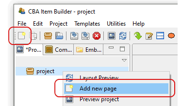
FIGURE 3.29: Toolbar icon and context menu to create a new page.
Both possible methods open the New Page-dialog (see panel A in figure 3.30), where the name for the new page to be created must be entered. Page names must not start with a digit and may only contain characters and digits, without special characters (except for _).
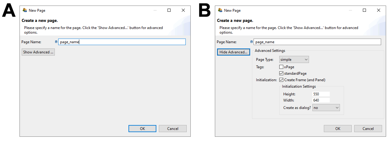
FIGURE 3.30: CBA ItemBuilder New Page-Dialog (left without and right with Advanced properties)
By clicking the Show Advanced button in the New Page dialog, additional properties of new pages to be created can be set (see panel B in figure 3.30).
The page type can be selected (see section 3.4), pages can be tagged as standardPage or xPage (see section 3.4) and it can be deselected that components of type Frame and Panel are automatically created when the page is created (see section 3.5). If this default is kept, then it can be specified in which size Frame and Panel are created and whether the Frame (and thus the page) is created as Dialog (see section 3.15).
| Page Type | Description |
|---|---|
Simple Page \(~~~\) 
|
Pages of the type simple page can be used to implement assessment components such as items or instruction pages with the CBA ItemBuilder. By default, simple pages are shown in CBA ItemBuilder Tasks separately on screen, filling the available space up to the defined CBA Presentation Size. Simple pages can be linked to other simple pages. Simple pages are the primary page type that can also be used for advanced applications, such as dialogs or as page components included in PageAreas-components. |
xPage \(~~~\) 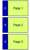
|
A page that is displayed simultaneously with another pag e in a Task is called an xPage (see section 3.6.2). xPages are typical of type Simple Page, and xPages defined for a Task can remain visible while navigating between different non xPages in the main area of the task. For example, xPages can be used to implement a common instruction or a navigation area that is visible during the complete task. Note that all other page types can also be marked as xPage and that xPages can be combined with pages other than Simple Pages. |
The item in Figure 3.31 uses multiple tasks to illustrate different page types and their use. The additional page types shown in Figure 3.31 and the components that can be added to pages of particular type will be described in subsection 3.13.
3.4.2 Pages Flagged as xPage
xPages are required to implement so-called xPage-layouts. An xPage-layout combines two pages simultaneously on screen (one regular page and one xPage). Pages can be changed using Links (see section 3.11 and Conditional Links, see section 4.3, and by assigning State to pages, see section 4.4.9). The xPage layout briefly described in Table 3.4 (see section 3.6.2 for details) requires that pages of the appropriate size for the particular area be linked in the page-area and the xPage-area. To ensure that this distinction fundamental to as xPage-layouts can be automatically maintained when creating Links using the CBA ItemBuilder’s user interface, regular pages, and pages with the xPage tag are consequently separated. xPages are defined when creating new pages (see Figure 3.32) in the Advanced-section of the New Page-Dialog of the CBA ItemBuilder.
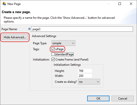
FIGURE 3.32: Tag for creating a new page as XPage.
Pages can also be flagged as xPage (see Figure 3.33, when pages are imported from the Template Browser (see section 6.8.7 for details).
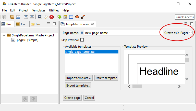
FIGURE 3.33: Checkbox to tag a page created using Template Browser as XPage.
The distinction between regular pages and xPages simplifies and structures complex assessment components created with the CBA ItemBuilder. For the definition of links, pages and xPages are not accidentally mixed. Section 3.11.4 describes how this classification is also applied to dialogs and popups.
The tagging of a page as xPage and / or standardPage can be changed again at any time via the Page Settings-dialog (see figure 3.34). The dialog can be called via the context menu of a page in the Project View.
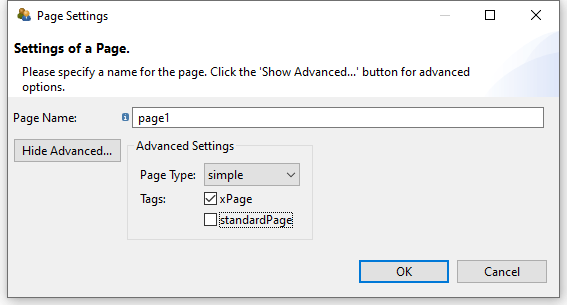
FIGURE 3.34: Dialog for changing Page Settings.
The page type Simple page is the default page type for creating assessment components using the CBA ItemBuilder. The size of Simple page is defined by the a component of type Frame used as root element (see section 3.5.1). Each page needs a Frame and only one Frame can be defined each page. Pages of type Simple page can be shown in PageAreas (see section 3.5.4) and the Frame of a Simple page can contain one or multiple PageAreas. Pages of simple type page are also the basis for creating Dialog-pages (i.e. pop-up pages within the item, see section 3.15).
The CBA ItemBuilder also provides additional page types. The page type is central to the functions and features of the CBA ItemBuilder:
Selected components can be added only to pages of a particular type. Unless otherwise specified, the different components described in this chapter are intended for pages of type
simple page.The Component Register (see Appendix B.6) provides a complete listing of which components can be added to pages of which type.To implement a specific task layout, pages flagged with the xPage attribute are required. To implement an xPage-Layout, a regular page and an xPage must be combined (see section 3.6.2 for details).
The page type and the xPage attribute defines which pages can be linked to each other using simple Links and Conditional Links (see section 3.11). For example, pages defined as xPages can only link to other xPages. Similarly, links within Web Child Pages can only be made to other Web Child Pages (see section 3.13.2 for details).
The task definition (see section 3.6.1) is crucial for defining the layout of an assessment component created with the CBA ItemBuilder. The task definition defines if an xPage-Layout is used (see section 3.6.2) and defines the page (and thereby the page type) of the page used as the Start Page.
3.5 Basic Containers (Frame, Panel and PageArea)

The graphical design of assessments in the CBA ItemBuilder is done via pages, each of which contains first a Frame and then usually a Panel.
Frame and Panel are automatically created by default when a new page is created. Only if this option is disabled (see section 3.4), Frame and Panel have to be added as components manually.
This section describes how to start from blank pages yourself (section 3.5.1), and how to nest multiple Panels (section 3.5.2) and how to use advanced features of Panels, such as automatic table layout (see section 3.5.3). Finally, the section ends with a description of PageAreas that can be used to re-use pages multiple times (see section 3.5.4).
3.5.1 Top-Level Component: Frame
A component of type Frame is required as highest component in the hierarchy for pages of all types. Exactly one Frame must be defined on each page, and Frames serve as the container for all other components.
Preparation for Empty Pages: Pages must always have a component of type Frame at the highest hierarchical level. If the item design does not uses an xPage (see the description of xPages, above in the section 3.4), then the size of the Frame should correspond to the size defined as CBA Presentation Size (see section 3.2.2).
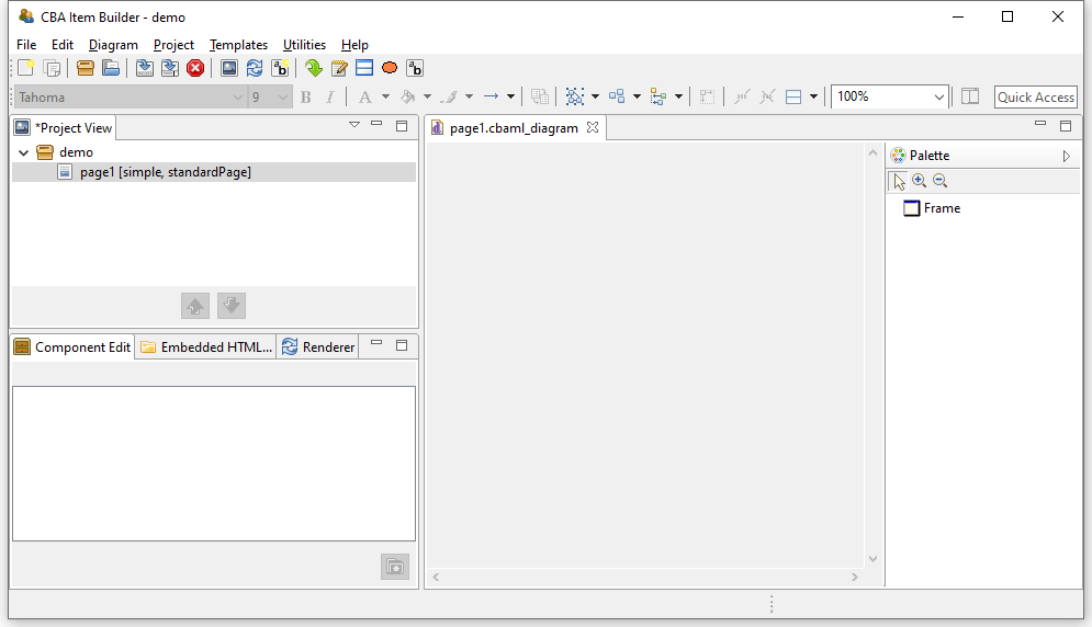
FIGURE 3.35: Empty Page Editor if no Frame is defined.
To define a Frame manually, the page must first be opened in the Project View by double-clicking. Then the Page Editor opens, as shown in figure 3.35. To add a frame, first select the component Frame in the Palette (icon  ). Then use the mouse to draw a rectangle in the empty area of the Page Editor, where you place one corner by clicking, and then, keeping the mouse button pressed, define the size of the
 Frame by moving the mouse over to the opposite corner. Then release the mouse button.
(see section 3.1.3 for details about hiding and showing the Palette).
The CBA ItemBuilder item shown in Figure 3.36 illustrates with a video the necessary steps to a) create a new page without Frame and Panel and b) adding manually a Frame and a Panel which fill the complete CBA Presentation Size (in this example 1024x768 pixels).
Frames are created as regular components in the Page Editor. After the component Frame has been selected in the Palette and added to a page using the point-and-click interface, it is recommended to configure the size and position exactly via coordinates (see 3.7.1). If no additional borders are intended, the Frame should be set to the coordinates X=0 and Y=0, with a Height and Width matching the CBA Presentation Size (see section 3.6.2 for details).
Frame is necessary for each page and automatically performed, if the Inizialization is not de-activated.
For this reason, previewing a project with a pages that do not yet contain a Frame lead to the error message shown in Figure 3.37.
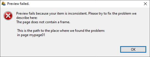
FIGURE 3.37: Message of a failed Preview because every Page requires a Frame.
Since components of the type Frame represent the highest containers in the hierarchy, no further components can be placed on a page outside a Frame.
Frame of a page contains the complete page content. Accordingly, deleting the Frame of a page will remove all defined components.
To cancel accidental deletion or replacement of components in the Page Editor, the Undo function can be used (see section 3.7).
Size, Identifier and Appearance of Frames: Like all visible elements, components of type Frame can be configured using the properties in the section Position of the Properties view (X, Y, Height and Width, see section 3.7.1). Frames can be uniquely named for the connection with dynamic item contents with a User Defined Id (see section 3.7.4).
Frame requires special attention, because the Frame defines the size of a page. Scrollbars can appear if the height or width of the Frame of a page are larger than the height or width of the CBA Presentation Size.
Frames can be configured with a border, which is displayed with a width of Border Width pixels in the color Border Color. By defining a border with a Border Width different from zero, the Frame and thus the required space for a page will be enlarged. If a Frame is defined with a Width of 100 pixels and an border is defined with a Border Width of 10 pixels , 120 pixels are required for the complete display of the page. The inner size of Frames therefore always remains unchanged.
Frame increases when a Border Width larger than zero is defined.
The color of the border will be changed in the Properties view on the tab Appearance via the stroke color (see section 3.1.4). Without affecting the size of a Frame, the background color of a Frame can also be changed using the fill color in tab Appearance of the Properties view.
To change the colors (Bacground Color and Border Color) directly in the Properties view, the color values must be known in the internal representation of the CBA ItemBuilder. Since this is usually not the case, edit the colors in the tab Appearance and not in the tab Core. However, you can copy color values that you have defined using the color selection dialog box as numerical values in the Properties view and insert them, for example, in the properties of other components.
Additional Properties of Frames: Frame-type components have additional properties that are covered in detail in later sections of this book. Frames can be configured as dialogs. Therefore the properties Dialog and Closable can be changed, located in segment Misc of the Properties view. It should be noted that the property Closeable is only relevant if the property Dialog is not configured as UNDEFINED (default). For full details on popus and dialogs, see section 3.15.
When a Frame is clicked, an event can be raised, which can be processed by a Finite-State Machine in the dynamic part of the CBA ItemBuilder (see chapter 4). For this purpose, Frames provide the property Raised Event in the segment Component Interaction of the Properties view, which can be configured as described in section 4.4.3. If the Frame contains other components, these components will absorb this event.
Moreover, the property Mouse Over Text in the segment Text of the Properties view allows for Frames to specify which text is displayed as a tool tip when the mouse is moved over the Frame.
Frames-Select Groups: The CBA ItemBuilder currently provides two ways to group components for single- and multiple-choice responses. As described in section 3.9.2, single-choice answers can be created with components of type RadioButtonGroup and nested components of type RadioButtons. For more advanced use cases (e.g. multiple-choice response formats with a defined number of maximally selected options), an overarching concept is implemented that defines the behavior of single- and multiple-choice answer formats using so-called Select Groups.
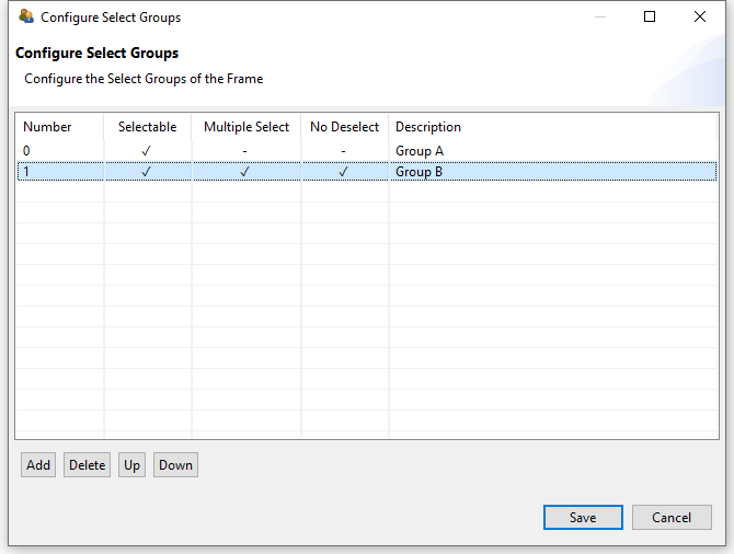
FIGURE 3.38: Dialog Configure Select Groups for single- and multiple-choice select groups.
Select Groups are defined for Frames using the dialog shown in Figure 3.38. This dialog is accessible from the context menu of the Component Edit (see section 3.1.2), when the Frame is selected (see Figure 3.39).
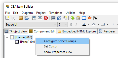
FIGURE 3.39: Context menu in the Component Edit for the Frame Component to open the dialog Configure Select Groups.
For a complete description of all the functions of Select Groups, see section 3.9.4.
3.5.2 Containers of Type Panel
Each page requires a Frame (see previous section 3.5.1), that can contain one or multiple Panels. At least one Panel is required for most pages. Exceptions are pages that are designed using PageAreas (see section 3.5.4). Accordingly, components of type Frame allow adding one or more components of type Panel and PageArea.
To define a Panel, the page must first be opened in the Project View by double-clicking. Then the Page Editor opens. To add a Panel, first select the component of type Frame in the Page Editor. If the Frame is selected, the Palette allows to select the component Panel ( ). Use the mouse to draw a rectangle within in the area of the selected
 Frame, and then, keeping the mouse button pressed, define the size of the Panel by moving the mouse over to the opposite corner. Then release the mouse button. The main properties of Panels can be defined using the Properties view.
Figure 3.40 shows how Frames can contain components of type Panel (pink rectangle on the left and blue area on the right) and of type PareArea (green rectangle in the middle). All components are configures with border (10 pixel for Panels and the PageArea and 20 pixels for the gray Frame at the top level). Use the button Explore Mouse Over... to see the type of each component as mouse over text. As you can see, the PageArea contains a Frame (red) that itself contains a Panel again (gray).
Technical Use of Panels: Frames are containers that can host Panels, and Panels can serve as containers for many other components (see Figure 3.144 in the previous section 3.5.1).
Panel is required for most pages for technical reasons (to host components), that can be also used to design the page.
Most of the possible components that can be added to Panels will be briefly described in this chapter, starting with components for displaying text (see section 3.8), components for collecting responses (see section 3.9), components for multimedia content (audio and video, see section 3.10), and components for linking between pages and triggering events (see section 3.11).
Frame or Panels removes all nested components.
Nesting Panels: Panels can contain Panels. This features is called nesting, since the inner Panel is nested in the outer Panel. The use of nested Panels is useful for two reasons: Additional Panels can be used for graphical design of pages (e.g., by adding a background to the panel). Moreover, additional Panels can facilitate page editing and can be used for grouping components. Components grouped together in Panels can be moved and placed together in the Page Editor (see section 3.7.1).
Frame and Panel are perfectly overlapping (i.e., X=0 and Y=0 coordinates for the nested child component and identical Width and Height of parent and child component), only the nested inner components can be selected in the graphical Page Editor. To select the outer components, the Component Edit view must be used (see section 3.7.3).
Layout Type: Components of type Panel provide two different Layout Types. By default Panels have the Layout Type=ABSOLUTE, meaning that the positio and size of components within a Panel are defined by coordinates X, Y and by Height and Width. This relates to the general layout approach that uses absolute coordinates (in pixels) to define the exact position of elements. The size and position of a Panel within a Frame or within another Panel with Layout Type=ABSOLUTE is defined by the coordinates X, Y and by the Height and Width of the Panel. All size-related numbers can be defined accurately by entering numbers in the Properties view, or by drag and drop of components in the Page Editor. Within Panels using the Layout Type=ABSOLUTE, elements can also be moved with the arrow keys of the keyboard. Make sure to adjust the Snap to Grid setting and the Grid Spacing (see section 3.1.4) to get best results. If the first Panel within a Frame is defined with some distance to the outer Frame (i.e.,X \(>0\) and Y \(>0\)), it can be used to create margins for pages. In this case, make sure the Width and Height of the Panel are smaller than the Width and Height of the Frame. The border of Panels can be designed to show a visible rectangle around the Panel (see Border Width and Border Color described in section 3.7.5). Panels can be used to show a (background) image (see section 3.10).
A second Layout Type=GRID can be configured to create table-based layouts using multiple nested Panels. This features is called Auto-Layout in the CBA ItemBuilder and is only available for components of type Panel. The position of the first Panel using either Layout Type=GRID or Layout Type=ABSOLUTE is defined with X and Y within the Frame component of a page, and the size of the first Panel is defined by the properties Width and Height. The Layout Type=GRID can be used to change the positioning of nested elements for Panels as described in section 3.5.3.
3.5.3 Auto-Layout-Panels
Pages should look consistent and alike across multiple parts of an assessment. For example, padding and margins should be similar if various pages are designed for one or several Tasks in an assessment project. The CBA ItemBuilder supports this requirement by providing so-called Auto-Layout Panels. The configuration of Auto-Layout Panels starts with the selection of the entry Set Auto Layout for a selected Panel, as shown in Figure 3.41 for example in the Component Edit.
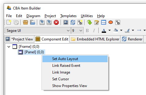
FIGURE 3.41: Context menu entry Set Auto Layout for selected Panels to open the dialog Auto Layout Panel Properties.
The dialog Auto Layout Panel Properties allows defining the number of rows and columns that are used for the automatic table layout. Columns and Rows can be of different type (absolute, percent, fill and auto) and the type defines the height and width of rows and columns.
- Absolute: A row or column will take exactly the defined height or width in pixlel.
- Percent: The height of row or the width of columns will be forced to match the defined percent.
-
Fill: The row height or column width will fill the available space in the Auto-Layout
Panel. - Auto: The height of row or the width of columns will created to match the required size of its content.
As shown in Figure 3.42, cells call also be merged and for each cell the vertical and horizontal alignment of the content can be defined.
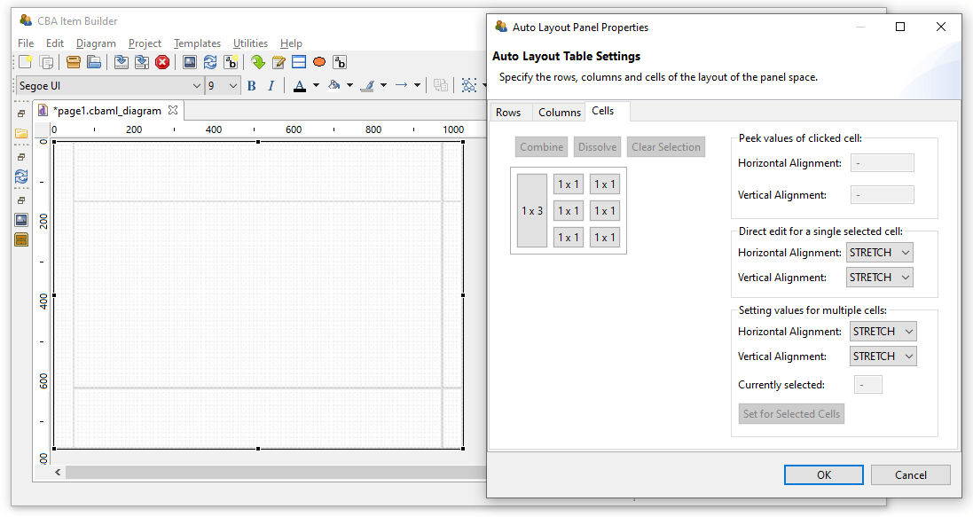
FIGURE 3.42: Dialog Auto Layout Panel Properties showing an example with merged cells.
Panels with Auto-Layout then contain as many child elements of type GridArea as cells are configured over the rows and columns. Each element of type GridArea contain a single component (e.g., an HTMLTextField or a SingleLineInputField) or a Panel that can contain multiple components.
Layout Type=GRID, a table structure for components of type Panel can be created using the Set Auto Layout context menu item. The structure is defined with Rows and Columns and the size and position of the resulting table cells of type GridArea are automatically calculated and cannot be changed in the Page Editor.
The calculation of cell sizes for Auto Layout Panels is done at design time of the item and is performed in the built-in Rendering-view. Based on the defined rows and columns and the combined cells, the resulting GridArea are created that can be selected in the Component Edit. To delete or change GridArea, the dialog Auto Layout Panel Properties must be used. It is also accessible from the context menu in the Component Edit after selecting the Panel that provides the Auto-Layout.
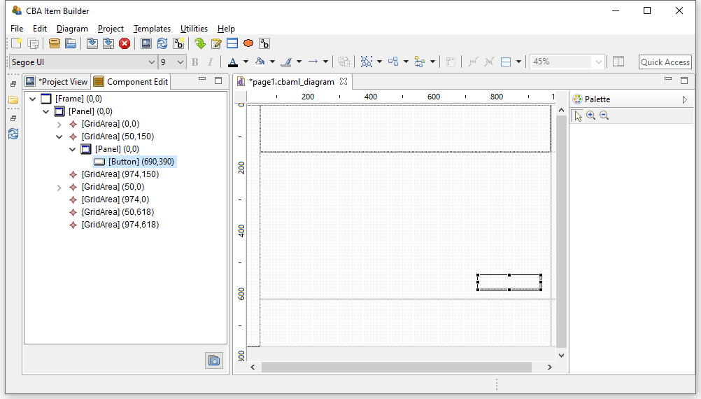
FIGURE 3.43: Dialog Component Edit of a page with Auto Layout Panel.
Panels with Auto-Layout can have cells that again contain Panels with Auto-Layout. However, a Panel can only be defined as Layout Type=GRID (i.e, to use Auto-Layout) if the Panel does not already contain components. Otherwise, an warning is displayed (see Figure 3.44).
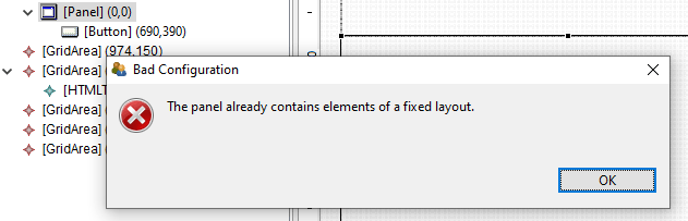
FIGURE 3.44: Message after the attempt to Set Auto Layout for a Panel that already contains components.
It is required to fix possible configuration errors in the page before calling Set Auto Layout. Only if the page is displayed without error in the Renderer view, the computation of positions for the GridArea components is possible (see numbers in parenthesis in the Component Edit in Figure 3.43).
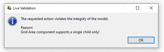
FIGURE 3.45: Message after Duplicate was called on the content of a GridArea.
Each GridArea (i.e. each cell in a Panel with Auto Layout) may contain only one child component. If several components are to be inserted, a Panel is always necessary first, which may then contain several components. If content of a GridArea is duplicated (see section 3.7.2 for a description of the way to Duplicate content), the item definition becomes invalid (see Figure 3.45). This mis-configuration can be fixed by moving the duplicated content to a still empty GridArea in the Page Editor.
3.5.4 Embedded Pages in PageAreas
An alternative approach to increase page similarity is to embed and re-use pages multiple times. Pages can be embedded into pages using PageAreas as shown in Figure 3.144. In addition to Panels also PageAreas can be placed within Frames of Simple Pages. Components of type PageAreas (and similarly also components of the type ChildArea and WebChildArea) are placeholders that define the location and size of embedded page’s content in the frame-component of a page.
Multiple PageAreas are possible on one page, as shown in Figure 3.46. The size of the visible area (View Port) corresponds to the size of the PageArea as defined in the Properties view with the properties Width and Height and the location of the PageArea is defined using the properties X and Y.
Use of Embedded Pages: Inserting pages allows a variety of possibilities that can only be listed here. The spectrum of possibilities ranges from the implementation of scrollable regions (as shown in Figure 3.46), over the reuse of page compositions as illustrated in Figure 3.47 to the dynamical display of additional content (see, for instance, section 6.4.4).
Definition of Embedded Pages: Using components of type PageArea (and analogously also ChildArea and WebChildArea) requires two steps: In the first step the PageArea is inserted and placed in the Page Editor. Since PageAreas can only be added to containers of type Frame, the Frame must first be selected for insertion in the Page Editor, so that the icon for PageAreas is displayed in the Palette ( ). Note that as illustrated in the video embedded in Figure 3.48, a
 Panel that already exists within the Frame must be resized before the Frame can be selected.
FIGURE 3.48: Item illustrating how to add a PageArea if a Panel fills the Frame completely (html|ib).
After selecting the icon PageAreas in the Palette, use the mouse to draw a rectangle in the empty area of the Page Editor. Although PageAreas can only be inserted into components of type Frame, an additional Panel can be used to design the page as a whole. Position and size of PageAreas can be adjusted via the Properties view.
Once a PageArea has been added to the Frame, it can be right-clicked in the Page Editor to bring up the context menu shown in Figure 3.49.
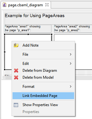
FIGURE 3.49: Context menu for components of type PageArea.
In the context menu of PageAreas the entry Link Embedded Page can be used to open the dialog shown in Figure 3.50. The dialog lists all pages that have been defined in the current Project File and which can be embedded in the current context in the PageAreas. To embed a page it has to be selected in the list and the dialog has to be closed with OK.
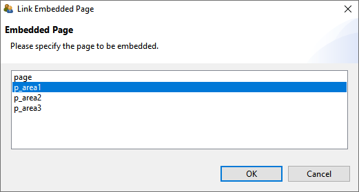
FIGURE 3.50: Link Embedded Page dialog for PageAreas.
An initial assignment of an embedded page is necessary, even if the assignment is then changed with conditional links (see section 4.3.4) or in the finite-state machine (see section 4.4.6).
User Defined IDs and PageAreas: With the help of PageAreas pages can be used multiple times in assessment components created with the CBA ItemBuilder. It is therefore necessary that each PageArea has its own unique naming.
UserDefinedId of PageAreas must be defined (see section 3.7.4) to be able to address page content embedded with PageAreas uniquely.
Note that in all syntax components of the CBA ItemBuilder (see section 4.1) all references to content of PageAreas must be include the UserDefinedId of the PageArea (see section 4.1.4).
CBA Presentation Size and PageAreas: After calling the preview, the CBA ItemBuilder checks if the defined pages are larger than the specified CBA Presentation Size (see section 3.6.2). If this is the case, a warning message is displayed, as shown in figure 3.51. When using PageAreas, scrollbars appear automatically, so the warning can be ignored (or de-activated in the Global Properties, see section 6.3).
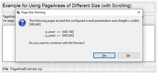
FIGURE 3.51: Warning when pages are larger than the defined CBA Presentation Size.
3.6 Tasks as Entry Points

After the required pages are defined, the definition of a so-called Task is necessary. Tasks fulfill different functions in CBA ItemBuilder projects. Most importantly, tasks are the entry points to an item for the Preview (see section 1.4) and when the item is used in a test assembly (see chapter 7).
As an entry point, the Task specifies which page should be used as Start Page, and if specified in the Layout Settings, which xPage should be used as Start xPage. By defining one of the existing pages as the Start Page, the Task also specifies the page type of page. Beyond this function, Tasks are also used to structure scoring within CBA ItemBuilder projects. Since existing pages and item content can be used differently in different tasks, scoring rules are defined per task (see chapter 5 for details about the scoring of CBA ItemBuilder tasks).
3.6.1 Task Definition in the Tasks-View
The necessary steps and an overview of the central options to configure tasks are described in the following. Using the menu Project > Browse Tasks or with the toolbar icon , the Tasks View in the right panel of the CBA ItemBuilder can be opened. If no task is defined yet, it should look as shown in Figure 3.52.
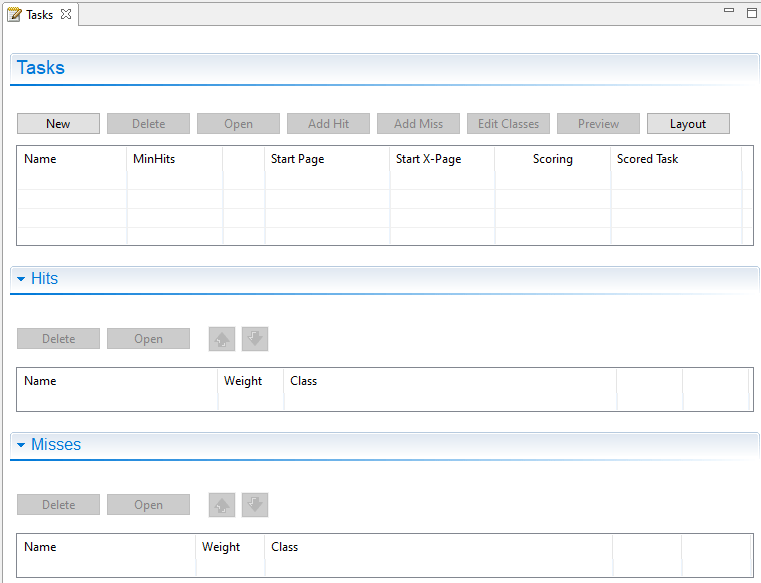
FIGURE 3.52: Empty Tasks - view of the CBA ItemBuilder.
A new Task can be created with the New button and existing Tasks can be edited in the Tasks editor by changing the entries in the particular row. The button Delete removes the Task in the row selected in the Tasks editor.
Task Name: After creating a new task via the New button, the default task name can be changed in the first column (Name). Task names can only contain selected characters: Letters, digits and underscores are allowed and the task name must start with a letter.42
MinHits: The minimum number of hits (default 1) can be entered in the second column (MinHits) and a positive number is expected.
First Page: Each task must define the first page (i.e., the page that is loaded first, when the task is shown). To define the first page, select an existing page from the list of pages. A completely defined task (with the name Task01 and the start page page) should look as shown in Figure 3.53.
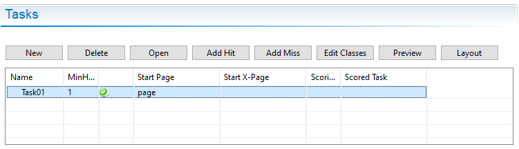
FIGURE 3.53: Tasks - view showing a complete Task-definition.
The green symbol  in Figure 3.53 indicates that the task definition is correct and that the specified page is part of the current project. A red symbol would be shown in case of a mis-configuration.43
If multiple Tasks are defined, the order of Tasks can be adjusted using the buttons  and
and  .
.
Task Initialization: Only for the implementation of items wiht dynamic content (see chapter 4) settings can be prepared for the logic layer of the CBA ItemBuilder using a syntax language (see 4.1). If this is necessary, syntax for the Task Initialization can be defined using the button Open. Afterwards an editor for the currently selected task will open for to entry syntax for the Task Initialization. Details on this syntax and on using the Task Initialization can be found in the 4.5 subsection in chapter 4.
Task Scoring: The three buttons Add Hit, Add Miss and Edit Classes are provided for defining the scoring for a selected task. The defined hit and mis conditions are then displayed in the Tasks-view. Further information about the scoring capabilities of the CBA ItemBuilder can be found in chapter 5.
The remaining two buttons serve the following functions: With Preview the preview can be started for the currently selected task (see 1.4 for details). The Layout button can be used to set the layout for defined tasks (see section 3.6.2 below).
[Issue 6]
3.6.2 Layout Settings for Tasks
A layout can be defined for each defined task. If the layout setting is not changed for a particular task, only one page is displayed at a time by default. The dialog Execution layout settings (see Figure 3.54) can be opened in the Tasks-view using the button Layout. If multiple task are defined in an CBA ItemBuilder project, the settings are applied for the task selected in the list of task in the left part of the dialog.
FIGURE 3.54: Dialog Execution layout settings to define xPage-layouts.
To save the changes, the Apply Settings button must be clicked before closing the dialog.
xPage Layout: The so-called xPage Layout can be activated using the dialog Layout setting (see Figure 3.54).
As shown in Figure 3.54, the xPage Layout allows to specify the xPage layout for a task using a checkbox. xPage layouts always composed by page and an xPage. The different layout types differ regarding the arrangement of these two components. Relative to the regular page the xPage can be left or right (Horizontal xPage Layout), top or bottom (Vertical xPage Layout). For Horizontal xPage Layout the property xPage size refers to the width of the xPage (full height as defined in the CBA Presentation Size), while for the Vertical xPage Layout the xPage size refers to the height of the xPage (full width as defined in the CBA Presentation Size).
The default size of the xPage Area can be changed at runtime during test taking if the Allow resize option is enabled. To make this possibility visible, a slider can be defined by setting a non-zero value for the ‘Slider width’ property. Finally, for visible sliders, the color can also be selected in the Slider color field.
Figure 3.55 shows an Horizontal xPage Layout with activated Allow resize-property. As can be seen in the example, scrollbars appear when the xPage (here left) or the Simple Page (here right) is larger than the visible area. By moving the Slider the visible size of the two pages can be changed. As you can see in the example, the size setting is retained when, for example, buttons are used to link to another page (see 3.11.4 for more details on using Links in combination with xPages). Table 3.5 summarizes all settings implemented in the CBA ItemBuilder for xPage-layouts. Table 3.5 summarizes the possible settings of the dialog Layout setting shown in Figure 3.54.
| Setting | Description |
|---|---|
| Enable xPage layout | Checkbox to enable the xPage layout for the selected task. |
| Horizontal xPage layout | Arrangement of the pages in the xPage layout (left:  , right: , right:  ) ) |
| Vertical xPage layout | Arrangement of the pages in the xPage layout (top:  , bottom: , bottom:  ) ) |
| xPage size | Size of the xPage (width for type left and right, height for type top and bottom). |
| Slider width | Size of the slider, if Allow resize is selected. |
| Slider color | Color of the slider, if the slider size is different from zero. |
| Allow resize | Allow to resize the xPage during runtime. Scrollbars will appear, as soon as the available space is smaller than the size of the Frame. |
CBA Presentation Size in Detail: The CBA Presentation Size defines the space on screen, that is used either for a single page or the combination of two pages (xPage-Layout). The item size for new Project Files is defined in the dialog Preferences (see section 3.2.2). Once a Project File is created, the item size is part of the Global Properties of that project. To edit the Global Properties, right-click on the project name and select Global Properties as shown in the Figure 3.56.
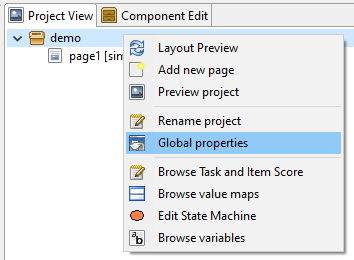
FIGURE 3.56: Entry Global Properties in the Context Menu of the project name in the Project View.
The entry Global Properties allows to edit the Project Settings, including the item size (Presentation height and Presentation width) for an existing CBA ItemBuilder Project File (see Figure 3.57).
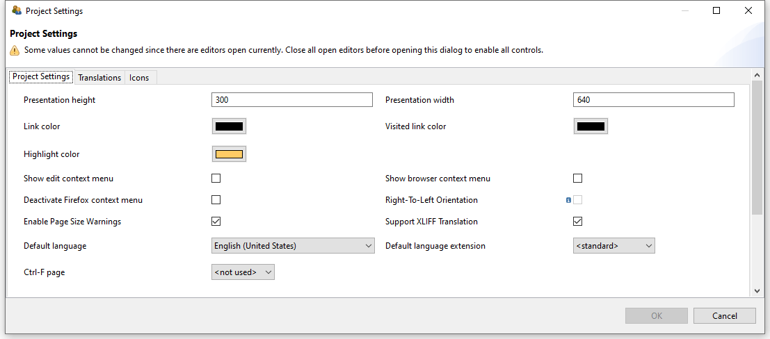
FIGURE 3.57: Project Settings to change the CBA Presentation Size.
The CBA Presentation Size and the size of pages defined as Width and Height property of the top-level container used as frame (see section 3.5.1) must fit each other so that no scrollbars appear. The critical factor here is whether an xPage Layout has been defined.
- No xPage Layout: The required size of an item results from the width of the
Frameand theBorder Widthof theFrame. Accordingly, the CBA Presentation Size must match the Frame Size plus two times theBorder Widthto avoid scrollbars (see upper part of Figure 3.58).
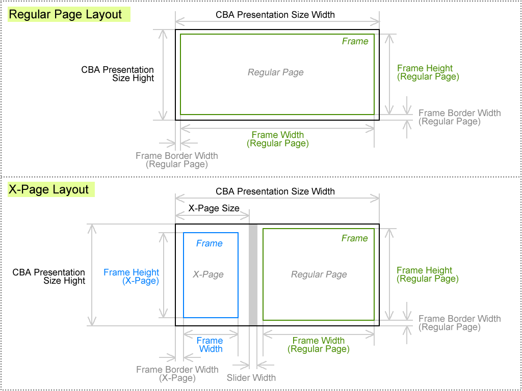
FIGURE 3.58: Schema for components of the CBA Presentation Size.
-
xPage Layout: If an xPage layout is enabled, then the CBA Presentation Size must be sufficient to span the
Frameof the regular page and theFrameof the xPage. In addition, two times theBorder Widthof the page, two times theBorder Widthof the xPage and the width of the slider (ifAllow resizeis selected) must be taken into account (see lower part in Figure 3.58).
Frame plus two times the width of the border (Border Width property of the Frame).
If a non-zero width of the slider (Slider width, see Figure 3.54) is set in an xPage layout, then the available size for the regular page is reduced.
3.7 Layout Pages using Components

Pages are designed in the CBA ItemBuilder Page Editor within components of types Frame (see section 3.5.1) and a Panel (see section 3.5.2). Page content is usually added to Panels by selecting a particular component from the Palette and drawing a rectangular in the Drawing Area of Page Editor. Before the different components for designing static content are described in detail, this section first contains general notes that are intended to make working with the CBA ItemBuilder easier.
Adding Components: Before a component can be added to a Page, the Page must be opened first. To add a new element to the Drawing Area of an opened Page, first select the component into which the new element should be included. If a Page was created with Frame and Panel (the default), select the Panel as the container. After the container is selected, the Palette shows all components that can be added to this container. Select the component from the Palette (the Palette will only show entries that can be selected for the current selected element). Afterwards, draw a rectangle in the main area (click into the Drawing Area within the component that should contain the new component, hold the left mouse button pressed, move the mouse so that a small rectangle appears and release the mouse button at the opposite corner of rectangle).
Undo/Redo Actions: Changes in the Page Editor and in the Properties view can be undone with Ctrl+Z (or Strg+Z,  ) respectively and redone with
 Ctrl+Y (or Strg+Y,  , see also Figure 3.60).
FIGURE 3.60: Main Menu Edit showing Undo and Redo.
If the Project File is saved, previous editing steps cannot be undone.
3.7.1 Positioning of Components
Within the Drawing Area of the Page Editor components can be positioned freely and precisely defined by integer-values used as coordinates.
Visual Editing: The CBA ItemBuilder allows to move components in the Page Editor for visual editing with the pointing devide (e.g., mouse) and keyboard. To do this, the components must be clicked with the left mouse button and moved with the mouse button pressed. Moving components is only possible if, on the one hand, the text property of the component is not in edit mode (see Table 3.6). Components can be moved and re-sized using the anchor-points in the Page Editor. If the Snap To Grid feature is activated (Rulers & Grid in the Properties view described in section 3.1.4), the components will snap to the defined grid. Press the Alt key to move components freely. Selected components can also be moved using the arrow keys.
| Visualization | Description |
|---|---|
\(~~~\) 
|
The component selected in the Palette can be added by left-click in the Page Editor and moving the mouse to draw a rectangle, before releasing the mouse. |
\(~~~\) 
|
Visualization of adding a component (left mouse-button pressed). The size of the component is defined as the gray rectangle. Releasing the mouse to finally add the component to the page. |
\(~~~\) 
|
Visualization of the information, that the selected component cannot be placed into the current context. Select a different component or draw the component into the appropriate container to continue. |
\(~~~\) 
|
Component can be moved while holding the left mouse button pressed. Use the Alt-key if Snap To Grid is activated. |
\(~~~\) 
|
Height of the component can be changed by clicking and moving the mouse while holding the left mouse button pressed. |
\(~~~\) 
|
Width of the component can be changed by clicking and moving the mouse while holding the left mouse button pressed. |
\(~~~\) 
|
The Width and Height of the component can be changed by clicking and moving the mouse while holding the left mouse button pressed. |
\(~~~\) 
|
Lasso used to select one or multiple components. Click on an empty place in the Drawing Area of the Page Editor and move the mouse while keeping the left mouse button pressed to use this feature. |
\(~~~\) 
|
Edit mode of the text property is activated. Select another component in the Page Editor (or use the Esc-key) to close this mode. |
Positioning Using the Property View: Components selected in the Page Editor can also be moved by changing the values of the coordinates X and Y as well as the values for Width and Height in the Properties view (see Figure 3.61 for an example).
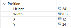
FIGURE 3.61: Section Position of the Properties view.
Frames, Panels, RadioButtonGroups, …) is defined as X: 0 and Y: 0. Accordingly, increasing the X-coordinate of a component will move it to the right, and increasing the Y-coordinate of a component will move it down.
In the Page Editor, scrollbars are displayed when components stick out beyond their container’s boundaries. Such a case may occur when negative X or Y coordinates are configured or when the total size (relative to X and Y) exceeds the container’s size.
Width or Height of a nested component are identical to Width or Height of the container). Use the Preview to verify that the final layout matches the expectations.
For editing components in the Page Editor, it can be helpful to change the zoom setting of the Page Editor. Suppose components are perfectly overlapping or exactly nested. In that case, components can be selected using the Component Edit view (see section 3.1.2). After selecting a component in the Component Edit, it is possible to adjust the coordinates in the Properties view so that they can be selected and edited in the Page Editor again.
Group Components using Panels: Components of type Panels can be used for different purposes. Firstly, at least one Panel is required within the ´Frame´ from a technical perspective. Secondly, Panels can be used for layout purposes, for instance to create space needed for margins, to show a border (see section 3.1.4) or a background image (see section 3.10.2). However, Panels can also used to group components. X and Y-coordinates of components nested within a Panel are defined relative to the left upper corner of the Panel.
Panel, the components can be dragged and dropped in the Page Editor into the Panel.
3.7.2 Clipboard and Duplication of Components
One of the challenges for new users of the CBA ItemBuilder is the use of the clipboard. The Page Editor of the CBA ItemBuilder uses components of different types. Since components of a specific type can only embed other components of particular types, using the clipboard requires some comments.
Duplicate: Within pages, components can be selected and duplicated via the context menu. To select multiple components, Lasso-selection feature of the Page Editor can be used (see Table 3.6). Similarly, components that are grouped, for instance, within a Panel (see section 3.7.1) can be duplicated together. Figure 3.62 shows the context menu for a selection of multiple elements.
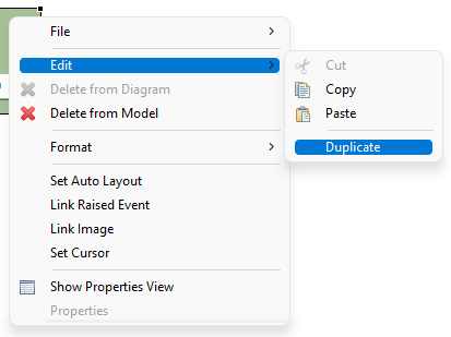
FIGURE 3.62: Context menu for a selection in the Page Editor showing the entry Duplicate.
The function to duplicate components is equivalent to executing Ctrl+C and Ctrl+V (or Strg+C and Strg+V) directly one after the other. The duplicated elements are added again in the same context and moved by 10 pixel in both X and Y. If components are grouped in a Panel, they can be easily aligned together after duplication. Otherwise, the duplicated components must be moved individually to the final location.
View Clipboard: Single components with or without nested components can be copied, using the Ctrl+C, the context menu entry Edit > Copy or the main menu entry Edit > Copy. The copy operation is available, after the component was selected in the Page Editor.
Elements the are added to the clipboard are shown in the View Clipboard (see Figure 3.63), together with the information, which components in the Page Editor can be selected when requesting a Paste operation (Ctrl+V or Edit > Paste). Multiple components can be used in the clipboard, and the clipboard remains active even after closing and opening a different project file.
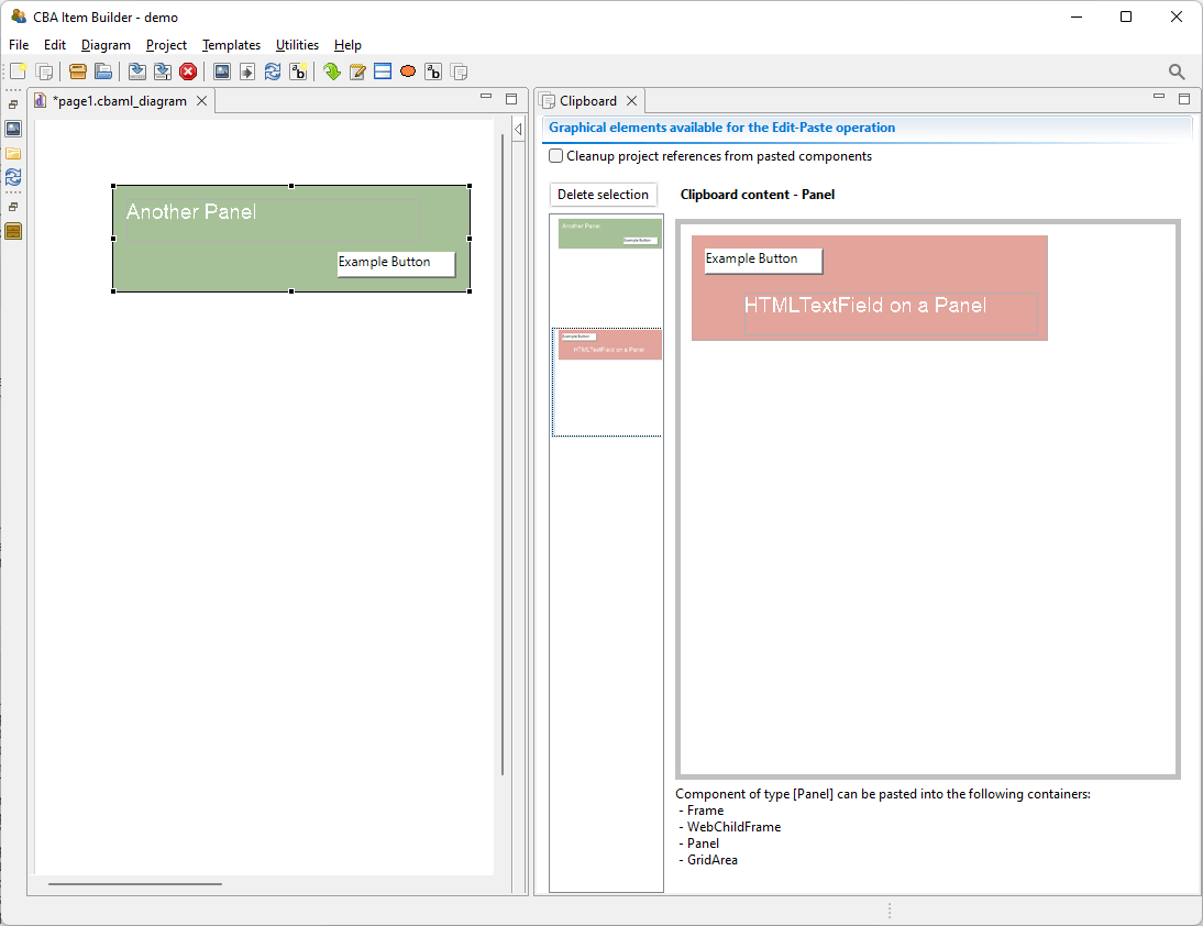
FIGURE 3.63: View Clipboard illustrating the visualization of elements in the clipboard.
Note that if the components are selected in the Component Edit (see subsection 3.1.2, it will be impossible to copy components until the components were selected (again) in the Page Editor.
Multiple Components: Duplicating elements with the context menu entry shown in Figure 3.62 is can handle multiple components at once, but is available only within pages. To copy multiple components across pages using the clipboard, components need to be nested into a single Panel. Note however, that if identical content is required on several pages, the concept of PageArea (see section 3.5.4) is often useful. If a complete page needs to be duplicated, this can also be achieved using Page Templates (see section 6.8.7).
Delete Components: The CBA ItemBuilder does not implement the Cut operation (i.e., Ctrl+X). To cut a selected component, copy the component first and use the context menu entry Delete from Model to delete the component, after it was added to the clipboard.
3.7.3 Selecting Components using the Component View
In the Page Editor of the CBA ItemBuilder pages are designed within a component of type Frame. For this purpose, the components are selected in the Palette of the graphical Page Editor and then added within Containers. Within the Page Editor components are visualized with rectangles at the position defined with the X and Y coordinate and with a size that reflects the height and width of components. Position and size are either defined in the Properties view, the result of visual editing (i.e., using drag and drop in the Page Editor) or are computed by the CBA ItemBuilder (if the Layout Type=GRID is used in Auto-Layout-Panels, see subsection 3.5.3).
The various possibilities can all result in components being perfectly nested, making it impossible to select the underlying component in the Page Editor.
An example of the Component View is shown in Figure 3.64.
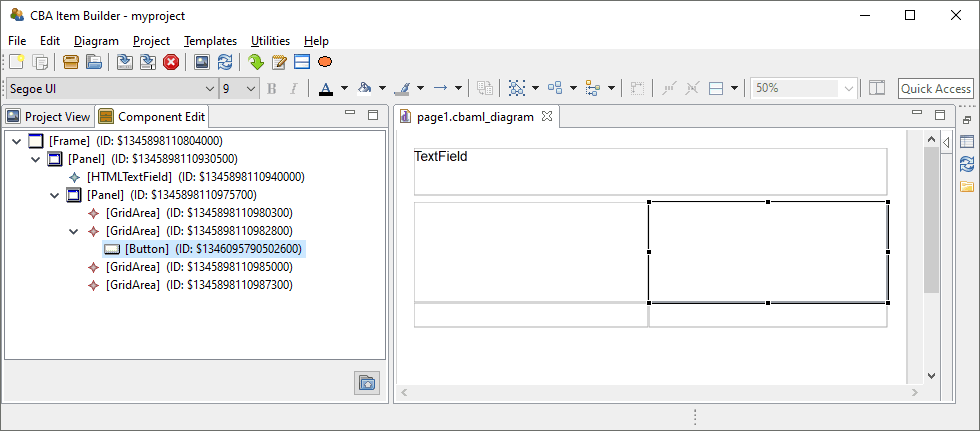
FIGURE 3.64: Component Edit view allows to select any component in the Page Editor.
To allow the selection of all components defined in a page, the CBA ItemBuilder provides the Component View. In the Component View (see figure 3.64) all components can be seen in their hierarchical structure and can be selected. If a component is not seen, then in the Component View the tree can be expanded and the components can be shown. The selection of components in the Component View corresponds to the selection of components in the Page Editor and also allows access to the Context Menu as well as the Properties View.
3.7.4 Naming Components with UserDefinedIds
Components that are used to create and design pages in the Drawing Area of the Page Editor have an automatic generated string identifier (i.e., a generated number that uniquely identifies the particular instance of a component). This automatic generated identifier can be overwritten so that components have more meaningful, human-readable identifiers.
Importance of UserDefinedIds: UserDefinedIds are provided and assigned by the item author. For that purpose, each component that can be selected in the Page Editor provides the property UserDefinedId in the section Identification of the Properties view. UserDefinedIs are used to refer to the components, for instance, for the definition of conditional links (see section 4.3), to change properties of components using the Finite-State Machine (see section 4.4), and to specify scoring-rules a Task (see chapter 5). UserDefinedIds also plays a central role with regard to the interpretation of log and process data, since log events as an attribute refer to the components from which they originated via the UserDefinedId (see section 1.6).
UserDefinedIds are human-readable identifiers for components that are used to connect the visual part (Page Editor) with the syntax components of the CBA ItemBuilder.
The CBA ItemBuilder automatically generates IDs when saving Project Files, which start with a $ character, followed by a unique random number. When naming the component, i.e. when item authors as users def IDs (UserDefinedIds), these automatically generated identifiers must be replaced.
Valid UserDefinedIds: Since the UserDefinedIds are used to create source code (see section 2.11), the following conventions and rules must be followed:44
- Only letters, digits and underscores (
_) are allowed as characters. - Each
UserDefinedIdmust start with a letter and it is not allowed to use a digit or underscore as the first character. -
UserDefinedIdsare case sensitive and upper and lower case letters need to be distiguished. - No spaces and blanks are allowed in
UserDefinedIds.
To edit a UserDefinedIds for a component selected in the Page Editor, change the entry of the same name in the Properties view (see Figure 3.65).
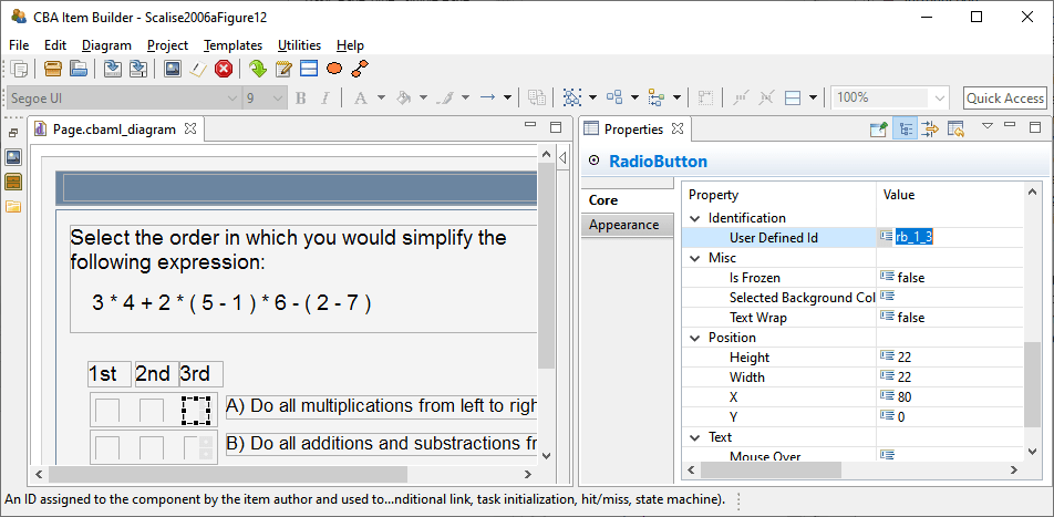
FIGURE 3.65: Properties view section Identification to define a UserDefinedId.
UserDefinedIds are entered in the Identification section of the Properties view. The CBA ItemBuilder checks the validity and uniqueness of entered UserDefinedIds.
The CBA ItemBuilder automatically checks whether the entered UserDefinedId is already used for another component in the current CBA ItemBuilder project and provides an error message, if the UserDefinedId is already used or invalid, as shown in Figure 3.66.
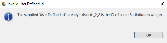
FIGURE 3.66: Message when a provided User Defined Id is not unique.
If a component with a UserDefinedId is deleted, this UserDefinedId can only be assigned again after saving the current Project Files.
Edit Multiple UserDefinedIds: Since providing UserDefinedIds of many components via the graphical editor can be very time-consuming, the CBA ItemBuilder provides a dialog that allows the UserDefinedIds of several components to be entered in tabular form. For using this feature all other editors must first be closed (see Figure 3.67).
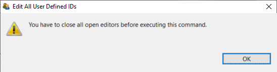
FIGURE 3.67: Dialog informing requesting to close all editors before the requested operation can be executed.
If there are no editors open in the main area of the CBA ItemBuilder, the entry Edit all user defined IDs can be opened via the main menu Project for an open Project File (see Figure 3.68).
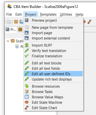
FIGURE 3.68: Main Menu Project showing the entry Edit all User Defined IDs.
The editor shown in Figure 3.69 lists all elements together with the assigned UserDefinedIds. Rows with generated Defined IDs are shown in gray. Using this dialog UserDefinedIds can be edited for a particular component shown as row in the table using the button Edit (or double-click the row). To be able to assign the individual elements without the Page Editor, the component type and selected properties are also displayed in this dialog.
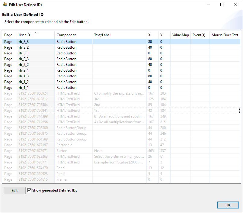
FIGURE 3.69: Dialog to Edit User Defined ID of a Project File.
By clicking on a column in the table header, the elements can be sorted in the Edit User Defined IDs dialog shown in Figure 3.69.
UserDefinedId is used for many different functions to connect components to syntax, it is recommended in larger CBA ItemBuilder projects to use a consistent naming scheme for all UserDefinedIds . A systematic naming schemes for the UserDefinedIds can reduce the error-proneness of scoring definitions for complex items (see chapter 5).
3.7.5 Design Pages with Basic Components
The visual design of assessment components with the CBA ItemBuilder is mainly done by using images (and images can be used with several components (see section 3.10.2).
Transparent Background: Transparent backgrounds of components can be defined with the property Transparent=true. In this case, the components do not hide components behind, which can, for instance, be designed using a component of type Panel with a linked (background) image.
ExternalPageFrames, see section 3.14.1) can be configured tob e transparent, allowing to apply designs based on images behind components.
Components can be defined as Transparent=true in the section Display of the Properties view. As described in the 6.2.1 section, the CBA ItemBuilder also supports transparency within images.
Borders and Background in Components: Components to collect responses, for instance, components for entering text responses (see section 3.9.1) should be easily to recognize by test-takers. Accordingly, they should be formatted and marked consistently. Background color or a border can be used to emphasize components, such as SingleLineInputFields and InputFields. The Border Width property must be set to a positive, non-zero width to define a visual border.
The frame color can be configured in the Appearance area of the Properties view using a color selection dialog (see section 3.1.4).
Rectangles and Lines: Beyond images, the CBA ItemBuilder provides Rectangles, Horizontal Lines and Vertical Lines as components to design items graphically. These components are also inserted with X, Y, Width and Height in the Page Editor. However, for components of type Line, the Width and Height is only relevant within the Page Editor. The Line Width property is used as a positive number to define the visual width of the line during runtime. Similarly, for components of type Rectanle also the Line Width property is used.
When components of type Rectangle are inserted late (i.e., when the item content is already added to the page) to create visual boundaries by frames, the rectangles are placed at the top of the editing order. In the Page Editor, it is then no longer possible to select underlying elements directly, but they must be selected with the help of the Component Edit (see section 3.1.2). Alternatively, the order in the Page Editor can also be adjusted using the context menu as shown in Figure 3.71. If the order has been changed (i.e., if a component of type Rectangle has been moved to the background in the editing order with Format > Order > Send to Back), then underlying components can be selected in the Page Editor.
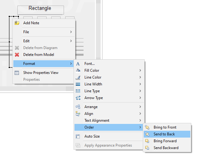
FIGURE 3.71: Context menu for design-time Z-order in the Page Editor.
It should be noted that the editing order does not influence the display order and the behavior of overlapping components at runtime (i.e., in the preview or the delivery of assessment composites created with the CBA ItemBuilder, see section 2.11.4). Moreover, components of type Rectangular can block the interaction with underlying components and prevent processing of assigned events (see section 6.8.5).
3.7.6 Defining the Cursor of Components
When components are displayed at runtime, the cursor (i.e., the mouse pointer) often hints at what can be done with that component. For example, a text input cursor (/text/) appears for elements into which text can be entered. Each component has a default cursor. As shown in Figure 3.72, the default cursor can be overridden in the CBA ItemBuilder.
To change the cursor for a component selected in the Page Editor, the entry Set Cursor can be selected in the context menu (see Figure 3.73).
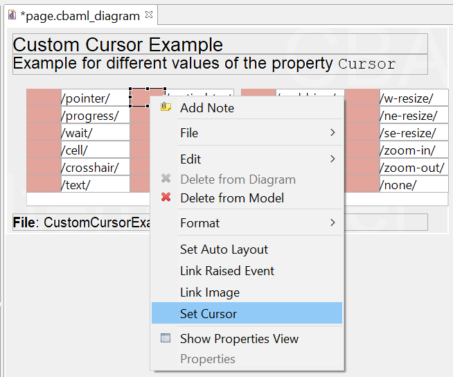
FIGURE 3.73: Context menu for defining the Cursor in the Page Editor.
In the dialog Set Cursor (see Figure 3.74) you can either select an element from the list of cursors, use an image imported into the ItemBuilder project via the Resource Browser (see section 3.10.1) or use the default cursor. If no cursor is to be displayed, then the entry /none/ can be selected as Cursor Type.
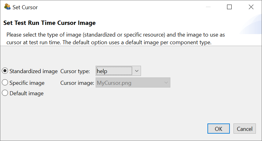
FIGURE 3.74: Dialog Set Cursor.
3.7.7 Defining the Tab-Order of Components
The Tab Index property in the Properties-view can be used to specify the order in which the input focus switches between components. Switching from one component to the next is possible with the Tab, if a positive integer number is defined for the Tab Index property.
The key combination Shift+Tab can be used to switch the focus back to the previous component (see Figure 3.75).The default value for the ‘Tab Index’ property is -1, and components with a Tab Index of -1 are not included in the tab sequence.
3.8 Components to Display Text

This section describes individual components for displaying text on pages designed with the CBA ItemBuilder. The components shown in Figure 3.76 can be added to containers of type Panel (on Simple Pages and Webchild Pages)45.
FIGURE 3.76: Overview of components to display text.
For adding static text to pages, the CBA ItemBuilder offers various components that differ in terms of design options and technical implementation. For all components for displaying text, you can restrict the list of available fonts, which is created in the CBA ItemBuilder based on the fonts installed on the system, to the fonts you require (see 6.8.2).
3.8.1 Text of Same Size: SimpleTextField
Text which should be displayed in a uniform font (i.e. the same font, font size and font color) can be added to a page using the SimpleTextField component. The configuration of the text is done by double-clicking on a SimpleTextField (or via the Edit Text entry in the context menu or the property Text in the Properties view).
The text defined for a component of type SimpleTextField can be single line or multi-line and the text is rendered with a vertical scroll bar if the text given the defined font size is larger than the defined size of the component. Not only the text can be modified using the property Text, also the font, the font size and the font color can be edited in the Appearance section of the Properties view (see Figure 3.77, and subsection 3.1.4).
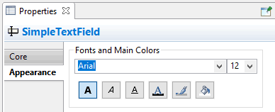
FIGURE 3.77: Section Appearance in the Properties view to define Fonts and Main Colors.
Components of type SimpleTextField support the following values for the property Alignment in the section Appearance of the Properties view
to configure the text alignment: LEFT, RIGHT, and CENTER. The item in Figure 3.78 illustrates the different components to display text.
Clicks on SimpleTextFields during assessments are logged as Trace events of type SimpleTextField.
SimpleTextFields as Input Source: Components of type SimpleTextField can also be connected to a source (using the context menu entry Configure Input Source or the property Input Source in section Component Interaction of the Properties view), for example, to display the current page in a simulated web browser or the result of a calculation with the built-in calculator engine. To configure the Input Source of a SimpleTextField provide the context menu entry Configure Input Source to open the Input Source Configuration Editor (see Figure 3.79).
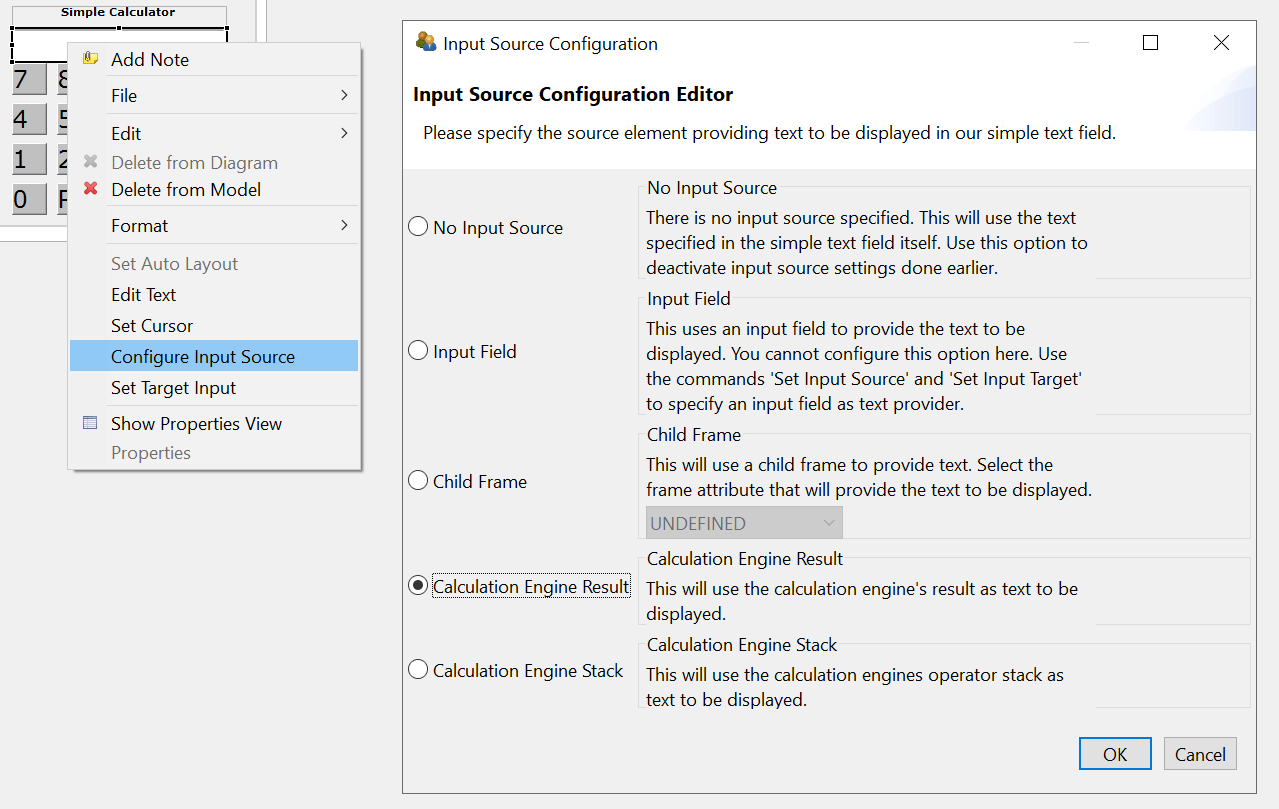
FIGURE 3.79: Input Source Configuration Editor to define the Input Source of SimpleTextFields`.
The different options to specify the Input Source of a SimpleTextField are illustrated in the item shown in Figure 3.80.
The default is No Input Source, meaning that the SimpleTextField shows the text configured in the property Text. With the option Input Field components of type SimpleTextField can mirror the input provided into a InputField. To link both components internally, first select the option Input Field for the SimpleTextField using the dialog Input Source Configuration (see Figure 3.79). The configuration is completed after selecting the context menu entry Set Source Input at first for the SimpleTextField that should take the text entry (see left part in Figure 3.81) and then the context menu entry Set Target Input (see right part in Figure 3.81).
FIGURE 3.81: Context menu entries to link components with the option Input Field.
The option Child Frame configures SimpleTextFieldss shows either the URL Text, the Page Description or the Tab Text of a web child page (see section 3.13.2). Finally, the options Calculation Engine Result and Calculation Engine Stack can be used to link the two outputs of the calculation engine to a SimpleTextField (see section 6.5.1).
3.8.2 Formated Text: HTMLTextField
Two additional components are provided to display text that can have different text formatting and multiple paragraphs. The HTMLTextField, which is described in this section, and the TextField, which is discussed in the next section.
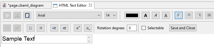
FIGURE 3.82: HTML Text Editor for the content of HTMLTextField components.
HTML Text Editor: Various options for formatting text are provided by the HTMLTextField by the HTML Text Editor.
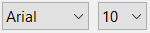 Font family (see section 6.8.2 for more information about the available font families) and font size (defined inImages and Multimedia Components pixels) can be specified for the current selection of text in the HTML Text Editor.
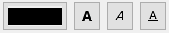 Font color (see section 6.8.3 for more information about the definition of colors) and font decoration bold, italic and underline can be assigned to the current selection of text in the HTML Text Editor.
 Text alignment (can be defined for each paragraph using the icons for left, center, right and justify46) is supported.
 Rotation (defined in degrees from 0 to 360) can be used to rotate the entire content specified in an
 HTMLTextField. Superscript (\(a^{super}\)) and subscript (\(a_{sub}\)) can be formatted for selected texts.
 Enumerations (numbered) and listings (bullet points) are supported.
 Paragraph indentation can be controlled with in
 HTMLTextFields.
HTMLTextFields in the Page Editor of the CBA ItemBuilder is only provided to give item authors a rough orientation. This text is updated only when the HTML Text Editor is closed and is not re-created when the size of an HTMLTextField is changed. The Preview or the Renderer view allow to check the exact display of text in the final item.
Save or Discard: Changes in the HTML Text Editor require to save the new text using the Save and Close button (see Figure 3.82). Closing the editor via the small cross () in the title bar discards the changes.
Clipboard: To simplify the editing of longer texts in HTMLTextFields, the CBA ItemBuilder provides functions to copy, cut and paste text. These functions work in addition to the usual keyboard shortcuts: 
Links: Beyond the formatting of text, individual sections of text in HTMLTextFields can be defined as embedded links, which can then refer to other pages within the CBA ItemBuilder project (see 3.11 for a description of the concept of linking between pages in the CBA ItemBuilder:  The color used for links and visited links can be configured in the Project Settings (see section 6.3). As shown in the dialog in Figure 3.83, conditions for links can also be defined (see section 4.3 for details on Conditional Links).
FIGURE 3.83: Dialog to Configure Embedded Link in HTMLTextFields.
3.8.3 Formated Text and Highlighting (TextField)
A second component for displaying differently formatted text is the TextField, which among other things supports highlighting.
Highlighting of Text: The CBA ItemBuilder supports the selection of characters and wordes as response format, labeled as Highlighting. Text highlighting is defined for components of type TextFields using the option Highlightable.
The following item in Figure 3.84 illustrates the text highlighting feature of the CBA ItemBuilder inspired by a PIAAC example (see OECD 2013).
Note that the buttons Green and Red illustrate the used of multiple colors for text highlighting (see subsection 4.4.6 for details, the default color can be configured as Global Property, see section 6.3). More details on the use of text highlighting as response format (and, in particular, scoring of text highlighting) can be found in section 5.3.8. Using components of type ImageAreas within so-called ImageMaps (see section 3.9.10) also allows the selection of predefined parts within images.
Mathematical Formulas: The TextField component allows to add formulas using the MathJax-syntax, as shown Figure 3.85.
To display a formula using MathJax in components of type TextField, the formulas must be entered between the two character keys {tex} and {/tex} in LaTeX format. The following fraction \(\frac{1}{\frac{1}{2}}\) is created by the syntax:
{tex}\sqrt{\frac{1}{\frac{1}{2}}}{/tex}3.8.4 Comparison of Components for Displaying Text
This section has described various components that can be used to represent text in assessment components and items. This surely leads to the question of which component should be used in which specific context. The answer to when to use aSimpleTextField, an HTMLTextField or a TextField depends on the required features. Table 3.7 summarizes the features of the different components to guide the selection.
| Feature | HTMLTextField |
TextField |
SimpleTextField |
|---|---|---|---|
| Allows text highlighting | no | yes | no |
| Shows scrollbars automatically | no | no | yes |
| Allows justified text | yes | yes | no |
Can be selectable
|
yes | no | no |
| Allows links | yes | yes | no |
| Allows images | no | yes | no |
| Allows formulas | no | yes | no |
| Can be rotated | yes | no | no |
Note that components of type TextField are also used in the Table component of the CBA ItemBuilder (see subsection 3.9.8).
Other Components: Components of type Link can also display text (see section 3.11.1). Moreover, components of type SingleLineInputField described in the next section for capturing text responses can be used to display text using the property ReadOnly: true. Values of Variables (including STRING variables) can be shown using components of type VariableValueDisplay (see section 4.2.3), and values of Variables that are translated to text using a Value Maps can also be used to show texts using components of type MapBasedVariableDisplays (see section 4.2.5).
3.9 Components to Collect Responses

The CBA ItemBuilder provides a variety of components that can be used to capture answers to questions and items. This section presents the various simple components that can be used for directly for designing static content (see Figure 3.86 for an overview).
Basic Components: First, two components for capturing text responses are described (see section 3.9.1). After that, components that can be used to capture click responses are described. Creating multiple-choice or single-choice response formats is possible, for instance, with components of type RadioButton with (and without) RadioButtonGrups (see section 3.9.2). Multiple-Choice items can also be created, for instance, using ‘Checkboxes’ (see section 3.9.3). Single and multiple selection of presented response alternatives is also possible with the Combobox (single-choice) and List components (single- and multiple-choice, see section 3.9.5). Finally, selection within images can be implemented with components of type ImageMap to collect responses (section 3.9.10).
FIGURE 3.86: Overview of components to collect responses.
Advanced Components: Beyond text and click responses shown in Figure 3.86, the CBA ItemBuilder provides components that can be used to create advanced response formats (see, for instance, section 3.13 for components of type Table, Menu and Tree, that can be combined with simple click response-formats). Moreover, selectable components (see section 3.9.6) can be used to collect click responses. Finally, the combination of multiple pages connected via links and conditional links, FSM Variables, and Finite-State Machines with simple and advanced response-formats allows creating complex items that create traces of task processing that can be used for advanced scoring schemes.
3.9.1 Components for Text Responses
Components for capturing text responses are simply input fields in which text can be entered when they are focused. To focus an input field the test taker must click in the input field, or the focus is set automatically with the focus()-operator (see section 4.4.6).
As shown in Figure 3.86, the CBA ItemBuilder distinguishes mainly two components for capturing text responses.
Single Line Text Input (SingleLineInputField): The component for single-line text input is called SingleLineInputField. Line breaks (with the Enter or Return key) are not accepted by SingleLineInputField (i.e., only one single line can be used).
Multiline Text Input (InputField): For multiline text input, the CBA ItemBuilder provides the InputField component. Line breaks (with the Enter or Return key) are possible and scrollbars appear, if the text height becomes larger than the height of the InputField component.
Properties of SingleLineInputField and InputField: Both components can be configured and used in identical ways (see Figure 3.87). SingleLineInputField and InputField can be used within Panels on Simple Pages and WebChild Pages. SingleLineInputField can also be used within WebBrowserToolbars on WebBrowser Pages.
SingeLineInputField and InputField as elements of an item or page that allows text input (see last row in Figure 3.87).
Font size and font family can be configured in the tab Appearance in the Properties view (see Figrue 3.5 in section 3.1.4). Components of type InputField and SingleLineInputField support the following values for the property Alignment in the section Appearance of the Properties view to configure the text alignment: LEFT, RIGHT, and CENTER.
Components of type SingleLineInputFields and InputFields support the Read Only property. If the value true is specified in the Properties view in section Misc, the text cannot be changed. The components then behave like SimpleTextFields (see section 3.8.1) with the difference, that the text can be selected.
All response capture components support the Frozen property, which locks the components for editing. Figure 3.87 shows how type SingleLineInputFields and InputFields components are displayed when Is Frozen: true is configured in the Misc section of the Properties view. The Frozen-property can also be modified using the operators setFrozen() / unsetFrozen() in Conditional Links and transitions triggered in the Finite-State Machine (see section 4.4.6).
Text color for InputField can be defined in the tab Appearance of the Properties view. By default the Link Color as defined in the in the Global Properties of a CBA ItemBuilder project file (see section 6.3) is used for SingleLineInputFields. To use the text color specified in the tab Appearance of the Properties view, the property Use Default Link Color needs to be specified as false. Note that the property Use Default Link Color might be invisible, until the filter Show Advanced Properties as shown in Figure 3.88 is clicked.
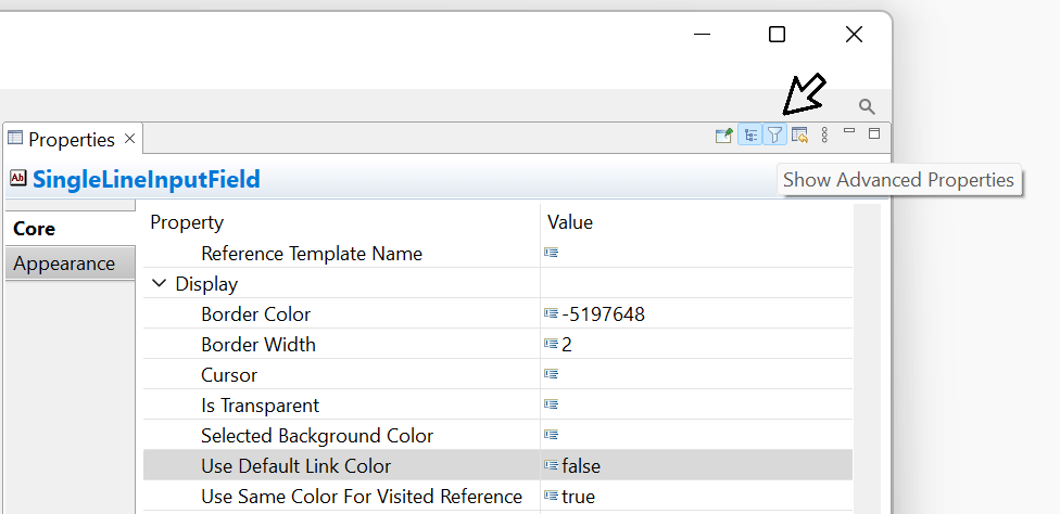
FIGURE 3.88: Filter Show Advanced Properties of the Properties view.
The length of the text that can be entered, as well as the characters that can be used, can be configured using regular expressions in the Misc section of the Properties view via the Input Validation Pattern property (see section 6.1.3 for examples). The two components for collecting text responses can raise FSM events (see section 4.4.3) when the text field receives input focus (Raised In Event) and when input focus is removed from the text field (Raised Out Event). If inputs are not accepted due to a regular expression, the Input Validation Event is triggered. The FSM events can be linked to the components using the context menu entries Link Raised In Event, Link Raised Out Event, and Link Input Validation Event.
SingleLineInputFields or InputFields can be copied to an additional variable using the result_text()-operator (see section 5.3.10 for details).
Components of type SingleLineInputFields and InputFields create Trace events of type SingleLineInputField and InputFields (when the input field is focused) and SingleLineInputFieldModified and InputFieldModified (when the text is changed), that are stored in the log data.47
3.9.2 Single-Choice Responses: RadioButtonGroup and RadioButtons
Even for simple item formats like single-choice and multiple-choice the item design (e.g., the affordance rendered by different item designs) can impact psychometric properties. This was, for instance, investigated by Moon et al. (2019, see Figure 3.89).
The creation of single-choice tasks is often done in computer-based assessment with components of the type RadioButton, while multiple-choice is usually implemented using Checkboxes (see subsection 3.9.3).
RadioButtons for single-choice) or rectangular (called Checkbox for multiple-choice). The CBA ItemBuilder follows this distinction, but also provides Frame Select Groups to define the behavior in more detail (see section 3.9.4).
As seen in Figure 3.86, RadioButtons in the CBA ItemBuilder are often not placed directly on pages within Panels. Instead, to insert RadioButtons in the Page Editor of a page, a component of type RadioButtonGroup can be used as container to create a group of related RadioButtons.
To add a RadioButtonGroup first be selected in the Palette () and drawn in the Drawing Area (and then, if necessary, positioned and adjusted using the coordinates X and Y as well as the properties Width and Height in the Properties view). The item shown in Figure 3.90 illustrates the use of RadioBottons within RadioButtonGroups and the properties IsTransparent and BorderWidth.
RadioButtonGroup: RaidoButtonGroups perform two functions. RadioButtonGroups are indispensable when used as response format n the CBA ItemBuilder to organize the membership of RadioButtons to groups. All RadioButtons that are nested in a RadioButtonGroup form a common group. Exactly one RadioButton per group can be selected. By default (i.e., before a RadioButton of a group is clicked), no RadioButton is selected. Accordingly, a missing answers can be identified reliably. Once a RadioButton is selected, this selection can only be changed, but not undone. The second function of RadioButtonGroups concerns the graphical design. Using Border Width and background color for RadioButtonGroups with the property Is Transparent:false, RadioButtonGroups can be used to visualize how RadioButtons belong together. Alternatively, additional components can be used to design pages (see section 3.7.5), for example, to insert a background image. RadioButtonGroup can be added to Panels on Simple Pages and WebChild Pages.
RadioButton: The actual component for the single choice response format is RadioButtons. Each RadioButton represents a selectable option, which is represented with a label text (and an optional image). After selecting a RadioButtonGroup in the Drawing Area of the Page Editor only the icon RadioButton () can be selected in the Palette. RadioButtons can only be added to RadioButtonGroups. Once the icon RadioButton is selected in the Palette, a RadioButton can be added to the RadioButtonGroup. This is done by clicking inside of the RadioButtonGroup, followed by a mouse-move with pressed left mouse button. Use the zoom feature (see section 3.1.1), if the RadioButtonGroup is small. Coordinates X and Y can be changed in section Position of the Properties view, but coordinates are specified relate to the origin (i.e., the upper left corner) of the RadioButtonGroup.
Properties of RadioButton: The size of RadioButton defined using Width and Height property must include the size for the label, that will appear for right-to-left languages right to the RadioButton. The label can be defined using the Text Property of RadioButtons, with font settings configured in the tab Appearance of the Property Grid. The label can be a single word, a multiline text (using the property Text Wrap: true) or a simple linked images, as shown in Figure 3.111 in section 3.10. If the property Use status image: true in the section Misc of the Property Grid is configured, two images (Activated Image and Pressed Image) can be used to distinguish two images as label for RadioButtons.
RadioButtons can have Background Color (if Is Transparent:false) and border with nonzero Border Width. Using the context menu entry Set Selected Background Color (or entering a color number directly into the property Selected Background Color in section Misc of the Property Grid, see section 6.8.3 for more information about CBA ItemBuilder color codes) allows to define the background color used when a particular RadioButton is the selected (single) choice.
Text Property provided by RadioButtons results in labels for Single-Choice response formats that are click-sensitive. If necessary, Conditional Links or the Finite-State Machine can be used to make additional components (such as HTMLTextFields) click-sensitive for RadioButtons (see section 6.4.8).
Radiobuttons can trigger Events when they are clicked to connect the static content with the dynamic parts of CBA ItemBuilder Tasks that are based on Finite-State Machines. For this purpose, a defined Event (see section 4.4.3) can be configured via the context menu and the entry Link Raised Event or in section Component Interaction of the Properties view (property Raised Event). For advanced uses, a second event name can also be defined only in the Properties view for the property Raised Alternate Event. While the Raised Event is triggered when a RadioButton is selected, the second Event (Raised Alternate Event) is triggered when an already selected RadioButton is pressed. From the Finite-State Machine (i.e., when a transition is triggered by a event, see section 4.4.4) or using a Conditional Link (see section 4.3.3), a RadioButton can be selected with the setActive()-operator (see section 4.4.6 for details).
RadioButtonGroup corresponds to a variable whose value represents the selected RadioButton. In addition, a Score variable can be defined, which indicates whether the correct ‘RadioButton(s)’ has (have) been selected (see section 5.3.2 for details).
Components of type RadioButtonGroup create Trace events of type Container (when clicked). Selecting RadioButtons results in a log event of type RadioButton with an attribute oldSelected that informs about the previous state of clicked RadioButton.
3.9.3 Multiple-Choice Responses: Checkbox
In order to convert multiple-choice answer formats with the help of the CBA ItemBuilder, the Checkbox can be used as a basic component. Checkboxes can be added to Panels, as shown in Figure 3.86. Each Checkbox can be selected and deselected.
Checkbox creates its own variable whose value represents the information if that particular Checkbox was selected. In addition, a Score variable can be defined which indicates whether particular pattern of multiple Checkboxes has been selected (see section 5.3.2 for details).
To add a Checkbox, first select a Panel in the Drawing Area of the Page Editor. If a Panel is selected, the icon Checkbox () can be selected in the Palette. To place the Checkbox, click into the Panel and move the mouse while keeping the left mouse button pressed.
Properties of Checkboxes: The position of Checkboxes can be precisely defined using the section Position of the Properties view. The size of Checkboxes must include the space required for the text label, that is displayed next to the Checkbox (on the right side for right-to-left languages). The label text can be defined by double-clicking on the Checkbox, using the context menu entry Edit Text or directly in the Properties view in section Text. Font and font size of the Checkbox labels can be configured using the Appearance tab of the Properties view. Analogous to RadioButtons, a background color for selected Checkboxes can be defined (property Selected Background Color or context menu entry Set Selected Background) in addition to borders (nonzero Border Width) and the background color.
Text Property provided by Checkboxes results in labels for Multiple-Choice response formats that are click-sensitive. If necessary, Conditional Links or the Finite-State Machine can be used to make additional components (such as HTMLTextFields) click-sensitive for Checkboxes (see section 6.4.8).
Components of type Checkbox can be linked to two different Events. The context menu entry Link Select Event allows to assign an Event that is triggered, when the Checkbox is selected, the entry Link Deselect Event can assign an Event for deselecting the Checkbox.
Components of type Checkbox create Trace events of type Checkbox for the log data, that provide the attribute oldSelected to informs about the previous state of the Checkbox.
Simple and Complex Multiple-Choice response formats or Multiple-True-False items can be created by using components of type RadioButtonGroups and RadioButton (see section 3.9.2). However, since the use of RadioButtonGroups is not possible in combination with Auto Layout-Panels (see section 3.5.3), Frame Select Groups can also be used to define single- and multiple-choice response formats (see section 3.9.4).
More advanced Single-Choice and Multiple-Choice response formats can be implemented using the dynamic features of the CBA ItemBuilder (see, for example, section 6.4.9).
3.9.4 Single- or Multiple-Choice using Frame Select Groups
Using RadioButtonGroups to structure and group RadiouButtons has a conceptual problem: RadiouButtons of a group cannot be distributed across different containers, such as Panels. This problem is solved by so called Frame Select Groups. Frame Select Groups are groups defined at the Frame-level for RadioButtons, Checkboxes (and Toggle-Buttons) that specify the membership of these components in a group for click responses. Frame Select Groups can be created via the Configure Select Groups dialog, which can be called from the context menu of the Frame of a page. As shown in figure 3.91, this dialog can be invoked via the Component Edit by right-clicking on the Frame.
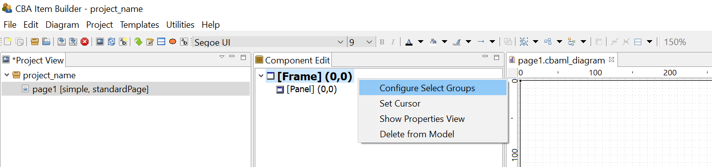
FIGURE 3.91: Context menu to Configure Select Groups in the Component Edit.
Frame Select Groups can be used together with Auto Layout-Panels (see section 3.5.3) to group components of type Checkbox, RadioButton or Toggle-Button into groups. Groups define the three important properties, that define Single- or Multiple-Choice response formats as groups (Frame Select Groups), instead of using RadioButtonGroups:
- Selectable: Can user interactions (i.e. clicks) on the components change the selection?
- Multiple Select: Is it possible to select more than one component of this group?
- No Deselect: Is an already selected component de-selected, if it is clicked again?
After right clicking the Frame of a page in the Component Edit (see subsection 3.1.2) the entry Configure Select Group opens the editor shown in Figure 3.92.
FIGURE 3.92: Configure Select Groups dialog to define Frame Select Groups.
Frame Select Groups are addressed by their index. I.e. in each Frame multiple groups can be created, and each component is then assigned to a group by entering the index (starting with 0) in the Properties-view of a component. In Figure 3.92, 9 different groups are defined. All components belonging to each group are assigned to the same index (see the property Frame Select Group in section Misc in Figure 3.93).
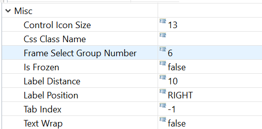
FIGURE 3.93: Assignment of a component to a Frame Select Group in the Properties-view.
The assignment of components to a previously defined Frame Select Group is defined by entering the number in the Properties-view, as shown in Figure 3.93. The meaning of the three properties (Selectable, Multiple Select and No Deselect) can be inspected with the example illustrated in Figure 3.94.
3.9.5 Single- or Multiple-Choice using ComboBoxes and Lists
The CBA ItemBuilder provides two additional components for creating single and multiple selections of existing elements. Both components can be added to Panels (see Figure 3.86). ComboBoxes can be used to implement Single-Choice response formats. Only one element can be selected from each Dropdown-list. Lists support single- and multiple-choice using the property Multiple Select Mode. When closed, ComboBoxes display only the selected element, while Lists show all available elements within the available space. ComboBoxes require scrollbars for the selection of an item if the list of defined Combobox Items cannot be shown simultaneously on screen (and the CBA ItemBuilder provides the property Visible Item Count to control how many items are displayed during the selection before scrolling is required. With the configuration Visible Item Count: 0 (default) as many items as possible are displayed). Lists show scrollbars, if the size of the List-component is to small to show all elements (see Figure 3.95).
Components of type ComboBox and List are containers for entries added in the form of ComboBox Item (for ComboBoxes) ListItem (for Lists).
ComoBoxes (ComboBox Items) and Lists (List Items) are not displayed individually in the Page Editor and can only be edited via the Component Edit (see section 3.1.2).
To add an item to the ComboBox, the context menu (right-click a component of type ComboBox in the Page Editor) must be used, which contains the entry Add Combo Box Item as shown in Figure 3.96 (the analog entry is called Add List Item for components of type List).
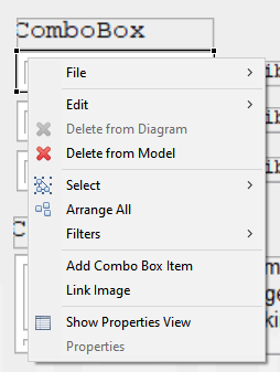
FIGURE 3.96: Context menu for ComboBoxes in the Page Editor.
After a new item has been created via the context menu, the central properties can be edited in the Add Combo Box Item dialog (see Figure 3.97). However, Text, UserDefinedId and Mouse Over Text can of course also be changed via the Properties view.
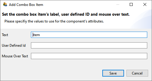
FIGURE 3.97: Dialog to configure a component of type ComboBoxItem.
To be able to edit an item of a ComboBox (or List), the ComboBox must first be selected as a container in the Drawing Area of the Page Editor. All defined items will then be displayed in the Component Edit section. To change the Text Property, the UserDefinedId or the Mouse Over Text the context menu in the Component Edit contains the entry Set Basic Attributes (see Figure 3.98). The context menu also contains the entry Link Page for defining a Link (see section 3.11) or a Conditional Link (see section 4.3).
Using the entry Link Raised Event that is part of the context menu when a ComboBox Item or List Item in the Component Edit are clicked with the right mouse button, FSM Events can be added that are triggered when the item is clicked.
Comobox-items provide the context menu entry Link Image that is currently not working as expected.
To delete an item in the Component View, the context menu entry ‘Delete Item’ can be used (see Figure 3.98).
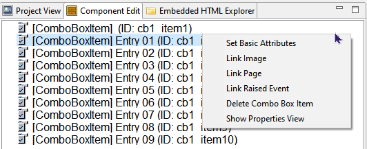
FIGURE 3.98: Context menu for ComboboxItems in the Component Edit.
Moreover, the context menu of items in the Component Edit also allow to open the Properties view.
The formatting of entries in ComboBoxes and Lists is uniform for all items via the properties in the Appearances tab of the Properties view. A border is only displayed if a non-zero Border Width is defined.
The SetFrozen()-operator and the property Is Frozen is currently not working for ComboBoxes and not supported for Lists.
If entries in a ComboBox are selected a log entry ComboBox is written into the Trace data. If an entry is selected within a List, this can be traced by means of the entry List Item in the log data.
3.9.6 Selectable Components in Panels or ImageMaps
In addition to specific components to collect click-responses, the CBA ItemBuilder allows to use additional components within Panels or ImageMaps to be selected.
Selectable Components: Different components such as HTMLTextFields provide the Selectable property, that can be used to allow components to be selected and de-selected by test-takers ( ). If several
 HTMLTextFields are placed within a Panel, then the selection of the component (e.g., the HTMLTextField) can be used to capture a click response.
If the option Selectable: true is enabled (default setting is false), then the entire HTMLTextField can be selected by the test-taker at item runtime, as soon as the Selectable: true is also defined for the hosting Panel. Note that the Selectable-property is only visible if the icon Show Advanced Properties is clicked (see Figure 3.99).
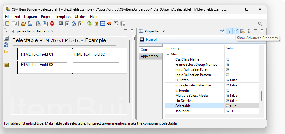
FIGURE 3.99: Advanced properties for Panels in the Properties-view to define Selectable: true.
Hosting Component: The selection of an HTMLTextField is done by clicking. The exact behavior of the selection can be defined as properties of the component, in which the selectable components (e.g., HTMLTextFields) are embedded (e.g., Panels). In addition to define Selectable: true, the Panel allows to define the additional properties No Deselect and Multiple Select Mode (see Figure 3.100 for illustrations).
An already selected HTMLTextField can be unselected by clicking on it, if No Deselect: false . Selected HTMLTextFields are highlighted with the color that is stored in the global settings as Highlight Color (see section 6.3). The scoring of selectable components such as HTMLTextFields is described in section 5.3.2. Operators for finite-state machine and task initialization syntax to modify the selectable property of HTMLTextFields are described in section 4.4.6.
3.9.7 Single-Choices as MenuBar with Menu
A component for the implementation of Single-Choice tasks analogous to menus of computer programs is provided by the CBA ItemBuilder as MenuBar (see Figure 3.101).
MenuBar: Components of type MenuBar can also be used added to Panels on pages of type Web Browser within WebBrowserToolbar. To create a Single-choice selection as a menu, a Panel or a WebBrowserToolbar must first be selected in the Page Editor. This makes it possible to select the MenuBar icon in the Palette ( ). If
). If MenuBar is selected in the Palette, a rectangle can be drawn within the Panel or within the WebBrowserToolbar by clicking with the left mouse button and moving the mouse with pressed mouse button. This rectangle represents the typically invisible border within which one or more menus can be placed. The position of the MenuBar can be set exactly via the Properties view (properties X, Y, Width and Height), as well as the border width and the border color (in the Appearance tab of the Properties view). Via the Properties view (property Raised Event in section Component Interaction) a FSM Event can be defined, which is triggered when a test-taker opens the MenuBar.
Menu: Unlike ComboBoxes and Lists, components of type MenuBar can provide multiple selections, which can be added to MenuBars as a component of type Menu. To add one or more Menu components to a MenuBar, the MenuBar must first be selected in the Page Editor. Then the icon Menu ( ) is available in the Palette. After this icon is selected, a
 Menu can be added inside the MenuBar. The size With and Height can also be edited directly in the Properties view. The position X and Y is not relevant for Menu components and is hidden in the default view of the Properties view. 48
Menu are containers for entries added in the form of MenuItems (using the context menu Add Menu Item of Menus).
Menus (MenuItems) are not displayed individually in the Page Editor and can only be edited via the Component Edit (see section 3.1.2).
Images can be added to Menu-items using the context menu Link Image (or by entering the exact file name of the image resource added using the Resource Browser, see section 3.10.1, to the property Image Reference in section Display Images of the Properties view).
Menu-items can be used trigger Links (see section 3.11 for details) or Conditional Links (see section 4.3 for details), assigned using the context menu entry Link Page in the Component Edit. Moreover, Menu-items can trigger Commands (using the context menu entry Set Command, see section 3.12 for details) and FSM Events (using the context menu entry Link Rasied Event, see section 4.4.3 for details).
3.9.8 Collect Responses using Table and TableCellEditor
As shown in Figure 3.102, additional components can be added to Panels which are needed for the implementation of specific item concepts. This concerns the use of tables (as input format) and so-called Trees, which can be used to design user interfaces as part of CBA ItemBuilder items.
FIGURE 3.102: Overview of components for special purposes.
For the design of pages, the CBA ItemBuilder provides a Table component (see item in Figure 3.103 for an example).
Table: Tables can be used for different purposes. They can be used to arrange information on a page in tabular form. Tables can also be configured to mimic simple spreadsheet functions. After the place for a table has been defined in the Page Editor, tables can be initialized via the context menu and the entry Configure Table. When the dialog shown in Figure 3.104 is called for the first time, the type can be specified once. Besides the table type (Standard or Spreadsheet), the number of rows and columns and the default background color can be specified. These changes cannot be corrected once the dialog has been closed with OK.
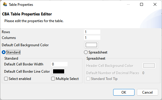
FIGURE 3.104: Dialog to configure Table-components.
After initializing a table, the table cells are automatically created and filled with components of type Text Field (see subsection 3.8.3 for more information). Note that height, width and position of table cells can only be changed manually in the Properties view once the table is created.
Table cells are TextFields to which an image (context menu entry Link Image) and a page as link (context menu entry Link Page) can also be assigned.
As shown in Example 1 in the item illustrated in Figure 3.103, tables of type Standard can be configured to be Select enabled (wither single-choice or multiple-choice with the additional option Multiple Select, see Figure 3.104).
TableCellEditor: For tables of type Spreadsheet a component TableCellEditor is available, which enables the editing area of the currently selected cell, which is typical for spreadsheets (see figure 3.103). After adding a component of type TableCellEditor it can be assigned to a table configured as type SpreadSheet via the context menu entry Attach Table.
3.9.9 Collect Responses using Tree, TreeView and TreeChildArea
To create browsable folders with nested elements, the CBA ItemBuilder provides three components usually used together (see Figure 3.105 for an example):
- The
Tree-component shows a tree, in which each element is represented by a label and the hierarchical structure is created at design-time by adding nodes in the Component Edit-view of the CBA ItemBuilder (see section 3.1.2). - The
TreeView-component that shows a list of all child-nodes of the node selected in theTree. - The
TreeChildArea-component that can be used to display pages in a designated area (similar to PageAreas, see section 3.5.4), linked to the currently selected node in theTree.
Tree Configuration: The basic configuration of Trees is done in the Component Edit-view of the CBA ItemBuilder as shown in Figure 3.106. Each Tree-component provides three sections in that can be edited using the context menu. The section [Type] is used to define custome node types ([TreeNodeType]), for intsance, to specify the font properties for all nodes assigned to this type. Each node must be assigned to a node type. The actual nodes that are to be displayed in the Tree (and the child nodes in the TreeView) are defined in the section [Nodes]. The columns shown in the TreeView are user defined and created in the Component Edit-view in the section [Columns]. Each child node in the section [Columns] corresponds to one column in the TreeView.
FIGURE 3.106: Configuration of Tree-component in the Component Edit-view.
The configuration of nodes is done using the context menu in the section [Nodes] using the Component Edit-view of a Tree-component, as shwon in Figure 3.107. Nodes are added using Add Tree Node and removed using Delete Tree Node. The node text (i.e., the displayed text in the Tree and TreeView-components), the Mouse Over text and the UserDefinedId are configured using the context menu entry Set Basic Attributes or by entering the values directly into the Properties-view.
![Context menue for [Nodes] in the Component Edit-view of a Tree-component.](img/ib_ui/IB_UI_TreeConfigurationInComponentEdit02.png)
FIGURE 3.107: Context menue for [Nodes] in the Component Edit-view of a Tree-component.
Each node must be assigned to a node type using the entry Set Node Type. This requires to define at least one element in the section [Type], using the context menu entry Add Tree Node Type that is available via right-click on the element [Types] within the element [Tree] in the Component Edit-view. A node type is defined by a text, a UserDefinedId and an optional Mouse Over Text. Additional properties for nodes of that particular type can be defined in the Properties-view (e.g., details concering the text presentation are used when Use Tree Front: false).
TreeView Configuration: The Tree component and the TreeView-component need to be linked. To link a TreeView to a Tree, right-click on the TreeView-component in the Page Editor provides the context menu entry Set Tree. Since Tree and TreeView are linked, the selection of a component in the Tree and in the TreeView are synchronized (i.e., selecting a node in the Tree selects the corresponding nodde in the TreeView and vice-versa).
The data about selected nodes shown in the TreeView are values for the columns, defined for each node by selecting the context menu entry Set Column Values (see Figure 3.107). The values need to be entered in the dialog shown in Figure 3.108 according to the order in which the [Columns] are defined in the Tree-component.
![Edit values for [Nodes] shown in the TreeView-component.](img/ib_ui/IB_UI_TreeConfigurationInComponentEdit03.png)
FIGURE 3.108: Edit values for [Nodes] shown in the TreeView-component.
Additional configurations (e.g., Sortable) can be specified in the Properties view of the TreeView-component.
TreeChildArea Configuration: The Tree component and the TreeChildArea-component need to be linked (similar to the TreeView as described above). Since Tree and TreeChildArea are linked, a child page can be linked to each node. When the node is selected in the Tree or the TreeView, the linked pages is shown in the TreeChildArea. Pages can be linked in the context menu of the Tree-component in the Component Edit view (see entry Link Page in Figure 3.106).
3.9.10 Graphical Single- or Multiple-Choice Formats using ImageMaps
Another component that can be used to computerize both Single- and Multiple-Choice response formats with the CBA ItemBuilder are ImageMaps. As the name suggests, these are images on which clickable areas can be defined. If the selection of a new clickable area deactivates an already selected area (Multiple Select Mode: false), then a Single-Choice response format is created. If additional elements are selected without deactivating already selected areas (Multiple Select Mode: true), a Multiple-Choice response format is created.
ImageMaps: ImageMaps that can be added to components of type Panel are shown in Figure 3.109).
To add an ImageMap to a page, the Panel must first be selected. After that the entry ImageMap ( ) is available in the Palette. If this icon is selected, it is possible to click inside a
 Panel in the Drawing Area of the Page Editor and draw a rectangle while holding down the mouse button. When releasing the left mouse button the ImageMap is added to the page. In the Properties view, the exact position and size of the ImageMap can then be adjusted in the Position section.
The graphical design of ImageMaps is usually done using a background image, which can be added using the context menu entry Link Image (see section 3.10). Alternatively, a background color can be configured in the Appearance tab of the Properties view (if Is Transparent: false). A border can be displayed if a non-zero Border Width is configured.
ImageArea: Components of type ImageMap are containers for clickable areas, which can be inserted as ImageArea or ImageTextField. One or more ImageArea(s) can be created in the Page Editor inside ImageMaps (see table 3.8 for a detailed description). The size of ImageAreas is insignificant, since they are only used to anchor polygonal features, which must also be inserted as AnchorPoint.
| Page Editor | Description |
|---|---|
 |
To add ImageAreas to an ImageMap, the ImageMap must first be selected in the Drawing Area of the Page Editor. |
 |
When the ImageMap is selected, the ImageArea icon ( ) can be selected in the Palette. After that a small rectangle (circa 25x25 pixels) needs to be drawn inside the ) can be selected in the Palette. After that a small rectangle (circa 25x25 pixels) needs to be drawn inside the ImageMap component, which represents the ImageArea. |
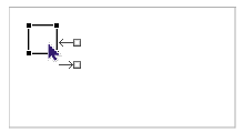 |
After the ImageArea has been added to the ImageMap, this component can be selected in the Page Editor. The displayed connector points ( ) can be ignored. Once the ) can be ignored. Once the ImageArea is selected, the icon AnchorPoint ( ) can be selected in the Palette. ) can be selected in the Palette. |
 |
Unlike other components, AnchorPoints are added by a simple click. The CBA ItemBuilder shows that this is only possible by clicking on components of type ImageArea. |
 |
If the icon AnchorPoints is selected, then a selectable area for the ImageMap can be defined by a single click on the ImageArea. It is important to click inside the component of type AnchorPoints in the Drawing Area. |
 |
Adding the AnchorPoints by clicking on the ImageArea automatically creates a rectangle whose corner points can now be adjusted to the desired shape. The polygon path symbolized by the corner points is always anchored to the ImageArea. |
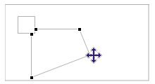 |
The individual corner points of the polygon path can be moved in the Drawing Area with the mouse. The polygon path must be selected for this operation first. After that the mouse can be moved over a corner point. As soon as the mouse icon indicates that the corner point can be moved, the polygon path can be adjusted at the selected point using drag and drop. If the corner point falls exactly on the line between two already existing points by a drag and drop operation, then the corner point is removed. |
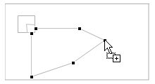 |
A new corner point can be added by clicking on a line of the polygon course. The Page Editor shows this option by a small + at the mouse pointer. After the new corner point has been added, it can be moved again via drag and drop. |
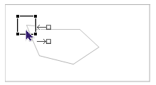 |
There are three different selections for ImageMaps. If the ImageArea is selected, properties for this polygon path can be changed in the Properties view. |
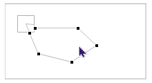 |
If the polygon path itself is selected, then the Properties view is not available, but individual points can be moved, added or deleted. |
 |
Properties of the whole ImageMap (e.g. the property Multiple Select Mode) can be edited if the ImageMap is selected in the Page Editor. |
ImageAreas are used to define the UserDefinedId for each click-sensitive path of an ImageMap, do define using the tab Appearance of the Properties view the background color and optional border (shown if Border Width is different from zero), to assign FSM Events (using the context menu entry Link Select Event and Link Deselect Event) and to define the Transparency (a value between 0 and 100 that defines the trancparency of the defined background color, when the path is selected).
AnchorPoint: For each ImageArea exactly one component is required to anchor the polygon path. For that purpose, an AnchorPoint must be added to the ImageArea. The AnchorPoint is not drawn as rectangle in the Page Editor. Instead, adding the AnchorPoint is performed by selecting the ImageArea to get access to the icon AnchorPoint in the Palette (), followed by a single click with the left mouse button inside of the rectangle that represents the ImageArea in the Page Editor. After adding the AnchorPoint, the automatically generated polygon path can be adjusted as described in table 3.8. Once the ImageArea is added to the ImageArea, only the polygon path or the ImageArea can be selected in the Drawing Area of the Page Editor. AnchorPoint do not provide additional properties.
ImageTextField: As shown in Figure 3.86, ImageMaps can contain standard components of type HTMLTextField and Button as well as ImageTextFields in addition to ImageAreas with AnchorPoints. Components of type Button (see section 3.11.2) and HTMLTextField (see section 3.8.2) added to ImageMaps can contain Links (see section 3.11), while the specific component of type ImageTextFields are TextFields (see section 3.8.3) without the possibility to add Links and to use the Highlighting feature. Instead, ImageTextFields can be added to ImageTextFields as click-sensitive texts that integrate into the Single-Choice (Multiple Select Mode: false) or Multiple-Choice (Multiple Select Mode: true) behavior of ImageTextFields (see Figure 3.110 for an example).
Figure 3.110 illustrates that multiple ImageMaps can be added to a page simultaneously and that ImageMaps not necessarily must use a background image.
3.10 Images and Multimedia Components

Many components can be used to display images on CBA ItemBuilder Pages. The following example (see Figure 3.111) shows a selection of components that can be linked to images.
The component that can only display images is the ImageField. It can be used to display an image with a fixed size (width and height). The size of the image used should be preferably match the original size of the image in pixels (see 6.2.1 for details). Size and position can be changed in the Page Designer. To determine the exact position, the properties can also be defined in the Properties view (see Figure 3.112).
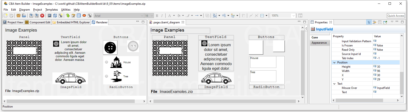
FIGURE 3.112: Rendering (left) and Page Editor (middle) and Properties view showing item ImageExamples.zip (html|ib)
Images can also be used as background in Panels. A panel without any further element leads to the same result as an ImageField. However, if required, additional components can be placed in panels. In the example above, this approach was used for the SingleLineInputField, which was placed on a panel with a pattern. Images are frequently used for the design of buttons. As described in subsection 3.11.2 the CBA ItemBuilder distinguishes two configurations, namely Standard button (only one image can be used) and Image button (one image can be defined for each of the states activated, deactivated, pressed and mouse over). RadioButtons can also contain images. If the images are specified as part of the RadioButton, the correpsonding option can also be selected by clicking on the image. Finally, the example in Figure 3.112 also shows that TextFields can contain images in addition to texts.
3.10.1 Manage Ressources
To use image files, audio data and video files for designing item they must be loaded into the CBA ItemBuilder Project File using the so-called Resource Browser. The Resource Browser supports the import of selected file formats that can typically be displayed in Web browsers.
Supported File Formats: The following Table 3.9 gives an overview of file formats for images, audio and video.49
| Extension | Description | Type |
|---|---|---|
*.gif |
GIF: Graphics Interchange Format, Lossless compression, transparency option, animation option, good browser support | Image |
*_min.png |
PNG: Portable Network Graphics, Lossless compression, transparency option, good browser support | Image |
*.jpg |
JPEG: Joint Photographic Experts Group, Lossy compression, good browser support | Image |
*.tiff |
TIFF: Tagged Image File Format, Lossless compression (not supported) | Image |
*.mp3 |
MP3: Lossy compression, good browser support | Audio |
*.mp4 |
MP4: Lossy compression, good browser support | Video |
*.webm |
WebM: Lossy compression, good browser support | Video |
*.ogg |
Ogg: Lossy compression, acceptable browser support | Audio |
*.ogv |
Ogv: Lossy compression, not supported by all major browsers | Video |
*.wav |
Wav: Waveform Audio File Format, good browser support | Audio |
Note that the XML-based vector image format for Scalable Vector Graphics (SVG) is currently not supported by the CBA ItemBuilder.
Resource Browser: To manage resources, the built-in Resource Browser provides the following three options: A) Add a resource file to the item project file, B) delete a selected resource file from the item project, and C) delete all unreferenced resources within a project.
FIGURE 3.113: Icon Browse resources in the CBA ItemBuilder Toolbar.
The Resource Browser can also be opened using the entry Browse resources in the Project menu. To import a resource file, the Resource Browser once opened provides the button Add. This button opens an open file dialog that can be used to select one or multiple files of supported format for importing.
Resources whose file name contain special characters or blank space cannot be used in item project and displayed at runtime.50 Resources with file names that cannot be used at runtime are detected by the Resource Browser and the CBA ItemBuilder displays a warning message.
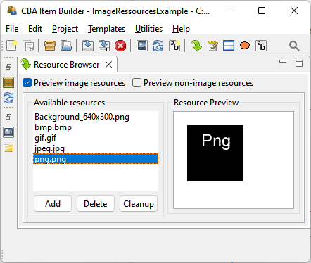
FIGURE 3.114: Resource Browser to manage embedded resources.
A resource entry selected in the list of Available resources (see Figure 3.114) can be removed, using the Delete button. If the automatic start of audio or video files should be suppressed, the checkbox Skip Preview can be marked.
As described in the following, resources are linked to components. Resources that are used in the current item project (i.e., images, audio files, and videos that are linked to components) cannot be deleted. Resources that not linked to a component (i.e., unused resource files) can be removed permanently from the item project using the button Cleanup.
Existing resources can be updated without linking them to components again by deleting the resource with the Resource Browser and adding a resource with the identical name. Note, however, that Generate and Save (see 3.2.1 below) will be necessary to apply the update.
Before you import resources in the item project, images, audio files, and videos should be prepared and converted into a suitable format. Images, for instance, should be prepared by image processing software and resized to the size required in the item project (see section 6.2 for further information).
A selection of file formats is commonly used for displaying images on the web. The CBA ItemBuilder supports image files in the formats JPEG, BMP, GIF and PNG.
Audio files can be added in MP3, OGG and WAV formats in the CBA ItemBuilder’s Resource Browser. A tool to edit and convert audio files is Audacity. For audio files to be played, the hosting may also need to be configured correctly (e.g. with regard to range headers). Therefore, it is recommended to thoroughly test the use of the audio format on the planned devices. In addition, audio output in the browser typically cannot occur until at least one user interaction (click, keyboard input, or similar) has taken place. The three audio formats are illustrated in the following item shown in Figure 3.116.
Video files can be added in MP4, OGV and webm formats in the CBA ItemBuilder’s Resource Browser. A tool to convert video files is VLC media player. The three video formats are illustrated in the following item shown in Figure 3.117.
Depending on the deployment method not all audio and video file formats are supported. Currently, the Ogg / Ogv or Mp3 / Mp4 are suggested formates to be tested first. For online use, MP4 with the codec H264 and WebM with the codec VP8 or VP9 are particularly suitable because of their high compatibility.
As a rule of thumb, MP4 should work in all common browsers, i.e., Android, Chrome, Internet Explorer, Edge, Firefox, Opera, and Safari - only Firefox on Linux requires a plugin (FFmpeg). Further, all universal browsers support WebM; the only exceptions are Internet Explorer and Safari.Resource files of a supported format can be used in item projects by linking them to components, as described in the next section.
3.10.2 Components to Show Images
Importing images via the Resource Browser is only the first step. An image must also be assigned to a component in the Page Editor to be visible on a page, and all components that can show images provide the “Link Image” entry in the context menu.
Dedicated ImageFields: ImageFields are components dedicated to showing images on pages. If image file formats support transparency (i.e., *.gif and *_min.png), the property Is Transparent can be set to true and Background Ccolor can be used. Images can have borders (i.e., Border Color can be used when Border Width is different from zero) and ImageFields support text for Mouse Over (text that is displayed when mouse over the ImageField). Components of type ImageFields are typically added to Panels, but are also supported within WebBrowserToolbars.
The CBA ItemBuilder automatically resizes components of type ImageField and Panel to the native size of the image. Although the components can be resized afterward, resizing images either risk a loss in quality or a potential waste of resources, as item projects might require more bandwidth as needed (see section 6.2 for further information). A tool to create and edit images is paint.net.
Background Images in Panels: Images can also be used to create the background of a page. For this, no ImageFields have to be used in the CBA ItemBuilder, but images can also be linked directly to a panel. Note, however, that when images are added as background images to Panels via the Link Image option, they must be precisely the size of the panel in Width and Height. If this is not the case, then unlike ImageFields, they will be cut off (if the image is larger than the Panel) or displayed repeatedly (if the image is smaller than the Panel). This difference between ImageFields for displaying images and the use of images in the background of Panels is shown in Figure 3.118.
FIGURE 3.118: Item illustrating the difference scaling of ImageFields and images as background in Panels (html|ib).
Other Components that allow to Link Images: TextFields (see subsection 3.8.3) can contain images (see Figure 3.111 in subsection 3.10 for an example). Images are necessary for components of type ImageMap (see section 3.10). Images can also be used to design components of type Button as so-called Image Button (see subsection 3.11.2). Moreover, TableCells (see subsection 3.9.8) can be linked to images. Finally, MapBasedVariableDisplay (see subsection 4.2.5) can be configured to show images assigned to values using so-called Value Maps (see subsection ).
3.10.3 Components for Audio and Video Content
For audio and video content integration, the Page Editor provides components of Audio and Video type that can be placed into Panels. These two components can be configured with or without visible controls and are used to play hard-linked audio or video resources. Multiple Audio or Video components can be embedded if numerous audio or video resources are required on a page. For special use cases, the CBA ItemBuilder also provides additional functionality to play audio or video resources selected via a Value Map with a variable (see 4.2.5 for a description of using MapBasedVariableDisplay with the Value Display Type either AUDIO or VIDEO).
Link Audio / Video to Components: Similar to images, videos and audio files can be added as resources to the CBA ItemBuilder project. After inserting them in the Resource Browser, they can be linked to the components using the context menu item Link Video or Link Audio (as shown in Figure 3.119).
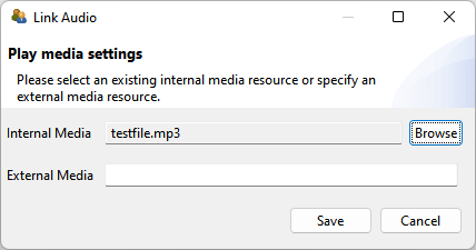
FIGURE 3.119: Link Audio dialog for Audio components.
Internal vs. External Media: In addition to internal resources that are part of the CBA ItemBuilder Project Files (referred to as Internal Media, audio and video files can also be inserted as URL’s (referred to as External Media). It should be noted, of course, that the External Media must then also be available at the time of the test execution, which is typically not guaranteed for offline deliveries (see section 7.2).
Controls: The CBA ItemBuilder allows using audio and video resources with the default controls (i.e., a start and a stop button; property Hide Controls: false). With this setting, test-takers can also navigate within the audio and video files and thus reset the playback. Alternatively, the default buttons can be hidden with the Hide Controls: true option. For this use case, the setMediaPlayer() operator must then be used to start the output and pause or stop it if necessary (see section 4.4.6). This property Hide Controls is illustrated for audio and video components in the item shown in Figure 3.120.
FIGURE 3.120: Item illustrating the use properties Hide Controls and Max Play of Audio and Video components (html|ib).
Max Play: Variables and the finite-state machine can be used to control precisely when and how often multimedia resources can be played if the standard controls are not used to control audio and video output. For simple use cases, however, the Max Play property (the default value \(0\) means any number of times) can be used to specify how often an audio file or a video file can be played. When the number is reached, the default controls are automatically hidden (see the item in Figure 3.120 as an example). The Max Play value can be changed directly in the Properties view.
Note, however, that using a custom Play button (i.e., a component of type Button that triggers an event and uses the Finite-State Machine operator setMediaPlayer() to play the audio, see section 4.4.6) is not acknowledging the Max play setting (see Figure 4.54) for an implementation of an restriction for audio playback using Finite-State Machine variables).
The link between the components of type Audio and Video and the Finite-State Machine is provided by a number of events that can be triggered (and processed by the Finite-State Machine, as described in section 4.4; see Figure 3.121).
FIGURE 3.121: Set Media Raised Events dialog for Audio components.
End Event is also provided, and the events are triggered even if the playback state is changed by an FSM operator (see section 4.4.6).
Automatic Start: If an audio or video resource is to be played automatically when a page is visited, this can be configured with the Automatic Start: true property. The items created with the CBA ItemBuilder are rendered in web browsers. Thus they are subject to the security restrictions of the browsers. One of these security restrictions requires user interaction before audio output may be started. This is always not the case if Automatic Start: true (or via the Finite-State Machine) is used to start an audio output in an item before the user has clicked or otherwise interacted with the HTML output. This is not a problem for operative test execution, as user first interaction is usually triggered by entering a login name or confirming the privacy notices before the first audio output is required. However, the security restriction also applies to editing items and the Preview used for this purpose. Therefore, the Preview can also be started with a simulated login dialog (see Show Login Dialog option in section 1.4.2). If this option is not activated (and the warning message of the CBA ItemBuilder is ignored), the Automatic Start function cannot work in the Preview.
Audio Volume: Controlling the audio volume is possible with the components of type ‘Audio’ and ‘Video’ for the test-taker when the default controls are used (Hide Controls: false). If the start volume of the is to be set or if the volume of individual audio or video components is to be changed, an operator is available (see section 4.4.6) that can be used in the finite-state machine. Controlling the system volume of the device on which the web browser is executed within which the items created with the CBA ItemBuilder are rendered is not possible from within the item. The test delivery software can take over this functionality if the test execution takes place under controlled conditions (e.g., using kiosk mode with a USB stick deployment, see subsection 7.5.3 for an example).
Alternate Video / Alternate Audio: Not all video formats (formerly also audio formats) are supported in all browsers. The CBA ItemBuilder, therefore, provides the functionality to link an Alternate Video to a component of type Video in addition to the primary resource (Audio analogously). The alternate media is used if a browser does not support the primary media.
Recording: The audio component can also be configured to record audio, using the property Record Audio: true. Starting (and ending) the recording is connected, for instance to buttons, as shown in Figure 3.122, using the dynamic features (i.e., Finite State Machine Events) described in Chapter 4.
As Figure 3.123 shows, the component of type Video can also be used in the same way to record from the webcam.
Note that the audio (and video) recording will only work if access to the microphone (or webcam) is granted. Moreover, due to a bug in CBA ItemBuilder 10.0, the audio-track of the recording is played twice after recording.
A couple of additional features of Audio and Video components appear in the CBA ItemBuilder user-interface but are currently either deprecated, still under development or undocumented. The property Use Audio is currently not functional. Moreover, as illustrated in Figure 3.120 the Frozen property is currently not functioning, and the feature VideoTextArea is currently not used.
3.11 Links between Pages

Assessment components created with em CBA ItemBuilder can consist of a single page or of multiple pages. If multiple pages are used, then Links attached to components can be used to switch between pages.
Links vs. Conditional Links: Links between pages in the CBA ItemBuilder can either be static (i.e., the same target page is always addressed). Or the link’s target is defined by conditions (i.e., the evaluation of the conditions decides which page is addressed). Accordingly, the CBA ItemBuilder differentiates between Links and Conditional Links.
The following example in Figure 3.124 illustrates simple Links and a Conditional Link.
Figure 3.125 graphically illustrates the distinction between Links and Conditional Links that is demonstrated in the item in Figure 3.124.
FIGURE 3.125: Schematic display of links in Figure 3.124.
The button on Page A always links to Page B. Similarly, the buttons on Page C and Page D always link back to Page B. The difference between these simple links and a conditional link is illustrated on Page B. Here, the button Link to Page A has a simple link, always referring back to Page A, while the button Link to Page A or C is configured with a conditional link that points either to Page C or to Page D.
The condition defined for this example has two parts, separated in the two lines:
{pageD: CheckBoxID}
{pageC: not CheckBoxID}
The first line defines the link to pageD (the page name of Page D), if the component of type Checkbox with the UserDefinedId: CheckBoxID is selected. If this Checkbox is selected, then the conditional link refers to pageD. If the component of type Checkbox with the UserDefinedId: CheckBoxID is not selected, the first line is ignored and the second line is evaluated. Since not CheckBoxID is true, the conditional link will link to pageC (the page name of Page C) in this example.
Conditions for Conditional Links are stored as syntax in the CBA ItemBuilder in the form shown. This is introduced in detail in section 4.1 and described specifically for Conditional Links in section 4.3.
The next section 3.11.1 describes how Links for switching between pages can be connected to various components in the Page Editor. Links between pages and xPages are covered in section 3.11.4, including an overview of links between pages of different page type.
Connecting multiple pages using links is a central concept of the CBA ItemBuilder, which is needed to create complex items. Analogous to hypertext, it is used to switch (whole) pages. With the help of special page types (e.g. WebChild pages, see section Y) it can also be used to change sections of the visually presented information. Finally, links can also be used to display content in the form of dialogues (see section Y). Additional possibilities to switch between pages are:
Pages can be linked to States. In this case, a page is displayed when the particular state that is linked to that page becomes the current state. More on this option can be found in section 4.4.9.
Pages in
PageArea-components (see section 3.5.4) can also be switched with a special operator (setEmbeddedPage (PageArea,PageName)). For more on this option, see section 4.3.4 (conditional links) and section 4.4.6.
Links vs. Commands: Links are used for switching between pages within a CBA ItemBuilder Task (see section 3.6 for task definition and section 8.2 for more information on splitting assessment components into individual tasks). To switch and navigate between CBA ItemBuilder tasks, Runtime Commands are used (see section 3.12).
Links vs. Events: Finally, the CBA ItemBuilder also allows to assign Events to components (see section 4.4.3). Events can be used to trigger Transitions in the Finite-State Machine of a project (see section 4.4), and operators within transitions (see section 4.4.6) or pages assigned to states (see section 4.4.9) can also be used to change pages.
3.11.1 Simple Components to Link Pages
Various components can be used to trigger switching between pages as links. Almost exclusively for switching between pages, the dedicated component Link is used, which is described first in the next section.
Dedicated Link-Component: During the execution of an assessment component created with the CBA ItemBuilder, components of type ‘Link’ are displayed as text. Clicking on the text will switch to the linked page. If a mouse is positioned over a link as a pointing device for a short time, a mouseover text can be displayed:
Adding a component of type Link to a page in the Page Editor requires selecting the container in which the Link should be placed first. If a container allows hosting components of type Links (such as, for instance, Panels), the pallet will show the component Link (see section 3.1.3). After selecting the component Link (see the small symbol  ) in the palette, a rectangle can then be drawn in the Drawing Area and its position adjusted with the properties
 X and Y (and Width and Height) if necessary. Font family, font size, font color of Links can be configured, as well as border and background (see 3.1.4).
The Link text and the target page can be configured using the Context Menu that is available using right-click on a component of type Link, as shown in Figure 3.127.
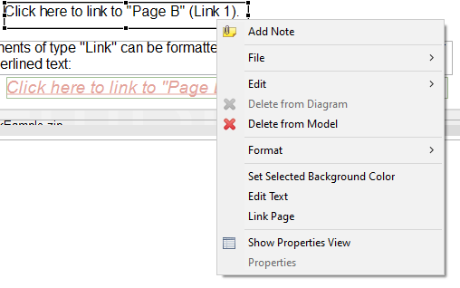
FIGURE 3.127: Context Menu for components of type Link.
Edit Link Text: To change the text that is shown as Link, the entry Edit Text in Figure 3.127 can be used. The built-in editor of the CBA ItemBuilder allows you to edit the single or multline link text, as shown in Figure 3.128.
FIGURE 3.128: Dialog Configure a Multiline Text.
Link Page: Using the context menu shown in Figure 3.127 the dialog to Link Pages can be requested. The dialog for linking pages (see Figure 3.129) is structured the same for all components that support this feature. In the section Select page on the left side of the dialog, all available pages are listed that can be used as link-targets in the current context. Defining a link is possible by selecting one of the pages before confirming the dialog with OK. The selected page can be changed by selecting a new page. Removing a defined link is possible by de-selecting the select link target-page.
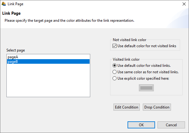
FIGURE 3.129: Dialog Link Page used for components of different type.
Visited Link Color: On the right side of the Link Page-dialog shown in Figure 3.129 different colors for visited and not-visited links can be defined. The default values for link colors can be defined in the Global Properties of a CBA ItemBuilder project file (see section 6.3).
Conditional Links: The buttons Edit Condition and Drop Condition in the lower right part of Figure 3.129 can be used to edit a Conditional Link as described in detail in section 4.3. It is important to note that if Conditional Links are used, the one or multiple target pages are not marked as selected in the Select page section of the dialog shown in Figure 3.129.
3.11.2 Button-Component
Components of type Button play an essential role in designing interactive assessment components with the CBA ItemBuilder. Typically, at least one button is used to navigate to the following Tasks (connected to the NEXT_TASK command, see section 3.12.1). Buttons can not only be used for links but also to collect click responses and to trigger FSM events (see section 4.4.3).
Component for (Image)Buttons: General-purpose components that also can be used to link between pages are buttons. Adding a component of type Buttonto a page requires selecting a container that can host Buttons (e.g., a Panel) first. If the element selected in the Drawing Area can contain a button, the Palette shows the icon to add a Button (see the small symbol  ).
).
The example item in Figure 3.130 illustrates for components of type Button two important properties: The use of images to style Buttons and the property Toggle.
As with all components, the context menu (right mouse button, see Figure 3.131) with the entry Show Property View can be used to edit properties.
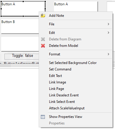
FIGURE 3.131: Context-Menu for components of type Button.
Components of type Button can have a text property that can be edited via the context menu entry Edit Text (see Figure 3.131). The editor for editing the text property is identical to the editor of text properties for components of type ‘Link’ already shown above (see Figure 3.128).
Toggle Buttons: By default, buttons can be clicked multiple times and buttons are only pressed as long as clicked by mouse or touch. However, buttons can also be configured to toggle between either pressed (i.e., on) and unpressed (i.e., off). So-called Toggle Buttons are defined by changing the property Is Toggle: true. Buttons with the Is Toggle=true property can remain in the pressed and non-pressed state, while buttons with the Is Toggle=false property automatically fall back to the non-pressed state after being pressed. Toggle Buttons can also be grouped by using the Frame Select Groups described in subsection 3.9.4 (see the item in Figure3.91 for an example).
Standard Buttons vs. Image Buttons: Whether the ‘Text’ property should be used for components of the ‘Button’ type or not depends on the use of images for button design. The CBA ItemBuilder distinguishes between two configurations: Standard Buttons which consist of a text and an optional image, and Image Buttons which should be designed using images only.
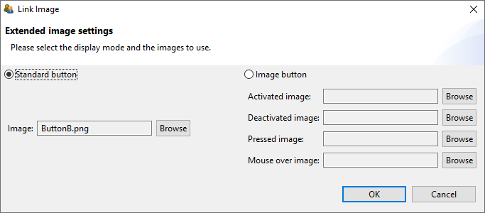
FIGURE 3.132: Component of type Button configured as Standard Button.
Figure 3.132 shows the dialog Link Image which can be accessed with the context menu item of the same name. The multiline text of Buttons can be styled using the properties font family, font size, font color, if a Button is configured as Standard Button. Moreover, border color and background color can be used to style Standard Buttons (see section 3.1.4). Standard Buttons can refer to one single image that is used as background image (see the buttons with the labels “Button B” in the example item provided in Figure 3.131).
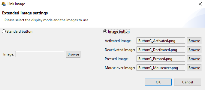
FIGURE 3.133: Component of type Button configured as Image Button.
If components of type Button are configured as Image Button (see figure 3.133), then four different images can be specified:
Activated Image: This image is displayed when the button is active, i.e., it can be pressed. For buttons with the property
Is Toggle=true, this image is displayed when the button is not toggled.Deactivated Image: This image is displayed when the button is frozen. A button can be frozen at design time using the property
Is Frozen=trueor at runtime using thesetFrozen()-operator. By default buttons are created with the propertyIs Frozen=false(identical to theunsetFrozen()-operator).Pressed Image: While a button is pressed, this image is displayed. For buttons with the property
Is Toggle=truethis image is displayed when the button is toggled.Mouseover Image: This image is displayed, when a mouse as pointing device is moved over a button.
Using the Context-Menu (see Figure 3.131 the background can be configured via the entry Set Selected Background Color) for standard buttons with the property Is Toggle=true (see Figure 3.134).
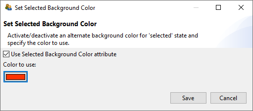
FIGURE 3.134: Dialog Set Background Color for Buttons (Standard Buttons).
Buttons are always defined as rectangles. If rounded corners are required, transparent images can be used, when the button is configured as Image Button. Components of type Button can be set frozen using the operators setFrozen() (and the revers operator unSetFrozen(), see appendix B.2) using either the Finite-State Machine (see section 4.4), Conditional Links (see section 4.3), or the Task Initialization (see section 4.5). The checkbox “Show Buttons as Frozen” in the example item in Figure 3.130 illustrates how frozen components of type Button look like.
Similar to components of type Link (see subsection 3.11.1) provides the context menu an entry Link Page (see Figure 3.131) that can be used to define regular (static) Links or to assign Conditional Links (see section 4.3) to components of type Button.
Buttons can be used in the CBA ItemBuilder when designing assessment components for very different purposes. Buttons can not only Link Pages, as described in the previous section 3.11.1 and switch between pages or open dialog pages (see section 3.15). Using the entry Set Command of the context menu (see Figure 3.131) enables to use buttons to control the navigation between tasks, close dialog pages, or change the full-screen mode on or off using Runtime Commands (see section 3.12).
Buttons can also execute operators. This is either possible using Conditional Links (see section 4.3) or with Events (see section 4.4.3). Events can be linked to selection (see menu entry Link Select Event) or deselection (see menu entry Link Deselect Event) of buttons using the context menu (see Figure 3.131). Deselect Event will only trigger for buttons configured as Is Toggle=true. If Events are linked to buttons, the events can be used to trigger rules in the finite-state machine (see section 4.4 for more details).
Finally, buttons can also be used to increase or decrease the value of components of type ScaleValueInput (see section 4.2.2 for a description of the entry Attach ScaleValueInput).
Text Color for Buttons: The text inside buttons works as a link, so the general link-color settings (see section 6.3) need to be considered. To set the text color in the Properties view, the properties Use Default Link Color: false and Use Same Color For Visited Reference: true must be set in the Display section.
Advanced Button Components: Not all functionality can be realized with simple buttons. For special requirements, the CBA ItemBuilder provides additional components that can be used, for instance, on particular page types (e.g., TaskbarButton and TabButton, see section 3.13.1). Finally, so-called map-based variable displays (see section 4.2.5) can be used instead of buttons, where, for instance, the displayed image can be changed depending on a variable with the help of ValueMaps (see section 4.2.4).
3.11.3 Links with other Compoments
Not only Links (see section 3.11.1) and Buttons (see section 3.11.2) can be used to link between pages. As can be seen in the item shown in Figure 3.135), a number of other components support the functionality of linking to pages directly.
Embedded Links: Components of type HTMLTextFields (see subsection 3.8.2) and TextField (see subsection 3.8.3) can embed links. By linking pages, the CBA ItemBuilder can be used to create navigation scenarios within assessment components and to design interactive tasks. Especially in combination with the special page types for web browser environments (web browser page and web child page, see section 3.13.2) typical hypertext environments can be created and used as part of computer-based assessments under controlled conditions.
Use Links on Answer-Selection: Components of type ComboBox and List (see section 3.9.5 for more details about ComboBox, ComboBoxItem, List and ListItem) and MenuItem (see section 3.9.7 for more details on MenuBar, Menu and MenuItem) can be used to link pages, when a response is given by selecting a particular item.
Use Links on Focus: Components of type SingleLineInputField can be used to trigger links when the components become focus. Since SingleLineInputField can also be defined to be Readonly=true (see section 3.9.1 for details), this can be very useful for using operators in Conditional Links without writing more complex Finite-State Machine rules (see section 4.3.3).
Change Page without Links: Not all components provide the entry Link Page in their context menu and can be used this way to switch to another page. Interactions with these components, for instance, mouse-clicks on components of type ImageValueDisplay, can nevertheless be used to switch between pages with the help of the finite-state machine. This approach based on the assignment of pages to states is described in detail in section 4.4.9.
3.11.4 Advanced Linking Scenarios
The CBA ItemBuilder offers unique flexibility in creating multi-page assessment components with different page types and various linking options. Pages can be of different types and can also be used as xPage, Dialog Page or Page Area. The following section is intended for advanced users of the CBA ItemBuilder who want to take advantage of the full range of possibilities when linking pages.
Link between Pages and xPages: When linking pages, it is crucial to consider the page type (see section 3.4) and the xPage-property (see section 3.4). For example, pages that were defined as xPage in the CBA ItemBuilder can only link to other xPages. Similarly, a page that is not defined as an xPage cannot link to an xPage. The separation of regular pages and xPages is also maintained for dialog pages (see 3.15 for more details on dialog pages). Again, if a dialog is linked from an xPage, it must necessarily be an xPage.
The following advanced example with two regular pages (Page1 and Page2), two xPages (X1 and X2), and two dialog pages (“Dialog1” and “XDialog1”) illustrates how xPages and Pages can be linked:51
Lets look at the button Go to "X2", which is connected to page X2 via Link Page. Since this page is an xPage (see the small symbol  ), the linked page is displayed in the xPage area of the item. Similarly, the link behind the
 Go to "X1" button on page X2 also causes the page X1 to be displayed in the xPage area. Accordingly, xPages are locked to remain in the xPage area of the item. The same is true for regular pages as well, as illustrated with the button Go to "Page2" (on Page1) and Go to "Page1" (on Page2). Components on pages that are not configured as xPages can link only to other regular pages.
The separation of pages by the xPage-flag is already implemented by the in the dialog to configuring links, i.e. depending on whether the link should be configured on a Page or an xPage, only all available Pages or xPages are listed.
The example item (see Figure 3.136 illustrates not only simple links between Pages and xPages, but also the use of links in dialog pages (see subsection 3.15 for more details) and the use of Finite-State Machine Events to switch Pages and xPages (see subsection 3.11.4 for more details).
Links Between Pages of Different Type: The CBA ItemBuilder distinguishes two kinds of links: Regular (static) Links and Conditional Links. Links can be assigned to a variety of components using the context menu entry Link Page. Links are resolved in the current environment and taking page types into account. To enable advanced linking across environments and page types, either Conditional Links or Finite-State Machines are required.
In addition to the simple links shown in the table, the setEmbeddedPage()-operator can also be used to link in PageAreas (see section 4.3.4).
3.12 Runtime Commands

Tasks created in CBA ItemBuilder project files (see section 3.6) are to be used with an execution environment, i.e., using a particular deployment software (see chapter 7). In most cases, deployments are a set of CBA ItemBuilder tasks, administered in a linear sequences. An authentication (i.e., login) of the test-takers is often required first before the items are shown in the defined sequence. Regardless of the administration mode, items are rendered in the test-takers web browser or in a browser-component provided as part of the deployment software.52
Since the CBA ItemBuilder allows creating complex items with multiple pages, it is essential to distinguish the navigation within Tasks (implemented inside the CBA ItemBuilder) and the navigation between Tasks, which is handled by the deployment software. Both parts are linked with so-called Runtime Commands (short: Command), which the item author can define within CBA ItemBuilder tasks to allow test-takers to end working on a particular task.
The different Runtime Commands can be assigned to Buttons (see 3.11.2) and to MenuItems (see 3.9.7) using the context menu in the Page Editor (see Figure 3.137).
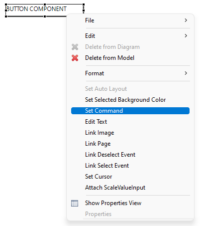
FIGURE 3.137: Context menu to assign a Runtime Command.
The dialog that opens (Set Runtime Command, see Figure 3.138) allows you to select one of the available Runtime Commands. Exactly one command (or EMPTY for none) can then be assigned to the currently selected Button or MenuItem (default is EMPTY).
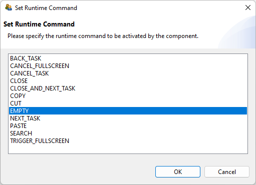
FIGURE 3.138: Dialog Set Runtime Command.
After specifying which command should be triggered by click or touch on the selected Buttons or MenuItems by selecting an entry in the dialog Set Runtime Command the button OK is used to conform the configuration. If a command is already assigned, it can be removed by selecting the command EMPTY or by deselecting the selected entry in the Set Runtime Command dialog.
Runtime Commands can also be defined directly in the Properties view (see property Command in Figure 3.139). The entry EMPTY can be selected to remove a defined Runtime Command.
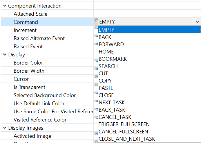
FIGURE 3.139: Property Command in section Component Interaction.
Runtime Commands can also be triggered from the dynamic content of items (see subsection 4.4.6 for specific finite-state machine operators that trigger commands).
3.12.1 Task-related Commands
A Task presented at runtime is always expected to be ended when one of the task-related commands is executed. Task-related Runtime Commands provide the possibility to end an assessment component form within the item.
NEXT_TASK: Ending a task and navigation to the next task is requested with the NEXT_TASK-command, that can be assigned, for instance, to a component of type Button.
NEXT_TASK-command (either linked to a Button as described above in section 3.12 or triggered in th Finite-State Machine (see section 4.4.6) is required for each Task if the test-taker should be able to end the Task. Typically only tasks ended by a planned timeout implemented in the deployment software or tasks ended by an external event triggered by an interviewer or test-administrator have no NEXT_TASK-command.
If no next Task is defined within a CBA ItemBuilder Project Preview or a Task Preview was requested, the NEXT_TASK-command will trigger the message illustrated in Figure 3.140.
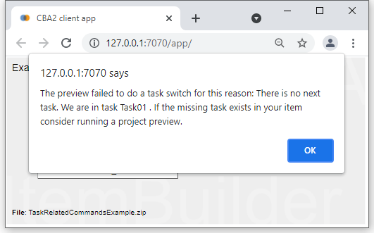
FIGURE 3.140: Preview message when calling the NEXT_TASK-command in the last Task.
BACK_TASK / CANCEL_TASK: For controlling the flow between tasks in more depth, deployment software (see chapter 7) and the TaskPlayer-API (see section 7.7) can additionally support the following commands:
-
BACK_TASK: Navigates to the previous task -
CANCEL_TASK: Cancels the current part of an assessment
3.13 Components for Special Page Types

Regular pages of type simple page were described in section 3.4.1. As shown in Table 3.10 additional page types are available in the CBA ItemBuilder for specific purposes. These more specific pages types are listed in Table 3.10 and the components that can only be used with pages of that particular types will be described in subsections 3.13.1 and 3.13.2.
| Page Type | Description |
|---|---|
Task Bar Page 
|
Several pages of type simple page can be connected with a Task Bar Page in such a way that the test-taker can switch between pages as if they were fullscreen applications. Buttons are associated with pages, and a home page is displayed when the button of type TaskbarStartButton is clicked, or when an activated button of type TaskbarButton is clicked again. Different layouts can be realized by altering the position of the components of type TaskbarGroup and ChildArea. |
Tab Folder Page 
|
Several pages of the simple page type can be connected to a Tab Folder Page in order to simulate multiple tabs. Unlike the Task Bar Page, however, all pages are equal and remain open when clicked again. Different layouts can be realized by altering the position of the components of type TabfolderGroup and ChildArea. |
Web Browser Page & Web Child Page 
|
A page type that acts as a frame for several subordinate pages is a Web Browser Page. A page of type web browser has an area in which a page of type ‘web child’ can be displayed. Transitions between simple pages and web browser-pages are not possible via links, but require the finite-state machine. Hence, the two page types are mainly used for specific task layouts with browser-like navigation between (simulated) web-pages. |
For each page of a particular type, components of type Frame act as root element. As shown in Figure 3.144, Frame within pages of type Simple Page can contain Panels (see section 3.5.2) and PageAreas (see section 3.5.4). The hierarchy shown in Figure 3.144 illustrates the general concept of containers and nesting elements within container implemented in the CBA ItemBuilder (see section 2.11.4).
FIGURE 3.144: Hierarchy of components for different Page Types.
Figure 3.144 also shows that one specific component is required as the root element for all other pages. Pages of type Tabfolder Page need a TabfolerFrame, pages of type Taskbar Page are designed using a TaskbarFrame as the root element. The frame elements WebBrowserFrame and WebChildFrame are used only for pages of type WebBrowser Page and WebChild Page.
Frame, TabfolderFrame, TaskBarFrame, WebBrowserFrame or WebChildFrame) . The CBA ItemBuilders context-sensitive Palette (see section 3.1.3) automatically shows the element that can be used as the top-level component if a page of a partiular Page Type is clicked in the Page Editor.
Frames are containers that can host the components shown in Figure 3.144. The child elements of frames can themselves be containers (i.e., Panels for SimplePages or the equivalent containers shown in blue for other page types) or components that embed other pages (PageAreas, ChildAreas or WebChildAreas).
3.13.1 Tabfoler and Taskbar Pages
The page types tabfolder and taskbar are special pages for implementing navigation within items with multiple pages. Both page types require an area for displaying simple pages (see ChildArea in Figure 3.144) and an area for displaying the navigation buttons (each button is assigned a page via a link). The main difference between the two Page Types is the behavior of the buttons.
Tabfolder: An item using a page of type tabfolder with three tabs (page1, page2 and page3) is shown in Figure 3.145. A page of type tabfolder can contain a component of type TabfolderGroup and a ChildArea. Only these two component types can be added to TabfolderFrames (i.e., the root elements of pages of type tabfolder). The ChildArea links to a first page of type simpe page and the TabfolderGroup can contain additional TabButton-components. The TabButton link to a simple page, so that clicking the TabButton-components changes pages in the ChildArea.
Taskbar: If an already selected button in a Tab Folder Page is clicked again, nothing happens. In contrast, clicking on an already selected button in a Task Bar Page causes the default page to be shown This default page is called the start page in Task Bar Pages, linked to the corresponding button of type TaskBarStartButton. An item using a page of type taskbar with three pages (startpage, page1 and page2) is shown in Figure 3.146.
The contents of pages of the types tabfolder and taskbar are created as a module of the type simple page (see section 3.3) and bound to buttons via links (see section 3.11). Further links between simple pages are also possible.
It is important to point out that the special page types tabfolder and taskbar are only simplifications for functionality that can also be implemented with PageAreas and the dynamic part introduced in chapter 4.
3.13.2 Browser Pages (Web Browser and Web Child)
The CBA ItemBuilder also supports the implementation of simulated hypertext environments with the page types Web browser and Web child. A page of type Web browser forms the outer frame on which typical browser buttons, an address bar, and an area for displaying pages of type Web child can be placed as components.
An example illustrating an assessment component implemented in the CBA ItemBuilder using Browser Pages can be found in Figure 3.147.
Web Browser: To create a simulated hypertext environment, a page of type web browser can be used that allows to host two types of components. The WebChildArea define the place at which the embedded pages of type web child are shown. The WebBrowserToolbar component hosts the specific browser buttons that simplify the implementation of simulated hypertext environments. Browser pages bring a built-in browsing history, buttons for forward and back navigation, a home button and a bookmark function. Figure 3.148 summarizes all components that can be added to WebBrowserToolbars.
FIGURE 3.148: Overview of components for web browser.
Often, the actual task or instruction should be displayed in addition to the simulated web environment. This example illustrates the use of xPage layouts well. The item in Figure 3.149. uses an xPage to display the Task and next to it a page of type Web browser. The actual simulated hypertext pages of type web child are embedded in the Web browser page via a component of type WebChildArea.
Deprecated Features / Features under Development: The components of type WebBrowserFrame (i.e., the root elements for pages of type web browser) provide the property Is Tabbed that can be used to implement tabbed browsing. However, the layout of tabbed browsers cannot be configured entirely, and links always open a new tab (hence, making the navigation buttons of WebBrowserToolbars obsolete).53
3.14 Embedding HTML Content
3.14.1 Compoment ExternalPageFrame

The CBA ItemBuilder allows the inclusion of HTML content in pages using the ExternalPageFrame-component. There are two options provided how HTML content can be included. Either, the HTML page and all used resources (e.g. images, audio/video files, CSS style sheets and JavaScript files) are added to the item project as embedded resources (Local). In this case, the CBA ItemBuilder items are delivered as internal resources. Embedded resources can also be used, for example, in an offline delivery (see section 7.2.2). Or the external contents are only integrated via a URL (External). In this case, it is necessary that the embedded resources are available at runtime and can be loaded from the browser via the Web. ExternalPageFrames can be defined to be transparent.
Components of type ExternalPageFrame can be selected from the palette as described above (3.7) and added to a container, e.g. a Panel. Size and position of embedded HTML content can be defined in the visual designer (see 3.7.1). The HTML content is assigned to the component via the context menu using the entry Set Page Address (see Figure 3.150).
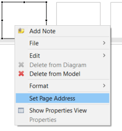
FIGURE 3.150: Context menu of ExternalPageFrame-components.
The dialog Set the URL allows specifying from which URL the content for this component is provided (see Figure 3.151). A Local URL can be defined if the content is provided as part of the item (included using the Embedded HTML Explorer), or the content references an External URL that needs to be accessible at runtime (see section 7.2.2).
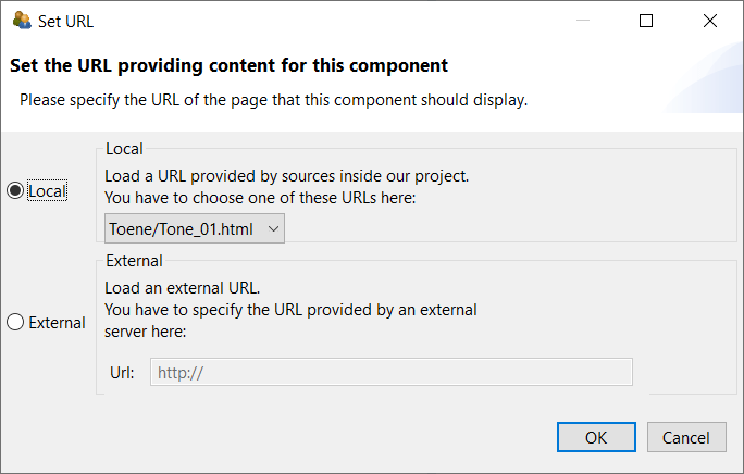
FIGURE 3.151: Dialog Set URL to configure ExternalPageFrames.
Regardless of the source from which the embedded HTML content is obtained at runtime, it is possible to exchange information between the embedded HTML content and the item. This is described in section 4.6.2. In the design view of the CBA ItemBuilder, the embedded HTML content is not displayed, that is, it will be visible only when previewing the item (see 1.4).
3.14.2 Using the Embedded HTML Explorer
To manage the local resources (i.e., the content in static files54 that can be delivered with the item project), the CBA ItemBuilder provides the Embedded HTML Explorer. The HTML Epxorer provides all necessary functions to add files as external-resources, organize them into folders, delete them, rename them and export them from the item project, if necessary (see context menu, shown in Figure 3.152).
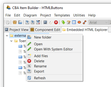
FIGURE 3.152: Context menu of the Embedded HTML Explorer.
To display the content of an HTML, CSS or JavaScript file, the entry Open or Open With System Editor can be selected. The screenshot in Figure 3.153 shows an HTML file opened in the HTML Explorer of the CBA ItemBuilder.
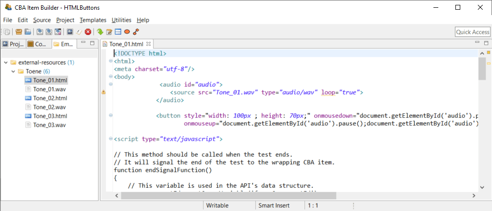
FIGURE 3.153: HTML document opened in an HTML Editor.
A warning is displayed if you try to open a file that cannot be opened in HTML Explorer (see Figure 3.154).
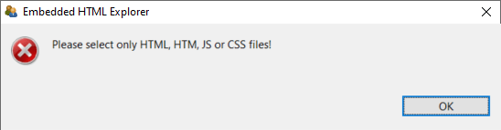
FIGURE 3.154: Warning shown by the Embedded HTML Explorer.
ExternalPageFrames as HTML and JavaScript cannot be used for long-term storage and archiving of items and must be tested independently of the browsers supported by the CBA ItemBuilder.
Caution Note about the use of HTML5 and JavaScript in ExternalPageFrames: As described in section 2.11.2, the CBA ItemBuilder separates the assessment content and the technical implementation required for rendering the items. This separation is impossible when assessment content is only embedded with ExternalPageFrames. Accordingly, it is not possible to adjust the display of items by updating the CBA ItemBuilder, for example, if functionality can no longer be used in new browsers or errors are detected in the embedded content. Due to this restriction, the use of HTML5 and JavaScript in ExternalPageFrames is suggested only in scenarios where resources to update or modify the embedded content are available at the time when items are created and as long as the items are planned to be used or maintained (see also the list of pros and cons in section 4.6.1).
Pros and Cons of Embedded HTML Content: The use of embedded content can offer significant advantages, as it allows to implement item formats, dynamic behavior and interactivity within CBA ItemBuilder items of any kind, including the use of advance libraries, web assembly code and more. However, this huge flexibility also comes with limitations. Pros and Cons are briefly summarized in the following list:
Pro:
ExternalPageFramescan link to HTML content distributed with the CBA ItemBuilder project file and to content included in online deliveries directly from external sources. If, for example, content can only be included by external links for legal reasons, theExternalPageFrameis essential. Of course, if content is only integrated via URL, the delivery must be online and allow access to online resources. If the conted embedded asExternalPageFrameis part of the CBA ItemBuilder project file, it will be deployed using the directoryexternal-resources(similar to the resources used by the item, deployed using the directoryresourcesof the project file).Pro: Parts and components that are difficult or impossible to implement with the objects and techniques of the CBA ItemBuilder can be quickly taken over from existing Web applications or easily programmed in HTML5 (i.e., with HTML and JavaScript). The possibility of including and integrating content as
ExternalPageFramewithin CBA ItemBuilder projects is therefore responsible for this tool’s flexibility, extensibility, and openness.Pro: If assessment components already exist as HTML programs and do not require long-term maintenance, integrating these components as
ExternalPageFrameis useful to enable the reuse of existing content. If more complex ideas are to be tried and tested, rapid prototyping practices can also be implemented usingExternalPageFrames.Con: Assessment content created with the pre-built components of the CBA ItemBuilder automatically provides log events (see section 2.8). If external content is only embedded in assessments using
ExternalPageFrames, the programming of the external content must independently capture necessary log events and integrate them into the log data of the test delivery using the provided interface (see section 4.6.2).Con: Content that is to be used via ExternalPageFrames in CBA ItemBuilder project files must be tested with regard to its display in all planned browsers (cross-browser testing, see section 8.4.1).
Con: The assessment components created with the CBA ItemBuilder are currently executed in HTML environments. From the model defined by item authors (see section 2.11.2), a JSON configuration is generated for execution in the browser, which can be executed and displayed by a JavaScript runtime. This JSON configuration is updated by opening a project file of an older version of the CBA ItemBuilder in the latest version. Older contents (in the form of CBA ItemBuilder project files) then profit from possible further developments and error corrections, e.g., with regard to the requirements of modern browsers. This process forms the basis of the migration strategy (see section 3.2.1 and also section 8.7.3) and does not apply to content inserted directly as HTML / JavaScript via the
ExternalPageFrames.Con: From the perspective of a tool for creating computer-based assessments by item authors, probably the most significant challenge for the long-term use of components as embedded HTML resources is the care and maintenance of these components. Depending on the integrated components’ complexity, questions of knowledge management, and documentation of the source code may become necessary or relevant.
3.15 Pages as Dialogs (Popups)

The CBA ItemBuilder allows showing pages as Dialogs (Popups). Dialogs are usually designed using pages of type Simple Pages (see 3.4.1), and dialog-pages support all features and components that are available for their particular Page Type. Figure 3.155 illustrates the use of dialog pages for various purposes.
As shown in Figure 3.156, the definition of a particular page as dialog can be configured in the Properties view. To define a page as dialog page the property Dialog (in the section Misc) of a page’s Frame must be specified either as DIALOG or MODAL_DIALOG)55.
FIGURE 3.156: Definition of a Frame as DIALOG in the Properties view.
3.15.1 Properties of Dialogs
The creation of dialog pages with the CBA ItemBuilder is done via properties of the ‘Frame.’ The dialog type (regular dialogs vs. modal dialogs), the display of a header with a button to close the dialog (closable dialogs), and the start position for dialog pages can be configured.
Modal vs. Non-Modal Dialogs: The CBA ItemBuilder distinguishes between two kinds of dialog pages (DIALOG and MODAL_DIALOG). A modal dialog is displayed exclusively on the screen. The content of the current page is still displayed as the underlying page, but is darkened. In contrast, a non-modal dialog allows further interaction with the content of the underlying page.
Figure 3.157 illustrates the difference between Modal and Non-Modal (regular) dialogs.56 Modal dialog pages are especially suitable for alerts and messages boxes that must be seen in any case. The presentation of modal dialog pages allows content of the item to be blocked. In contrast, non-modal dialog pages are useful if, for example, item content should remain visible and usable, as is the case with a calculator or for digital scratch paper.
The dialog pages that can be opened in Figure 3.157 using the buttons Closable Dialog and Non-Closable Dialog are not modal. Although they hide a part of the item, the item content can still be changed in the background. The checkbox can be selected and text can be entered into the SingleLineInputField. This kind of interaction is not possible for the dialogs that can be called with the buttons Closable Modal Dialog and Not-Closable Modal Dialog.
Closable vs. Not-Closable Dialogs: As shown in Figure 3.157, another property determines the appearance and behavior of dialog pages: Cosable. Dialog pages that are configured as Closable = true can be closed using the small icon  located in the title bar, that is added by the CBA ItemBuilder to closable dialogs. In contrast, dialogs configured as
 Closable = false don’t show a title bar. If and how dialog pages with the property Closable = false can be closed can be defined and controlled by the item author.
Frame provide the property Closable (true or false) that can be used to configure the behavior of dialogs. This property is only relevant, if the Frame is configured as either as DIALOG or MODAL DIALOG in the property Dialog.
Start Position of Dialog Pages: Dialog pages appear at runtime within the displayed area of a CBA ItemBuiler project file defined by the CBA Presentation Size (see section 3.2.2). Pages configured as dialogs should therefore not be larger than the CBA Presentation Size. The position at which dialogs are displayed is determined by the X and Y coordinates of the component of type Frame, which is inserted into a dialog page.
Transparent Dialog Pages: For advanced designs of complex assessment components with the CBA ItemBuilder, it can also be useful to design dialog pages transparently. This functionality is only available for dialogs with the property Closable=false and can be configured by defining both Frame and Panel as Transparent=true (see Figure 3.155 for an example). In combination with transparent images as background (see section 6.2.1) this allows to implement dialogs with non-rectangular shape in the CBA ItemBuilder.
3.15.2 Opening and Closing Dialogs
Pages whose Frame is configured as dialog (i.e., Frames with a value DIALOG or MODAL_DIALOG in the property Dialog) can be displayed using different methods.
Open Dialog via Link: The easiest way to display a dialog in the CBA ItemBuilder is to link to a page that has been configured as a dialog. Using this approach, all components that can link to a different page (see section 3.11) can be used to open and show a dialog.
Open Dialog Pages with openDialog()-Operator or States: Two different mechanisms are available for displaying dialog pages from within the dynamic part of CBA ItemBuilder items. As described in section 4.4.6, dialog pages can be opened using a so-called operator (the openDialog()-operator). When this operator is executed (either within a Transition or as part of a Conditional Link), the page with the provided Page Name as argument will be shown as dialog. Moreover, pages (in general) as well as pages configured as dialog pages can be assigned to States of the Finite-state Machine (see section 4.4.9). If a State is assigned to a pages configured as dialog, the dialog will appear as soon as the particular State becomes the Current State (see section 4.4.2).
Depending on the configuration, dialog pages can also be closed or hidden in different ways.
User Interaction to Close Dialog: Dialog pages defined with the property Closable=true can be closed at runtime at any time using the small icon in the dialog header.
Runtime Command ‘Close’: Dialog pages can also be closed using the Runtime Command CLOSE and CLOSE_AND_NEXT_TASK (see section 3.12.2). Using this technique, as shown in the example in Figure 3.157, Buttons can be defined to close dialog pages. For that purpose, a runtime command is assigned to the button.
For advanced applications, it may also be necessary to track in the logic layer of the CBA ItemBuilder whether a dialog has been closed. Such an application must prevent unsupervised closing of dialog pages with the property Closable=false. Components of type Button can then be used to close the dialog (using the runtime command CLOSE) and trigger an FSM event (see section 4.4.3, which can then be processed in the logic layer of the CBA ItemBuilder.
Close Dialog Pages with closeDialog()-Operator: Dialog pages with a particular Page Name can also be closed from the finite-state machine with the help of the closeDialog()-operator (described in section 4.4.6).
3.15.3 Links in Dialogs
As described above, dialog pages are opened when a link directed to them is activated. According to the separation into pages of different areas, xPages can refer to dialogs defined as xPage. Regular pages cannot link to dialogs (and pages) that are not defined as xPage.
However, dialogs can contain links (see 3.11. Links to other dialogs are opened as dialogs, links to regular pages are opened as regular pages. Therefore, as Figure 3.158 shows, two dialog pages can be displayed at the same time: A dialog of an xPage and a regular dialog.
The separation of regular pages (and regular dialogs) and xPages (and xPage dialogs) is maintained even if pages are linked to states (see section 4.4.9).